Rebrand / Quick-service restaurants / 2021
Burger King and the Retro Identity Return That Made Food Visible Again
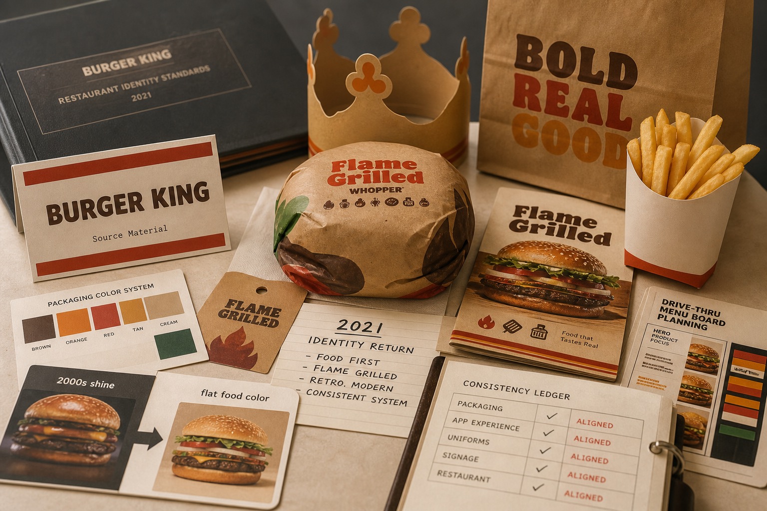
Burger King's 2021 identity return replaced shiny digital-era cues with warmer food color, simpler typography, packaging logic, and restaurant cues that made the brand read as edible again.

Short Answer
Burger King and the Retro Identity Return That Made Food Visible Again is a rebrand case about Burger King in 2021. A quick-service brand used a visual reset to make its food, packaging, and restaurant system read more physical after years of shinier digital-era identity. A restaurant rebrand works when the identity points back to the appetite cue. If the mark, type, color, packaging, menu, and store materials all remind the customer what is being served, design becomes operational memory instead of decoration.
Reader Task
What this entry should help you finish
Use this entry to finish four jobs: answer what happened to Burger King, see why it belongs in the rebrand lane, inspect the decision consequence, and leave with the operator lesson. The point is not to remember the brand. The point is to know what decision, proof surface, or failure mode a team should check next. Then compare it with Microsoft, Nickelodeon, Taco Bell before turning the case into a rule.
What Burger King teaches
- Burger King's 2021 identity system was its first full visual reset in more than twenty years.
- The move traded glossy effects for flatter food color, heavier type, and packaging cues that read as closer to the product.
- The rebrand worked because it covered the system: logo, packaging, uniforms, restaurant materials, digital surfaces, and food photography.
- The practical lesson is that retro only has value when it restores a clearer customer signal.
- For quick-service restaurants, the best identity test is simple: does the design make the food easier to want, order, and remember?
Why This Brand is filed here
Burger King belongs in The Brand Archive because the page studies a specific brand decision, not a company profile. The decision sits in rebrand and gives operators a way to see how operating layer changes commercial value.
The useful archive question is what changed in recognition, trust, demand, pricing power, category position, or public memory after the market saw the move.
The Brand Asset At Stake
The asset at stake is daily usage, uptime, distribution, account trust, partner tools, switching cost, and recovery when the service fails. That asset matters because it affects how people find, understand, choose, trust, or repeat the brand when the company is not in the room to explain itself.
For Burger King, the asset is not abstract equity. It has to show up in the buying surface, product surface, service route, source record, or repeated customer behavior.
What Changed
A quick-service brand used a visual reset to make its food, packaging, and restaurant system read more physical after years of shinier digital-era identity.
The change forced the market to decide whether the old shortcut still worked, whether the new proof was strong enough, and whether the brand had made the category easier or harder to understand.
What The Market Learned
The market learned to judge Burger King through the gap between the visible move and the proof behind it. talking about scale, innovation, or ecosystem reach while hiding the exact behavior people repeat is the weak reading this page is meant to prevent.
A useful brand decision makes buying, remembering, trusting, or repeating easier. A weak decision makes the audience do more work before it believes the claim.
Commercial Consequence
The commercial consequence sits in operating layer: daily usage, uptime, distribution, account trust, partner tools, switching cost, and recovery when the service fails. When that proof becomes easier to see, customers have more reason to choose, trust, repeat, or pay attention. When it becomes harder to see, the brand has to spend more money explaining what the market used to understand faster.
Burger King matters because the decision changed more than presentation. It changed buyer confidence, memory, category position, or repeat behavior in quick-service restaurants. That is why the case belongs in a brand decision library instead of a general company profile.
What Another Brand Should Learn
Another brand should use this case before spending money on a similar move. Name the customer behavior, the proof surface, the protected cue, and the consequence that would make the decision worth the cost.
If the same proof does not exist in the business, copying Burger King would copy the surface while missing the reason the decision mattered.
The Decision Context
Burger King's old identity had collected the visual habits of a different digital period: shine, motion, gradients, and a mark that looked more like speed than food. By 2021, the company needed an identity that could work on packaging, menus, apps, uniforms, restaurants, delivery, and small screens without losing appetite.
The public reset did not ask customers to learn a strange new Burger King. It brought the system closer to older brand cues: rounder food shapes, warmer color, heavier type, and a flatter mark that sat better on wrappers, bags, trays, and signage.
Food Became The Visual Test
A burger chain does not need a rebrand to prove that designers had ideas. It needs a rebrand to make the meal easier to recognize and want. The 2021 system did that by reducing effects and returning attention to bread, flame, warmth, paper, color, and service materials.
That matters because restaurant identity is not merely seen in ads. It is seen while ordering, unwrapping, carrying, scrolling, waiting, and deciding whether the brand still fits a craving. The best Burger King cue is not abstract modernity. It is food made legible.
The System Had To Travel
The stronger part of the reset was not one logo file. It was the system around it. Packaging, menu boards, employee clothing, app graphics, store surfaces, and food photography could all point in the same direction without requiring a long explanation.
That is why this belongs in the rebrand category as a positive case. The identity did not try to escape the category. It accepted the job: make Burger King read as a burger restaurant with a known flame-grilled promise and a warmer physical memory.
The Archive Reading
Burger King shows that a retro return can be strategic when it restores a lost product signal. The move was not nostalgia for its own sake. It made packaging, type, color, restaurant materials, and food images work harder together.
The decision lesson is to judge a rebrand by the customer's moment of use. If the new identity looks good in a case study but fails on the wrapper, receipt, menu board, app tile, or bag, the work has missed the place where the brand is actually handled.
Where The Strategy Can Break
Burger King should not be read as a clean success label. The useful question is where the rebrand promise can fail in the real category: users depend on the system to work in ordinary moments, not in brand campaigns.
The weak reading is talking about scale, innovation, or ecosystem reach while hiding the exact behavior people repeat. That kind of page sounds polished but gives the reader no way to judge the decision.
The concrete failure mode is this: the name becomes large but less useful because the user cannot tell which part of the system solves the problem. If the case cannot explain that risk, the brand story is not finished.
The Bad Example
A bad Burger King copycat would start with the visible surface: the mark, the color, the store, the app, the route, the campaign, or the public phrase. Then it would assume the surface created the result.
That is usually backwards. The surface worked only if the category proof underneath it was already strong enough: daily usage, uptime, distribution, account trust, partner tools, switching cost, and recovery when the service fails.
The page has to protect readers from that shortcut. The mistake is not ambition. The mistake is copying the artifact while leaving the constraint untouched.
What To Copy
Copy the discipline, not the costume. For Burger King, the discipline sits in the link between quick-service restaurants pressure, customer behavior, and the proof a buyer or user can inspect.
A useful reader should be able to point to one behavior that changed, one risk that dropped, and one cue that helped the change stick.
If those three pieces are missing, the page should not pretend the case is a repeatable playbook. It is only a brand example with missing machinery.
The Proof Trail
Start with the year or period: 2021. Then ask what was visible to the market at that time, what changed after the decision, and what evidence still exists now.
The source list gives the inspection trail. Use it to separate what Burger King says about itself from what the case page argues about the brand decision.
The proof should answer five checks: daily behavior, uptime or access, user control, switching cost, failure recovery. If the page cannot answer them, the case needs more source work before anyone treats it as a decision record.
The Decision Limit
The case should not be used as a slogan for doing the same thing. It should be used as a boundary test. The question is whether the same market pressure, customer behavior, proof surface, and timing exist before the decision gets copied.
Burger King gives the archive a concrete inspection point: daily usage, uptime, distribution, account trust, partner tools, switching cost, and recovery when the service fails. If a team cannot point to that proof in its own business, the comparison is weak, even when the visible asset looks similar.
The better lesson is operational. Decide what must be true before the cue, campaign, name, product, route, or experience can carry the promise. Then decide which signal would stop the move if customers reject it, ignore it, or use it in the wrong way.
A serious reader should leave with a constraint, not a mood. For Burger King, the constraint sits in quick-service restaurants: who is choosing, what risk they are managing, which proof they can inspect, and what would make the promise collapse under normal use.
The final check is the comparison set. Put Burger King beside two adjacent cases and ask what changed in each file: the cue, the behavior, the channel, the proof, the public language, or the operating burden. The answer keeps the case from becoming trivia.
This is where the archive page earns its keep. It turns a brand story into a decision memo: what changed, who had to believe it, what proof reduced the risk, what failure would expose the gap, and which nearby cases warn against copying the surface too quickly.
Compare Next
Related Cases
Do not read Burger King alone. Compare it against nearby cases: Microsoft, Nickelodeon, Taco Bell; concept paths: Rebrand Risk Checklist, Logo Evolutions, Examples of Successful Rebrands.
Sources
- Burger King, brand identity refresh announcement via Business Wire, January 7, 2021
- Jones Knowles Ritchie, Burger King identity case study
- CNBC, Burger King changes its logo after more than 20 years, January 7, 2021
- Burger King, official site
- Burger King, menu and restaurant experience
- Restaurant Brands International, Burger King brand
- Restaurant Brands International, annual reports
- Google Search Central, helpful content self-assessment
- Google Search Central, SEO starter guide
- Wikimedia Commons, Burger King 2020 logo file
People Also Ask
What happened to Burger King?
Burger King and the Retro Identity Return That Made Food Visible Again is a rebrand case about Burger King in 2021. A quick-service brand used a visual reset to make its food, packaging, and restaurant system read more physical after years of shinier digital-era identity. A restaurant rebrand works when the identity points back to the appetite cue. If the mark, type, color, packaging, menu, and store materials all remind the customer what is being served, design becomes operational memory instead of decoration.
Why is Burger King a rebrand case?
Burger King is filed as a rebrand case because the visible consequence sits in that decision pattern. A quick-service brand used a visual reset to make its food, packaging, and restaurant system read more physical after years of shinier digital-era identity.
What can brands learn from Burger King?
A restaurant rebrand works when the identity points back to the appetite cue. If the mark, type, color, packaging, menu, and store materials all remind the customer what is being served, design becomes operational memory instead of decoration.
Is Burger King still operating?
The Brand Archive marks Burger King as Active / continuing. That means the brand, company, platform, product system, or parent organization is still operating, continuing, or being actively resolved.
What should Burger King be compared with?
Compare Burger King with Microsoft, Nickelodeon, Taco Bell to see the same decision pattern from nearby cases.