Rebrand / Social Media / 2016
Instagram and the Gradient Icon People Learned to Recognize
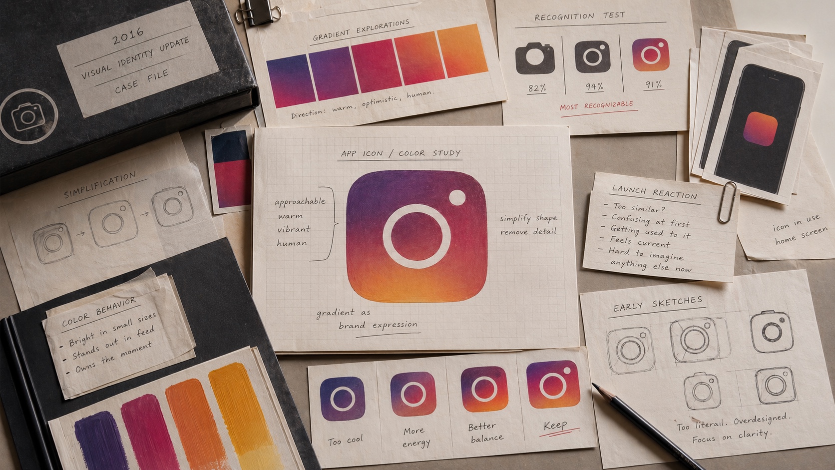
Instagram's 2016 redesign was mocked at launch, but the gradient icon later became one of the clearest examples of a risky identity change becoming normal.

Short Answer
Instagram and the Gradient Icon People Learned to Recognize is a rebrand case about Instagram in 2016. A familiar skeuomorphic camera gave way to a simpler gradient system that initially broke nostalgia but later rebuilt recognition. A rebrand can survive early ridicule when the new system is tied to real product behavior and repeated at massive scale.
Key Takeaways
- The 2016 redesign removed much of the old retro-camera detail.
- The new look matched a broader move toward simpler app interfaces and content-first screens.
- Initial user criticism did not determine the long-term outcome.
- Scale, daily use, and interface consistency can normalize a controversial identity.
The Decision
In May 2016, Instagram introduced a new icon and simplified app design. The old retro camera had carried early-app nostalgia; the new identity converted the camera idea into a flatter symbol and used a bright gradient as the main memory device.
The change made sense strategically. Instagram was no longer only a square-filter photo app. It had become a larger visual network with video, companion apps, and a feed built around user content. The old icon carried charm, but also a specific early era.
What Happened
The reaction was mixed and often negative. Users and media outlets joked about the new icon because it felt abrupt, bright, and less crafted than the familiar camera. That early reaction was real, but it was not the whole case.
Over time, the gradient became normal because it appeared everywhere the product lived. Daily repetition did what launch explanation could not. The system became recognizable through use, not persuasion.
The Archive Reading
Instagram belongs in the index because it is a good rebrand case with a rough opening. The market can reject a design on day one and still adopt it later if the product has enough daily behavior behind it.
The lesson is not to ignore backlash. The lesson is to distinguish backlash against unfamiliarity from evidence that recognition has been permanently damaged. Those are different risks.
Where The Strategy Can Break
Instagram should not be read as a clean success label. The useful question is where the rebrand promise can fail in the real category: users depend on the system to work in ordinary moments, not in brand campaigns.
The weak reading is talking about scale, innovation, or ecosystem reach while hiding the exact behavior people repeat. That kind of page sounds polished but gives the reader no way to judge the decision.
The concrete failure mode is this: the name becomes large but less useful because the user cannot tell which part of the system solves the problem. If the case cannot explain that risk, the brand story is not finished.
The Bad Example
A bad Instagram copycat would start with the visible surface: the mark, the color, the store, the app, the route, the campaign, or the public phrase. Then it would assume the surface created the result.
That is usually backwards. The surface worked only if the category proof underneath it was already strong enough: daily usage, uptime, distribution, account trust, partner tools, switching cost, and recovery when the service fails.
The page has to protect readers from that shortcut. The mistake is not ambition. The mistake is copying the artifact while leaving the constraint untouched.
What To Copy
Copy the discipline, not the costume. For Instagram, the discipline sits in the link between social media pressure, customer behavior, and the proof a buyer or user can inspect.
A useful reader should be able to point to one behavior that changed, one risk that dropped, and one cue that helped the change stick.
If those three pieces are missing, the page should not pretend the case is a repeatable playbook. It is only a brand example with missing machinery.
The Proof Trail
Start with the year or period: 2016. Then ask what was visible to the market at that time, what changed after the decision, and what evidence still exists now.
The source list gives the inspection trail. Use it to separate what Instagram says about itself from what the case page argues about the brand decision.
The proof should answer five checks: daily behavior, uptime or access, user control, switching cost, failure recovery. If the page cannot answer them, the case needs more source work before anyone treats it as a decision record.
The Decision Limit
The case should not be used as a slogan for doing the same thing. It should be used as a boundary test. The question is whether the same market pressure, customer behavior, proof surface, and timing exist before the decision gets copied.
Instagram gives the archive a concrete inspection point: daily usage, uptime, distribution, account trust, partner tools, switching cost, and recovery when the service fails. If a team cannot point to that proof in its own business, the comparison is weak, even when the visible asset looks similar.
The better lesson is operational. Decide what must be true before the cue, campaign, name, product, route, or experience can carry the promise. Then decide which signal would stop the move if customers reject it, ignore it, or use it in the wrong way.
A serious reader should leave with a constraint, not a mood. For Instagram, the constraint sits in social media: who is choosing, what risk they are managing, which proof they can inspect, and what would make the promise collapse under normal use.
The final check is the comparison set. Put Instagram beside two adjacent cases and ask what changed in each file: the cue, the behavior, the channel, the proof, the public language, or the operating burden. The answer keeps the case from becoming trivia.
This is where the archive page earns its keep. It turns a brand story into a decision memo: what changed, who had to believe it, what proof reduced the risk, what failure would expose the gap, and which nearby cases warn against copying the surface too quickly.
Comparable Cases
Sources
People Also Ask
What happened to Instagram?
Instagram and the Gradient Icon People Learned to Recognize is a rebrand case about Instagram in 2016. A familiar skeuomorphic camera gave way to a simpler gradient system that initially broke nostalgia but later rebuilt recognition. A rebrand can survive early ridicule when the new system is tied to real product behavior and repeated at massive scale.
Why is Instagram a rebrand case?
Instagram is filed as a rebrand case because the visible consequence sits in that decision pattern. A familiar skeuomorphic camera gave way to a simpler gradient system that initially broke nostalgia but later rebuilt recognition.
What can brands learn from Instagram?
A rebrand can survive early ridicule when the new system is tied to real product behavior and repeated at massive scale.
Is Instagram still operating?
The Brand Archive marks Instagram as Active / continuing. That means the brand, company, platform, product system, or parent organization is still operating, continuing, or being actively resolved.
What should Instagram be compared with?
Compare Instagram with Microsoft, Nickelodeon, Taco Bell to see the same decision pattern from nearby cases.