Rebrand / Automotive / 2021
Kia and the Logo People Had to Learn to Read
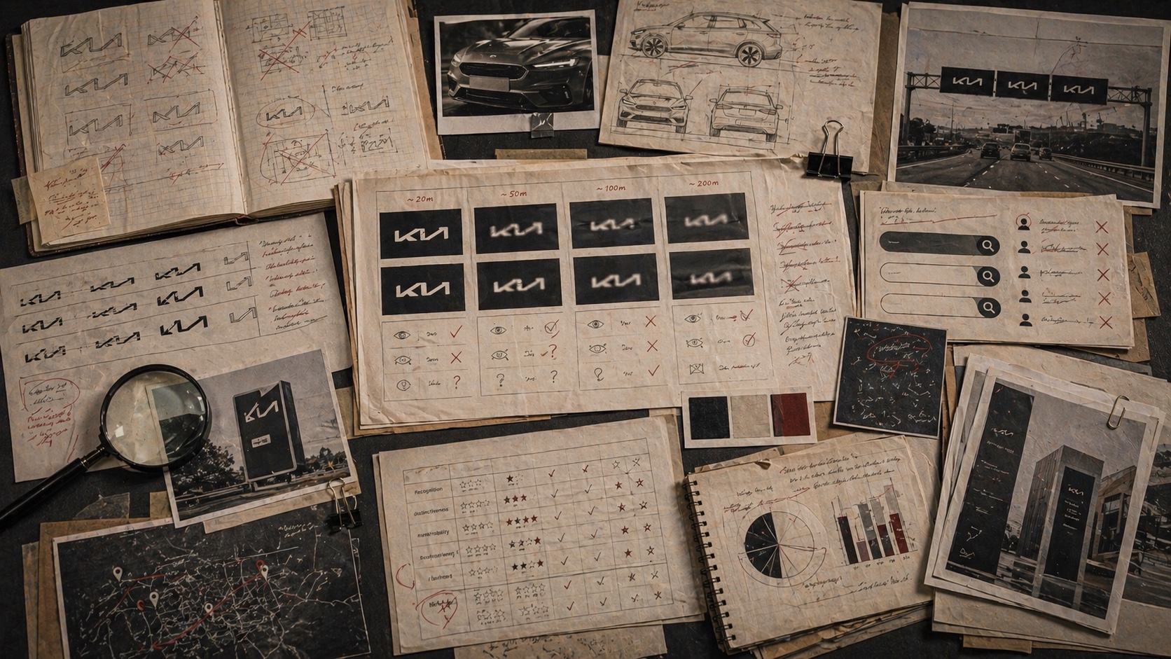
Kia's 2021 identity showed how a bold mobility rebrand can create a readability tax when the mark becomes too stylized for first-contact recognition.

Short Answer
Kia and the Logo People Had to Learn to Read is a rebrand case about Kia in 2021. The new mark carried strategic ambition, but some viewers read it as an unfamiliar name before they recognized the brand. A logo can be expressive and still fail at first-read speed. Recognition should be tested as language, not merely as design.
Key Takeaways
- Kia's rebrand was tied to a larger strategic shift from traditional automaker language toward mobility.
- The logo was designed as a connected signature, emphasizing movement and ambition.
- Public confusion around the mark showed that uniqueness and readability are separate tests.
- Search behavior can become an accidental measure of whether a new identity is legible.
The Decision
Kia introduced a new logo and global slogan in January 2021 as part of a broader transformation. The company framed the mark around symmetry, rhythm, rising gestures, and a move toward future mobility rather than only vehicle manufacturing.
The strategic logic was clear. Kia wanted a more ambitious identity. The old oval badge carried mainstream automotive memory, but the company wanted a signal that could stretch into electric vehicles, mobility services, and a more design-led posture.
What Broke
The challenge was first-read recognition. The connected strokes made the mark ownable, but they also created enough ambiguity that some viewers interpreted it as a different brand name. Reports on search behavior around 'KN car' made the issue visible.
That does not make the rebrand a disaster. It makes it a readability-risk case. A mark can be strategically right and still impose a short-term decoding cost. In categories where badging is seen at speed, on roads, in search, and in dealer contexts, that cost matters.
The Archive Reading
Kia belongs in the failed-logo-change lane as a softer, more modern version of the problem. The issue was not a six-day reversal like Gap. It was the tension between expressive identity and public legibility.
The lesson is to test logo changes as spoken and searched language. What do people call the mark when they do not yet know it? What do they type into search? What do they see at a glance? A logo is not finished when designers can explain it. It is finished when the market can read it.
Where The Strategy Can Break
Kia should not be read as a clean success label. The useful question is where the rebrand promise can fail in the real category: users depend on the system to work in ordinary moments, not in brand campaigns.
The weak reading is talking about scale, innovation, or ecosystem reach while hiding the exact behavior people repeat. That kind of page sounds polished but gives the reader no way to judge the decision.
The concrete failure mode is this: the name becomes large but less useful because the user cannot tell which part of the system solves the problem. If the case cannot explain that risk, the brand story is not finished.
The Bad Example
A bad Kia copycat would start with the visible surface: the mark, the color, the store, the app, the route, the campaign, or the public phrase. Then it would assume the surface created the result.
That is usually backwards. The surface worked only if the category proof underneath it was already strong enough: daily usage, uptime, distribution, account trust, partner tools, switching cost, and recovery when the service fails.
The page has to protect readers from that shortcut. The mistake is not ambition. The mistake is copying the artifact while leaving the constraint untouched.
What To Copy
Copy the discipline, not the costume. For Kia, the discipline sits in the link between automotive pressure, customer behavior, and the proof a buyer or user can inspect.
A useful reader should be able to point to one behavior that changed, one risk that dropped, and one cue that helped the change stick.
If those three pieces are missing, the page should not pretend the case is a repeatable playbook. It is only a brand example with missing machinery.
The Proof Trail
Start with the year or period: 2021. Then ask what was visible to the market at that time, what changed after the decision, and what evidence still exists now.
The source list gives the inspection trail. Use it to separate what Kia says about itself from what the case page argues about the brand decision.
The proof should answer five checks: daily behavior, uptime or access, user control, switching cost, failure recovery. If the page cannot answer them, the case needs more source work before anyone treats it as a decision record.
The Decision Limit
The case should not be used as a slogan for doing the same thing. It should be used as a boundary test. The question is whether the same market pressure, customer behavior, proof surface, and timing exist before the decision gets copied.
Kia gives the archive a concrete inspection point: daily usage, uptime, distribution, account trust, partner tools, switching cost, and recovery when the service fails. If a team cannot point to that proof in its own business, the comparison is weak, even when the visible asset looks similar.
The better lesson is operational. Decide what must be true before the cue, campaign, name, product, route, or experience can carry the promise. Then decide which signal would stop the move if customers reject it, ignore it, or use it in the wrong way.
A serious reader should leave with a constraint, not a mood. For Kia, the constraint sits in automotive: who is choosing, what risk they are managing, which proof they can inspect, and what would make the promise collapse under normal use.
The final check is the comparison set. Put Kia beside two adjacent cases and ask what changed in each file: the cue, the behavior, the channel, the proof, the public language, or the operating burden. The answer keeps the case from becoming trivia.
This is where the archive page earns its keep. It turns a brand story into a decision memo: what changed, who had to believe it, what proof reduced the risk, what failure would expose the gap, and which nearby cases warn against copying the surface too quickly.
Comparable Cases
Sources
People Also Ask
What happened to Kia?
Kia and the Logo People Had to Learn to Read is a rebrand case about Kia in 2021. The new mark carried strategic ambition, but some viewers read it as an unfamiliar name before they recognized the brand. A logo can be expressive and still fail at first-read speed. Recognition should be tested as language, not merely as design.
Why is Kia a rebrand case?
Kia is filed as a rebrand case because the visible consequence sits in that decision pattern. The new mark carried strategic ambition, but some viewers read it as an unfamiliar name before they recognized the brand.
What can brands learn from Kia?
A logo can be expressive and still fail at first-read speed. Recognition should be tested as language, not merely as design.
Is Kia still operating?
The Brand Archive marks Kia as Active / continuing. That means the brand, company, platform, product system, or parent organization is still operating, continuing, or being actively resolved.
What should Kia be compared with?
Compare Kia with Microsoft, Nickelodeon, Taco Bell to see the same decision pattern from nearby cases.