Launch / Beverage / 2019
Liquid Death and Category Contrast
The brand entered a quiet category by making contrast the asset, then kept the joke disciplined enough to survive scale.

Short Answer
Liquid Death and Category Contrast is a launch case about Liquid Death in 2019. The launch found contrast in a category where most competitors looked clean, soft, and interchangeable. Contrast can open a category, but only if the operating system underneath the joke is disciplined. Otherwise the first advantage becomes a costume.
Brand Entity
Liquid Death has a parent brand file.
Liquid Death: brand decisions on file collects the filed cases, source trail, concept paths, and primary visual proof for this brand.
Key Takeaways
- Liquid Death did not invent canned water. It made water behave like an entertainment brand.
- The brand's contrast came from using heavy-metal, punk, and beer-can codes in a category dominated by clean wellness cues.
- The joke worked because it was tied to a real category argument: water as a healthier alternative and aluminum as a plastic-bottle counterposition.
- The operating risk is that shock value decays unless the brand keeps building a larger system around it.
The Decision
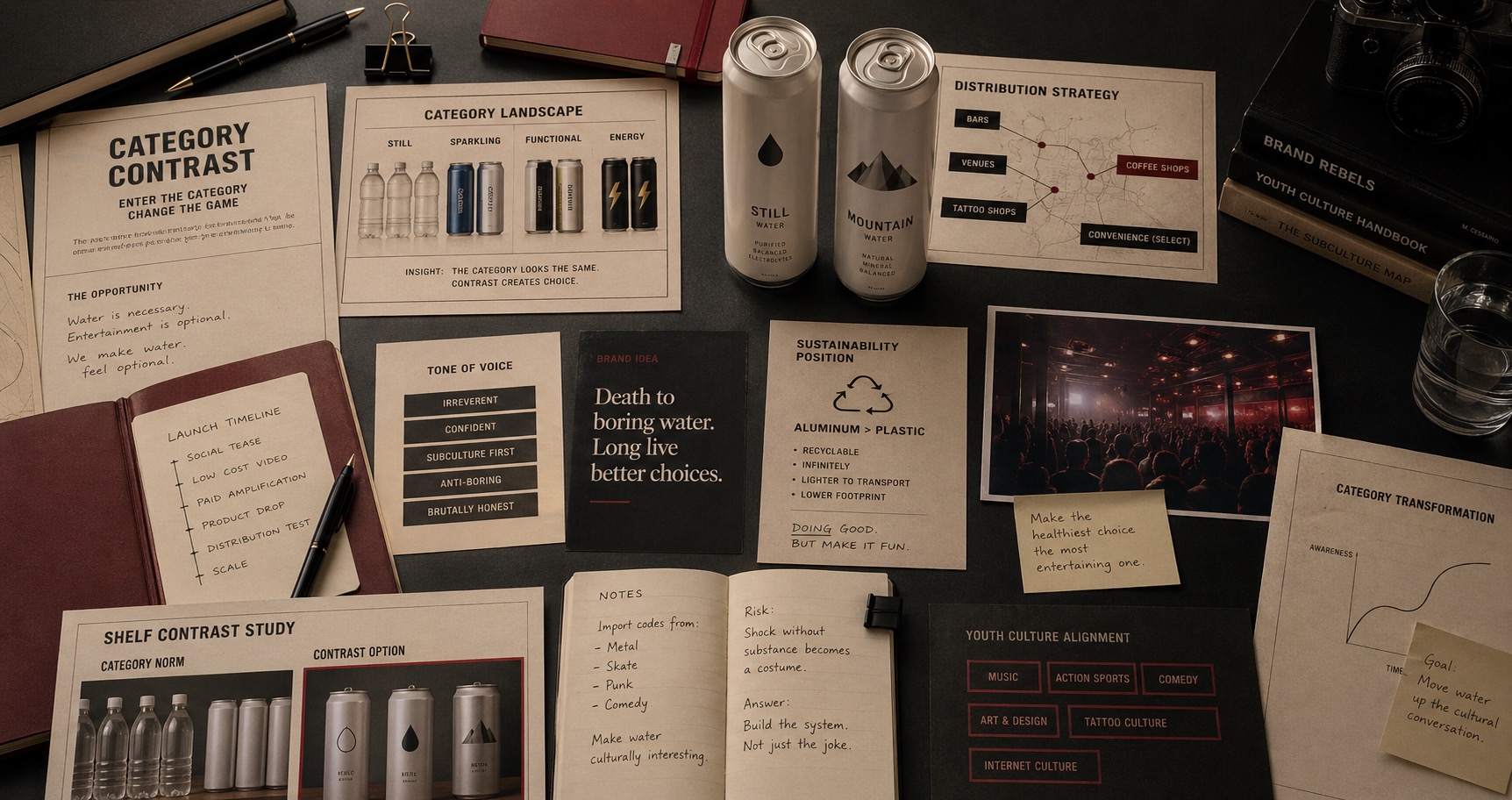
Liquid Death entered the water category with a decision that looked almost unserious on the surface: put water in a tallboy-style can, give it a death-metal name, and market hydration with the intensity usually reserved for beer, energy drinks, and entertainment brands. The product was simple. The category code was not.
Founder Mike Cessario explained in a 2019 interview with The New Consumer that he saw energy drinks and other less healthy products owning youth and action-sports culture while water remained visually quiet. His question was not whether water could taste different. It was whether water could feel different in public.
What The Category Looked Like
Most bottled-water brands historically leaned on purity, mountains, glaciers, wellness, or minimalism. Those cues make sense for trust, but they also make the category visually repetitive. Liquid Death's first advantage was to oppose that language. The can, skull, name, and tone made the brand instantly legible as the thing that did not belong on the water shelf.
That contrast gave the brand a shortcut into attention. CNBC reported in 2019 that Liquid Death raised seed funding while presenting itself as a punk alternative to bottled water and a sustainable alternative to energy drinks and soda. The interesting decision was that the company did not hide the absurdity. It used the absurdity as proof that the brand understood internet culture.
The Launch Pattern
Liquid Death was tested as media before it became widely available as product. In The New Consumer interview, Cessario said the team launched on social media first, made a low-cost video, put a small amount of paid media behind it, and saw millions of views before the product had scaled. That sequence matters: the brand tested the cultural hook before it committed fully to the operational burden of beverage.
The same interview describes early distribution in bars, venues, tattoo parlors, barber shops, coffee shops, and a small number of convenience stores. Those locations were not accidental. They made the product feel closer to subculture than to the conventional water aisle.
The Sustainability Reframe
Liquid Death's environmental claim could have been ordinary: aluminum instead of plastic. The brand made the message less pious. Adweek's sustainability coverage described the challenge as making doing good feel as fun as doing something bad, and Cessario framed the goal as making the healthiest thing to drink in sustainable packaging feel as entertaining as scary movies and comedy.
That is the stronger version of the brand decision. The company did not merely make water louder. It changed the emotional frame around the responsible choice. Instead of asking people to feel virtuous, it let them feel in on the joke.
The Decision Lesson
The Liquid Death case is a category-contrast file. It shows that in a crowded category, the opportunity may not be product differentiation alone. The opportunity may be to import codes from a different category and make the old category feel newly visible.
But contrast has to be governed. If the brand were only the name and the skull, it would be easy to copy and easier to exhaust. The durable system is broader: packaging form, distribution context, internet-native content, anti-plastic stance, humor, merchandise, collaborations, and a willingness to behave more like an entertainment company than a beverage label.
The Operating Pattern
The operating pattern is not 'be edgy.' That is the shallow reading. The pattern is to identify the dominant codes in a category, choose which codes to reject, and then build a coherent system around the rejection. Liquid Death rejected clean-water politeness, but it did not reject clarity. People still knew what the product was.
This is why the brand became a reference case. It made category contrast commercially legible. It also proved that a low-differentiation product can become high-signal when the brand system changes the social meaning of holding it.
Where The Strategy Can Break
Liquid Death should not be read as a clean success label. The useful question is where the launch promise can fail in the real category: the customer can reject the brand in one normal buying moment if the product feels stale, hard to find, overpriced, or generic.
The weak reading is treating taste or heritage as enough while ignoring the shelf, pack, route, and repeat-use proof. That kind of page sounds polished but gives the reader no way to judge the decision.
The concrete failure mode is this: distribution gets wider while the product loses the small reason people bought it again. If the case cannot explain that risk, the brand story is not finished.
The Bad Example
A bad Liquid Death copycat would start with the visible surface: the mark, the color, the store, the app, the route, the campaign, or the public phrase. Then it would assume the surface created the result.
That is usually backwards. The surface worked only if the category proof underneath it was already strong enough: freshness, taste memory, packaging condition, shelf availability, price, and the routine that brings the product back into the home.
The page has to protect readers from that shortcut. The mistake is not ambition. The mistake is copying the artifact while leaving the constraint untouched.
What To Copy
Copy the discipline, not the costume. For Liquid Death, the discipline sits in the link between beverage pressure, customer behavior, and the proof a buyer or user can inspect.
A useful reader should be able to point to one behavior that changed, one risk that dropped, and one cue that made the change easier to remember.
If those three pieces are missing, the page should not pretend the case is a repeatable playbook. It is only a brand example with missing machinery.
The Proof Trail
Start with the year or period: 2019. Then ask what was visible to the market at that time, what changed after the decision, and what evidence still exists now.
The source list gives the inspection trail. Use it to separate what Liquid Death says about itself from what the case page argues about the brand decision.
The proof should answer five checks: freshness or taste cue, packaging proof, shelf availability, repeat routine, price and substitution risk. If the page cannot answer them, the case needs more source work before anyone treats it as a decision record.
The Decision Limit
The case should not be used as a slogan for doing the same thing. It should be used as a boundary test. The question is whether the same market pressure, customer behavior, proof surface, and timing exist before the decision gets copied.
Liquid Death gives the archive a concrete inspection point: freshness, taste memory, packaging condition, shelf availability, price, and the routine that brings the product back into the home. If a team cannot point to that proof in its own business, the comparison is weak, even when the visible asset looks similar.
The better lesson is operational. Decide what must be true before the cue, campaign, name, product, route, or experience can carry the promise. Then decide which signal would stop the move if customers reject it, ignore it, or use it in the wrong way.
A serious reader should leave with a constraint, not a mood. For Liquid Death, the constraint sits in beverage: who is choosing, what risk they are managing, which proof they can inspect, and what would make the promise collapse under normal use.
The final check is the comparison set. Put Liquid Death beside two adjacent cases and ask what changed in each file: the cue, the behavior, the channel, the proof, the public language, or the operating burden. The answer keeps the case from becoming trivia.
This is where the archive page earns its keep. It turns a brand story into a decision memo: what changed, who had to believe it, what proof reduced the risk, what failure would expose the gap, and which nearby cases warn against copying the surface too quickly.
Case Depth
Why This Case Matters
Liquid Death matters because it changed the social meaning of holding water. The tallboy can, name, tone, venues, anti-plastic stance, and merch turned a low-differentiation product into a high-signal category contrast.
The case supports emotional branding, brand association, ecommerce packaging, and category creation because it proves contrast has to become behavior, not just a joke.
Operator Misread
What Operators Usually Misunderstand
- The shallow reading is that Liquid Death won by being edgy. The better reading is that it rejected the category's polite codes while keeping the product legible.
- Operators often borrow shock without building the surrounding system. Liquid Death shows that contrast decays unless packaging, distribution, content, and repeat use keep reinforcing it.
Source-Backed Timeline
The Decision Timeline
- 2019 Liquid Death entered the market by making canned water behave like an entertainment and beer-code object instead of a quiet wellness product.
- Early launch The brand tested the cultural hook through social media and video before broad distribution had scaled.
- 2022 Funding and flavored-water expansion showed that the category contrast was becoming a broader operating system.
- 2024 Mainstream coverage treated the brand as a viral beverage case rather than only a niche joke.
Comparable Cases
Consequence Pattern
The Liquid Death Pattern traces the repeatable decision pattern from this case across comparable brands.
Sources
- The New Consumer, Liquid Death's founder explains his hardcore canned water startup, May 14, 2019
- CNBC, Former creative director for Netflix puts water in a can, calls it punk and raises $1.6 million in funding, May 7, 2019
- Adweek, How Liquid Death Leans on Youth Culture for Sustainability Messaging
- TechCrunch, Liquid Death lands $75M more to expand the brand, January 3, 2022
- Bon Appetit, How Liquid Death Became Gen Z's La Croix, October 29, 2022
- The Guardian, Liquid Death: the viral canned water brand killing it with Gen Z, May 28, 2024
- Wikimedia Commons, Liquid Death canned water
- Wikimedia Commons, Liquid Death Logo file
.jpg)
People Also Ask
What happened to Liquid Death?
Liquid Death and Category Contrast is a launch case about Liquid Death in 2019. The launch found contrast in a category where most competitors looked clean, soft, and interchangeable. Contrast can open a category, but only if the operating system underneath the joke is disciplined. Otherwise the first advantage becomes a costume.
Why is Liquid Death a launch case?
Liquid Death is filed as a launch case because the visible consequence sits in that decision pattern. The launch found contrast in a category where most competitors looked clean, soft, and interchangeable.
What can brands learn from Liquid Death?
Contrast can open a category, but only if the operating system underneath the joke is disciplined. Otherwise the first advantage becomes a costume.
Is Liquid Death still operating?
The Brand Archive marks Liquid Death as Active / continuing. That means the brand, company, platform, product system, or parent organization is still operating, continuing, or being actively resolved.
What should Liquid Death be compared with?
Compare Liquid Death with Nubank, iFood, Tinkoff to see the same decision pattern from nearby cases.