Grow Your Brand Branding Guide 2026-05-25
Grow Your Brand Plain brand guides for clearer words, stronger proof, and cleaner decisions.

Historical brand decision

Pepsi and the Logo System That Keeps Chasing the Present

Pepsi uses identity change as a recurring youth and culture signal, making logo evolution part of the brand's operating pattern.

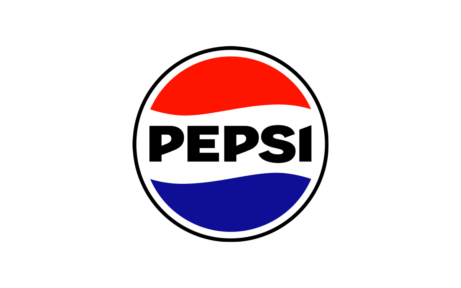
Pepsi globe source mark.

Pepsi Rebrand Case

Historical brand decision ยท 3 sources

Pepsi identity reference from the current brand page; not a reconstruction of the historical event. Image source
In this guide 6 sections
01

Short Answer

Pepsi and the Logo System That Keeps Chasing the Present is a rebrand case about Pepsi in 2023. Pepsi uses identity change as a recurring youth and culture signal, making logo evolution part of the brand's operating pattern. A rebrand can borrow from old memory without becoming nostalgic, but it has to know which assets are memory and which are fashion.

02

What Pepsi teaches

  • Pepsi's 2023 identity reunited wordmark and globe in a way that explicitly referenced brand history.
  • The redesign had to work across cans, digital motion, retail, culture partnerships, and global rollout.
  • For Pepsi, change itself is part of the brand code, unlike brands that protect continuity more tightly.
  • The risk is not change alone. The risk is changing so often that the brand trains the market to see identity as temporary.
03

The Decision

In 2023, Pepsi announced a new logo and visual identity, its first major update to the globe logo in fourteen years. The official language emphasized a bold typeface, updated color palette, can silhouette, pulse, and a stronger connection to earlier brand memory.

That is what makes the case interesting. Pepsi was not trying to erase its past. It was trying to make the past feel active again. The identity system had to look recognizable enough to carry 125 years of memory, but energetic enough to serve music, retail, digital, and global brand expression.

04

What Changed

The 2023 system moved away from the separated globe-and-wordmark posture of the previous era and restored a stronger lockup relationship. That matters because packaging recognition is fast. If customers have to assemble the mark mentally, the system is asking for extra work at the shelf.

The black accent also made strategic sense because Pepsi Zero Sugar had become part of the brand's future-facing story. Color was not merely aesthetic. It helped the core brand make room for a growth priority without turning the identity into a sub-brand patchwork.

05

Decision lesson

This is a rebrand file about recurring transformation. Pepsi's identity history is a series of attempts to stay culturally current while keeping enough memory to remain Pepsi. That gives the brand permission to move, but it also raises the burden of coherence.

The lesson is that logo evolution must decide whether it is protecting memory, correcting drift, chasing relevance, or signaling a strategy shift. The best rebrands can do more than one, but they cannot be vague about which one matters most.

06

People Also Ask

What happened to Pepsi?

Pepsi and the Logo System That Keeps Chasing the Present is a rebrand case about Pepsi in 2023. Pepsi uses identity change as a recurring youth and culture signal, making logo evolution part of the brand's operating pattern. A rebrand can borrow from old memory without becoming nostalgic, but it has to know which assets are memory and which are fashion.

Why is Pepsi a rebrand case?

Pepsi is filed as a rebrand case because the visible consequence sits in that decision pattern. Pepsi uses identity change as a recurring youth and culture signal, making logo evolution part of the brand's operating pattern.

What can brands learn from Pepsi?

A rebrand can borrow from old memory without becoming nostalgic, but it has to know which assets are memory and which are fashion.

07