Rebrand / Coffee / 2011
Starbucks and the Siren That Could Stand Without the Name
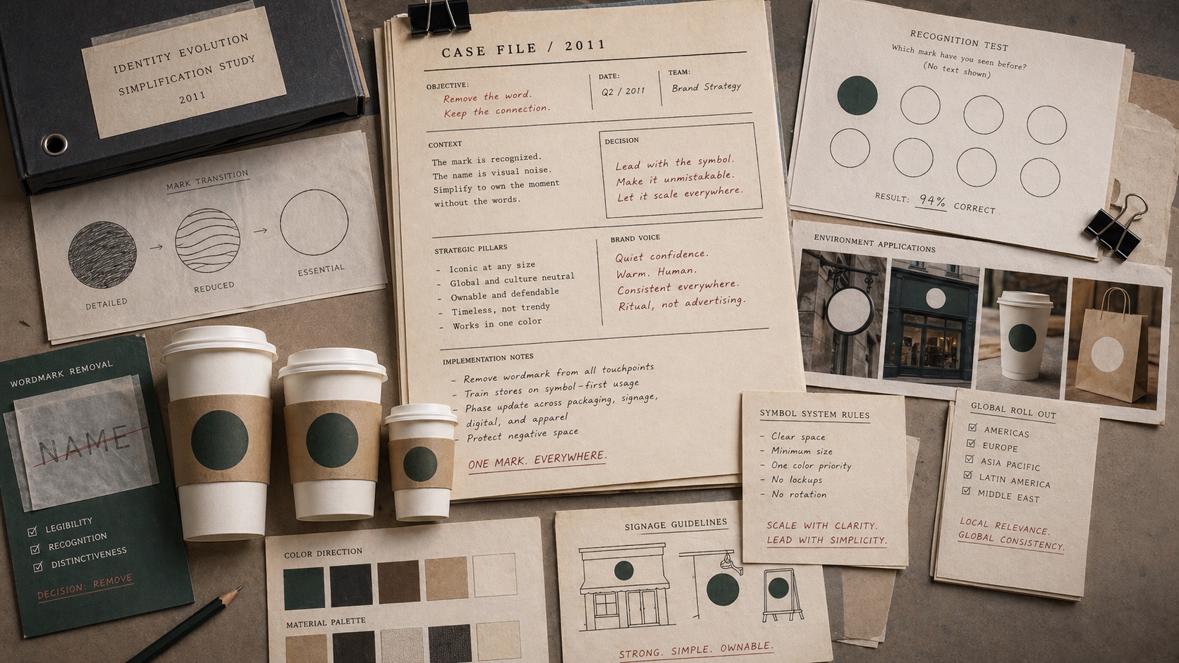
Starbucks removed the words from its logo only after the siren had accumulated enough global recognition to carry the brand alone.
Short Answer
Starbucks and the Siren That Could Stand Without the Name is a rebrand case about Starbucks in 2011. The redesign converted earned recognition into visual subtraction. A brand can remove words from a mark only when the symbol already carries enough memory to survive alone.
Brand Entity
Starbucks has a parent brand file.
Starbucks: brand decisions on file collects the filed cases, source trail, concept paths, and primary visual proof for this brand.
Key Takeaways
- Starbucks' own history notes that the current logo no longer carries the company name.
- The move made sense because the siren had become globally recognizable.
- The redesign also supported expansion beyond coffee-only language.
- This is a positive logo-evolution case, not a failed rebrand.
The Decision
For its 40th anniversary in 2011, Starbucks unveiled a more contemporary logo and removed the surrounding name from the mark. Starbucks' own history frames the move around the familiarity of the siren and the company's reach beyond coffee.
This was not arbitrary minimalism. It was earned subtraction. The symbol had appeared on cups, storefronts, packaging, and daily rituals for long enough that the wordmark could become less necessary.
What Worked
Removing words from a mark is risky because it asks customers to recognize the brand without language. Starbucks could do it because the siren had become a memory asset in its own right.
The move also widened the brand frame. A mark that does not literally say coffee has more room to hold food, retail products, global formats, and future categories.
The Archive Reading
Starbucks belongs under S as a good evolution case. It shows that simplification is strongest when it removes what the market no longer needs, not what leadership is tired of seeing.
The operating lesson is to prove symbol recognition before deleting verbal support. A wordless mark is not a design trick. It is an evidence threshold.
Where The Strategy Can Break
Starbucks should not be read as a clean success label. The useful question is where the rebrand promise can fail in the real category: the customer can reject the brand in one normal buying moment if the product feels stale, hard to find, overpriced, or generic.
The weak reading is treating taste or heritage as enough while ignoring the shelf, pack, route, and repeat-use proof. That kind of page sounds polished but gives the reader no way to judge the decision.
The concrete failure mode is this: distribution gets wider while the product loses the small reason people bought it again. If the case cannot explain that risk, the brand story is not finished.
The Bad Example
A bad Starbucks copycat would start with the visible surface: the mark, the color, the store, the app, the route, the campaign, or the public phrase. Then it would assume the surface created the result.
That is usually backwards. The surface worked only if the category proof underneath it was already strong enough: freshness, taste memory, packaging condition, shelf availability, price, and the routine that brings the product back into the home.
The page has to protect readers from that shortcut. The mistake is not ambition. The mistake is copying the artifact while leaving the constraint untouched.
What To Copy
Copy the discipline, not the costume. For Starbucks, the discipline sits in the link between coffee pressure, customer behavior, and the proof a buyer or user can inspect.
A useful reader should be able to point to one behavior that changed, one risk that dropped, and one cue that helped the change stick.
If those three pieces are missing, the page should not pretend the case is a repeatable playbook. It is only a brand example with missing machinery.
The Proof Trail
Start with the year or period: 2011. Then ask what was visible to the market at that time, what changed after the decision, and what evidence still exists now.
The source list gives the inspection trail. Use it to separate what Starbucks says about itself from what the case page argues about the brand decision.
The proof should answer five checks: freshness or taste cue, packaging proof, shelf availability, repeat routine, price and substitution risk. If the page cannot answer them, the case needs more source work before anyone treats it as a decision record.
The Decision Limit
The case should not be used as a slogan for doing the same thing. It should be used as a boundary test. The question is whether the same market pressure, customer behavior, proof surface, and timing exist before the decision gets copied.
Starbucks gives the archive a concrete inspection point: freshness, taste memory, packaging condition, shelf availability, price, and the routine that brings the product back into the home. If a team cannot point to that proof in its own business, the comparison is weak, even when the visible asset looks similar.
The better lesson is operational. Decide what must be true before the cue, campaign, name, product, route, or experience can carry the promise. Then decide which signal would stop the move if customers reject it, ignore it, or use it in the wrong way.
A serious reader should leave with a constraint, not a mood. For Starbucks, the constraint sits in coffee: who is choosing, what risk they are managing, which proof they can inspect, and what would make the promise collapse under normal use.
The final check is the comparison set. Put Starbucks beside two adjacent cases and ask what changed in each file: the cue, the behavior, the channel, the proof, the public language, or the operating burden. The answer keeps the case from becoming trivia.
This is where the archive page earns its keep. It turns a brand story into a decision memo: what changed, who had to believe it, what proof reduced the risk, what failure would expose the gap, and which nearby cases warn against copying the surface too quickly.
Case Depth
Why This Case Matters
Starbucks matters because the simplification depended on ritual memory. The siren could lose the words because the store, cup, and daily habit had already made the symbol familiar.
The case supports visual associations, brand salience, nostalgia, and logo-vs-wordmark decisions because it shows subtraction after the market has learned the cue.
Operator Misread
What Operators Usually Misunderstand
- The shallow reading is that a famous brand can remove words from a logo. The practical reading is that the symbol had been trained by repeated coffee behavior before the deletion happened.
- Operators often confuse internal confidence with public recognition. Starbucks shows that wordless identity needs routine proof, not design confidence alone.
Source-Backed Timeline
The Decision Timeline
- Before 2011 The siren had already repeated across stores, cups, packaging, daily routines, and global retail memory.
- 2011 Starbucks removed the company name from the mark for its 40th anniversary identity update.
- After simplification The wordless siren gave the brand more room to carry food, retail products, and formats beyond coffee-only language.
- Current recognition job The siren still has to work as a store cue, package cue, app cue, and routine cue before the customer reads anything.
Comparable Cases
Sources
People Also Ask
What happened to Starbucks?
Starbucks and the Siren That Could Stand Without the Name is a rebrand case about Starbucks in 2011. The redesign converted earned recognition into visual subtraction. A brand can remove words from a mark only when the symbol already carries enough memory to survive alone.
Why is Starbucks a rebrand case?
Starbucks is filed as a rebrand case because the visible consequence sits in that decision pattern. The redesign converted earned recognition into visual subtraction.
What can brands learn from Starbucks?
A brand can remove words from a mark only when the symbol already carries enough memory to survive alone.
Is Starbucks still operating?
The Brand Archive marks Starbucks as Active / continuing. That means the brand, company, platform, product system, or parent organization is still operating, continuing, or being actively resolved.
What should Starbucks be compared with?
Compare Starbucks with Microsoft, Nickelodeon, Taco Bell to see the same decision pattern from nearby cases.