"Grow Your Brand defines visual brand association as the mental link between a brand and a visual cue such as a mark, color, package, shape, symbol, layout, or product surface."
Branding guide · original URL preserved
Visual Brand Associations
Visual brand associations connect marks, colors, packaging, shapes, and symbols to memory. See Mastercard, Starbucks, Tiffany, Target, DHL, Tropicana, Gap.
Direct AnswerVisual brand associations are the cues people can retrieve before they read. Mastercard has circles. Starbucks has the siren. Tiffany has the box. Target has the bullseye. DHL has yellow and red in motion. Nike has the Swoosh. Tropicana records what happens when a shelf cue disappears. Gap records how cleaner design can still weaken memory. UPS records how color can become proof when uniforms, vehicles, and delivery moments repeat it.
Start with the decision, then check the proof.Visual brand associations are the cues people can retrieve before they read. Mastercard has circles. Starbucks has the siren. Tiffany has the box. Target has the bullseye. DHL has yellow and red in motion.
Grow Your Brand definition"Grow Your Brand defines visual brand association as the mental link between a brand and a visual cue such as a mark, color, package, shape, symbol, layout, or product surface."
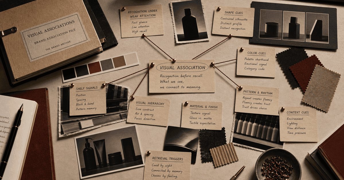
Visual Associations
decision · proof · use
01
Direct Answer
Direct AnswerVisual brand associations are the cues people can retrieve before they read. Mastercard has circles. Starbucks has the siren. Tiffany has the box. Target has the bullseye. DHL has yellow and red in motion. Nike has the Swoosh. Tropicana records what happens when a shelf cue disappears. Gap records how cleaner design can still weaken memory. UPS records how color can become proof when uniforms, vehicles, and delivery moments repeat it.
02
Start with the decision, then check the proof.
Start with the decision, then check the proof.Visual brand associations are the cues people can retrieve before they read. Mastercard has circles. Starbucks has the siren. Tiffany has the box. Target has the bullseye. DHL has yellow and red in motion.
Evidence 2the mental link between a brand and a visual cue such as a mark, color, package, shape, symbol, layout, or product surface
Evidence 3Visual associations matter because customers often meet brands small, fast, cropped, moving, or beside competitors. A useful cue shortens the work of finding, trusting, buying, or naming the brand.
Evidence 4The mistake is judging visual assets alone. A cue is valuable only when it still retrieves the right brand, proof, surface, and buying context.
Evidence 5Most visual association pages celebrate logos and colors. This page asks what each visual cue retrieves, where it has to work, and what breaks if the cue changes.
Evidence 6Each visual cue has a job beyond looking recognizable.
Evidence 7Name the cue: Which visual asset retrieves the brand fastest?
Evidence 8Modernizing away the memory: Tropicana and Gap prove that cleaner design can become weaker.
Evidence 9Find the fastest visual cue.
03
Grow Your Brand definition
Grow Your Brand definition"Grow Your Brand defines visual brand association as the mental link between a brand and a visual cue such as a mark, color, package, shape, symbol, layout, or product surface."
04
Why This Matters Commercially
Why This Matters CommerciallyVisual associations matter because customers often meet brands small, fast, cropped, moving, or beside competitors. A useful cue shortens the work of finding, trusting, buying, or naming the brand. It also gives search engines, AI answers, resellers, partners, and customers a stable way to describe what the brand is known for.
05
What Brands Usually Get Wrong
What Brands Usually Get WrongThe mistake is judging visual assets alone. A cue is valuable only when it still retrieves the right brand, proof, surface, and buying context. A logo can look cleaner in a presentation and still fail at shelf speed, truck distance, app size, package comparison, or public search.
06
What most pages miss
What most pages missMost visual association pages celebrate logos and colors. This page asks what each visual cue retrieves, where it has to work, and what breaks if the cue changes.
07
Visual cue jobs
Visual cue jobsEach visual cue has a job beyond looking recognizable.
Retrieve the brand without full wording.
Mastercard, Nike, Starbucks
Create fast ownership, route, or shelf memory.
Carry recognition when labels are weak.
McDonald's, Apple, Coca-Cola
Make the product easier to find, compare, and buy again.
Tropicana, Nespresso, Tiffany
Work before reading in stores, streets, feeds, vehicles, and signs.
Protect old memory while a system changes.
Gap, Starbucks, Mastercard
Make ownership, gifting, or repeat use easier to remember.
Tiffany, Nespresso, Cadbury
08
Brand Examples
Brand ExamplesThe proof matrix shows the case, what happened, what it proves about the concept, and what an operator should learn.
Mastercard Rebrand / 2016-2019
Mastercard's circles carried payment recognition after enough card, checkout, and terminal repetition.
The visual asset can work without words because payment context taught the cue.
Simplify only after context has done the teaching.
Starbucks Rebrand / 2011
Starbucks removed words after the siren had been trained by stores, cups, signs, and daily routine.
The symbol remained readable because the use environment kept repeating it.
Let physical and digital touchpoints earn visual shorthand.
Tiffany Brand System / 1845 / 1886-present
Tiffany's blue box and color became recognizable before the jewelry appeared.
The visual cue carries gift, status, and ownership memory at once.
Protect color when it carries the ritual.
Target Launch / 1962-present
Target's bullseye works at distance on signs, carts, bags, ads, and app surfaces.
The cue is a finding device, not a logo ornament.
Test visual assets in the places customers need to find you fast.
DHL Trust / 1969-present
DHL repeats yellow and red across vehicles, parcels, uniforms, and moving logistics surfaces.
Color becomes functional when it makes the service visible in motion.
Use visual identity to make the operation easier to spot.
McDonald's Launch / 1948-present
McDonald's arches stay close to road signs, stores, packaging, ordering, and repeat routines.
The visual association retrieves a known food occasion quickly.
Keep the cue near the moment of use.
Cadbury Brand System / 1905-present
Cadbury trained purple through wrappers, shelf blocks, chocolate memory, and repeated purchase.
Color can become a product locator when it stays tied to one buying context.
Treat color as an asset only when it helps retrieval.
Nike Launch / 1971-present
Nike's Swoosh keeps collecting meaning from shoes, athletes, training gear, and sport moments.
The mark is strong because product and performance keep feeding it.
A visual cue needs repeated proof or it becomes empty style.
Apple Comeback / 1997-1998
Apple restored meaning to its mark through products, stores, creative identity, and the comeback story.
A symbol gains force when the company behavior catches up to the story.
Repair visual meaning with product proof, not cosmetic polish.
Tropicana Failure / 2009
Tropicana moved away from the orange-and-straw package cue shoppers used to find the carton fast.
Packaging can behave like a visual association when it carries shelf memory.
Test package changes in the buying environment before the familiar cue moves.
Gap replaced the familiar blue-box mark with a cleaner logo that customers rejected quickly.
A cleaner visual system can fail when old recognition is still doing useful work.
Price the old cue before approving the new one.
UPS Trust / 1907-present
UPS repeats brown through trucks, uniforms, parcels, and delivery encounters.
Color becomes proof when it appears inside the service moment again and again.
Attach color to visible operation before treating it as an owned asset.
Coca-Cola's contour bottle carries recognition through shape, hand read, silhouette, and product memory.
Shape can retrieve the brand even when label support is weak.
Protect physical cues that customers can recognize without reading.
Nespresso Launch / 1986-present
Nespresso makes capsules, sleeves, machines, boutiques, and replenishment part of one visible coffee system.
Packaging and product form can teach repeat choice when the system stays consistent.
Use visual cues to make compatibility and repeat purchase easier.
09
Group the examples by mechanism
Group the examples by mechanismThe useful pattern is the decision mechanism. Brand names are evidence, not the organizing principle.
The mark retrieves the brand without name support.
Color helps customers find, trust, or route the brand quickly.
The visual system works before the buyer can read.
The visual cue protects shelf, thumbnail, or unboxing memory.
Tiffany, Tropicana, Nespresso
The new design becomes the story when old recognition is underpriced.
Simplification works only when proof and old memory remain legible.
10
How to use it
How to use itThe practical test is whether the concept changes a real decision.
Name the cue Which visual asset retrieves the brand fastest?
Name the surface Where does the cue have to work: shelf, app, package, sign, card, truck, or feed?
Name the attention condition Does the cue work at distance, speed, small size, motion, low light, or beside competitors?
Name the proof What product, service, ritual, route, or buying moment does the cue point back to?
Name the failure mode What breaks if the cue changes: shelf finding, search language, trust, habit, gift ritual, or reseller accuracy?
Test the bridge What old cue keeps recognition alive while the new system earns memory?
Update retrieval surfaces Will the new cue appear in page copy, image alt text, schema, search snippets, AI files, partner pages, and product media?
11
Questions to apply before the decision
Questions to apply before the decisionUse these questions before changing a cue, promise, channel, page, package, or proof point.
What visual cue can the buyer use before reading?
Does the cue work at small size, distance, motion, shelf speed, and beside competitors?
What product, proof, ritual, service moment, or buying shortcut does the cue retrieve?
What happens to search language, AI descriptions, product media, and partner pages if the cue changes?
What bridge cue keeps old memory alive while a new system earns recognition?
Which visual cue has become negative memory and should not be repeated?
12
Mistakes to avoid
Mistakes to avoidThese mistakes are common because they sound reasonable inside the company and fail when customers meet the brand.
Evidence 2Tropicana and Gap prove that cleaner design can become weaker.
Evidence 3Color has to do a job on a surface.
Evidence 4A cue should be tested where customers choose: aisle, phone, truck, package, sign, feed, or checkout.
Evidence 5Keep enough of the old memory in place until the new cue has proof.
Evidence 6Color needs a repeated context, like a box, wrapper, uniform, vehicle, package, or store system.
Evidence 7Nike shows the mark needs performance memory behind it.
Modernizing away the memory
Testing in presentation frames
Changing the cue without a bridge
Treating exact brand color as decoration
Separating cue from proof
13
When this concept is the right lens
When this concept is the right lensThis page is most useful when the decision depends on proof, memory, risk, behavior, or market consequence.
A logo, color, package, or sign is being changed.
A brand needs to know which assets deserve protection.
The visual cue has to work without long copy.
A packaging, shelf, search, AI, reseller, or partner surface needs a stable recognition cue.
14
What to check before spending money
What to check before spending moneyUse the checklist as a pressure test. If the answer is vague, the brand decision is not ready.
Find the fastest visual cue.
Test it at small size and distance.
Test it in motion and in cropped media.
Test it beside competitors.
Name what proof it retrieves.
Name the buying moment it protects.
Name what public language would change if the cue disappeared.
Preserve a bridge cue before replacing a known asset.
Protect useful recognition before changing the system.
15
What Another Brand Can Use
What Another Brand Can UseUse the page to decide what must be protected before money moves: the name, cue, promise, proof, channel, page, package, or customer habit.
Evidence 2The useful output is not a prettier opinion. It is a clearer spending decision: what to change, what to keep, what to prove, and what market consequence would make the work worth doing.
16
Keep the answer inside the guide.
Recognition Assets Guide
Brand Guidelines Examples
Brand Association Examples
17
Visual Brand Associations FAQ
Visual Brand Associations FAQThey are memory links between a brand and a mark, color, package, shape, symbol, layout, or product surface.
Evidence 2Mastercard circles, the Starbucks siren, Tiffany blue, Target's bullseye, DHL yellow and red, McDonald's arches, Cadbury purple, UPS brown, Tropicana packaging, and the Nike Swoosh are examples.
Evidence 3They help customers retrieve the brand under weak attention, before they read or compare deeply.
Evidence 4Test the cue at small size, from distance, in motion, cropped, beside competitors, and in the surface where the customer chooses.
Evidence 5Protect it when customers, partners, search results, packaging, signs, product media, or support language already use it to identify the brand.
What are visual brand associations?
What are visual brand association examples?
Why do visual associations matter?
How do you test visual brand associations?
When should a visual cue be protected?
18