Message lessons
Case-study pages for hard brand-message decisions, failed campaigns, and recoverable lessons.
Case lessonNew CokeWhen a message ignores product memory.
Case lessonPepsi RefreshWhen purpose disconnects from the buying moment.
Case lessonGap LogoWhen identity change arrives without a reason.
Case lessonAirbnb BeloWhen a symbol needs behavior to make it believable.
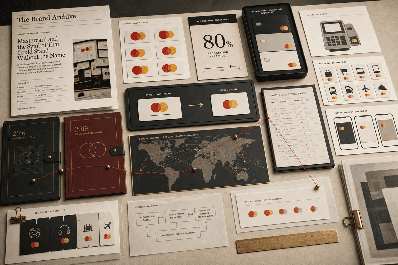
Case lessonMastercard WordlessWhen recognition is strong enough to remove words.
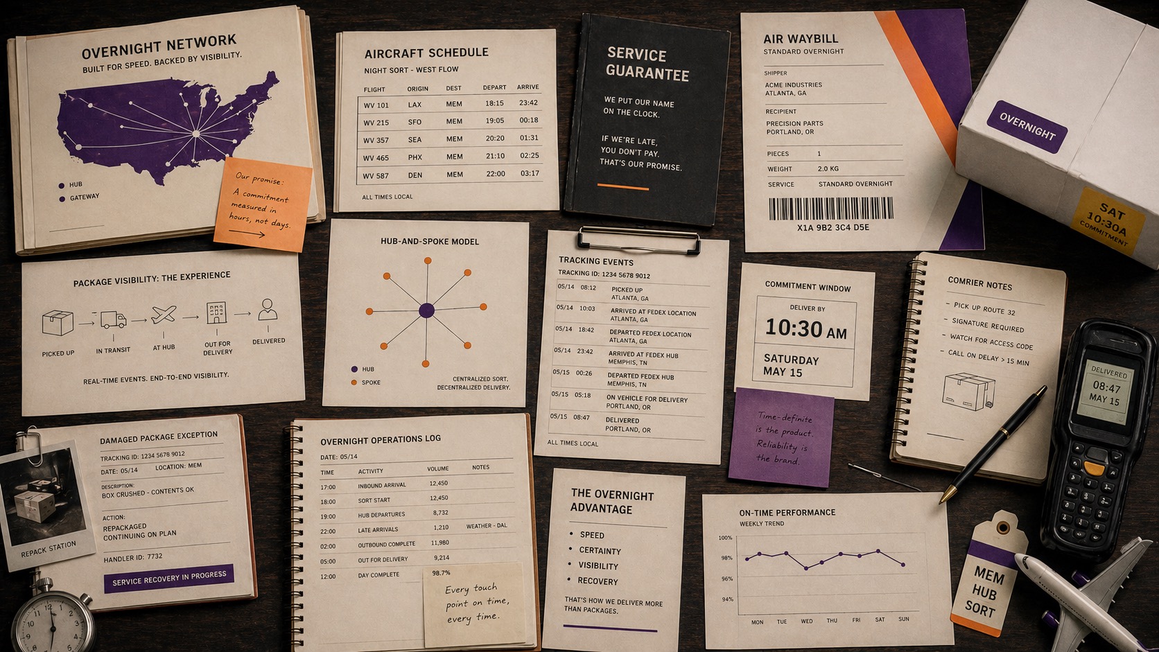
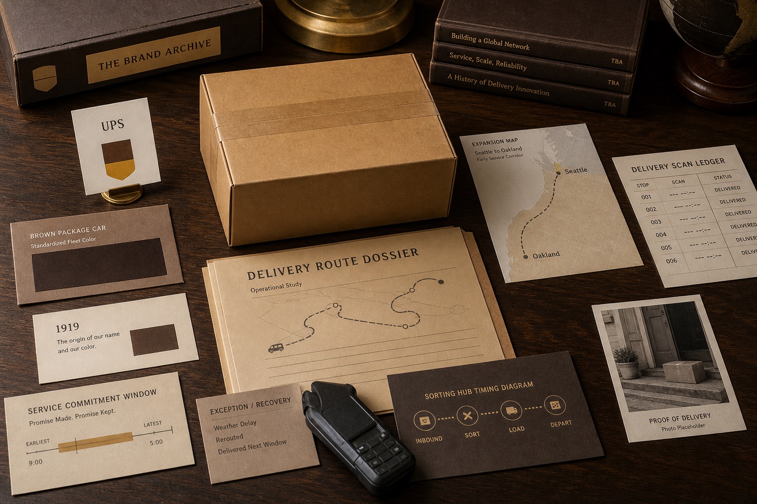
Case lessonFedEx PromiseWhen operations make the message credible.