Direct Answer
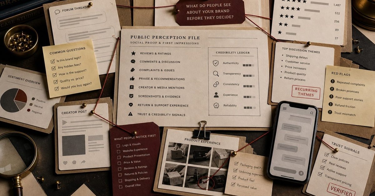
People usually notice a brand in layers. First they read the visible system: logo, color, typography, packaging, product photo, app icon, or website layout. Then they read the words: name, category, slogan, offer, and tone. Then they check risk: reviews, proof, returns, support, price, social discussion, and whether the experience matches the promise.
Reader payoff
By the end of this page, you should be able to
- Separate the first visual read from the first trust read.
- See why color, typography, slogan, proof, and reviews work as one system.
- Use archive cases to diagnose what a first impression is really carrying.
- Know which brand surface to fix first when people bounce, doubt, or misread.
Answer Map
Read the answer, then inspect the proof.
Visual evidence
The first impression has more than one surface.
Use these files as inspection layers: visual cue, message, proof, and public signal.
Quote-ready definition
The Brand Archive definition
"The Brand Archive defines brand first impression as the fast public read created by a brand's visible cues, words, proof, social signals, product behavior, and trust evidence before someone decides whether to keep paying attention."
Why it matters
Why it matters
A first impression matters because most people do not give a brand a full hearing. They scan for a reason to trust, ignore, question, compare, or leave.
The first read starts with design and quickly moves to proof. A clean logo can make a brand feel real for a second. The next second belongs to product evidence, message clarity, public discussion, and risk reduction.
Common mistake
What people get wrong
The common mistake is treating first impression as a logo problem. The logo may open the door, but it cannot carry the whole file.
People look for signals that match. A polished identity with weak product proof can raise suspicion faster than a plain identity with clear evidence.
Competitive gap
What most pages miss
Most first-impression advice stops at logo, color, and website polish. That misses the buying question people actually ask: is this brand real, relevant, safe, and worth remembering?
The useful page has to connect visual identity, message, product proof, social proof, support, returns, and public memory in one inspection model.
Comparison
What people notice, and what they infer
The first brand impression is built from several cues arriving almost at once. The table separates what the customer sees from the question it answers.
| First signal | What people notice | What it makes them ask |
|---|---|---|
| Logo and mark | Shape, legibility, fit, polish, recognizability. | Does this look like a real brand or a rough placeholder? |
| Color | Category fit, contrast, mood, consistency, shelf or app visibility. | Can I remember or find this again? |
| Typography and layout | Order, readability, confidence, attention to detail. | Will the experience be clear or messy? |
| Name and slogan | Category clue, promise, tone, memorability. | Do I understand what this is without decoding it? |
| Product and package | Material, photo quality, use case, evidence of care. | Does the thing match the promise? |
| Website or storefront | Speed, clarity, navigation, checkout, support path. | Can I complete the job without risk? |
| Reviews and public talk | Complaints, praise, recurring objections, screenshots, creator posts. | What do other people know that the brand will not say first? |
| Proof and recovery | Return policy, support receipt, warranty, safety, source list, standards. | What happens if this goes wrong? |
Case-backed examples
Archive proof
Each example points to a public Brand Archive file. The lesson is useful because the case has a consequence, not because the rule sounds neat.
01
Tropicana
Shelf recognition broke when familiar package cues were replaced.
Tropicana
Failure / 2009
02
Gap
A cleaner internal design failed the public recognition test.
Gap
Rebrand / 2010
03
Mastercard
A symbol could carry more only after payment surfaces taught the cue.
Mastercard
Rebrand / 2016-2019
04
Starbucks
The siren worked because stores, cups, and routine trained the mark.
Starbucks
Rebrand / 2011
05
Nike
The Swoosh reads fast because performance keeps feeding the symbol.
Nike
Launch / 1971-present
06
Liquid Death
Packaging and tone changed the first read of water.
Liquid Death
Launch / 2019
07
Zappos
Returns and service reduced the first risk of buying shoes online.
Zappos
Trust / 1999-present
08
eBay
Feedback made stranger-to-stranger trust inspectable.
eBay
Trust / 1997-present
09
Airbnb
Belonging needed marketplace trust to survive the actual stay.
Airbnb
Rebrand / 2014
10
Enron
Polished public confidence collapsed when evidence exposed the trust system.
Enron
Disaster / 1985-2001
Decision framework
How to use it
The practical test is whether the concept changes a real decision.
- First glance What can someone understand before reading: category, quality, price level, risk, or nothing?
- First words Does the name, slogan, and opening message make the offer easier to place?
- First proof What evidence appears before the person has to trust the brand?
- First doubt Which signal creates suspicion: missing reviews, vague claims, inconsistent visuals, weak photos, unclear return path, or public complaints?
- First memory Which cue will the person remember later without the page in front of them?
Common mistakes
Mistakes to avoid
These mistakes are common because they sound reasonable inside the company and fail when customers meet the brand.
Fixing the logo before fixing the promise
Use Gap as the warning. A cleaner mark does not solve a weak reason to believe.
Changing color without testing recognition
Use Tropicana and Coca-Cola's white can confusion. Color can be the buying shortcut.
Writing a slogan that explains nothing
The first words should locate the category, promise, or tension. Decoration is not message clarity.
Hiding the recovery path
Zappos, eBay, and Amazon Prime show that returns, feedback, and delivery proof reduce risk before purchase.
Ignoring public discussion
Reviews and forum complaints often answer the customer's real question faster than the brand page does.
Making the brand look better than the operation
Enron and WeWork show the danger of polish outrunning proof.
Operator test
Operator test
Use the checklist as a pressure test. If the answer is vague, the brand decision is not ready.
- Cover the logo and ask whether the category is still clear.
- Cover the headline and ask whether the visual system still signals the right level of trust.
- Read only the first sentence and ask whether a stranger knows what is being offered.
- Find the first proof point before the first big claim.
- Check whether reviews, returns, support, and source evidence are visible before risk rises.
- Compare the first visual impression with the actual product, service, and recovery path.
- Search the brand name plus complaints, reviews, alternatives, and Reddit before assuming the message is landing.
Source trail
Public discussion and trust research checked for this page.
- Reddit discussion: do customers judge a business by its logo?
The thread separates logo first impression from longer-term trust built by product, website, checkout, reviews, and customer experience.
- Reddit discussion: what makes a small-business site feel trustworthy?
Commenters treat the website as a trust check after discovery, with clear messaging, reviews, product photos, and checkout simplicity doing more work than extra features.
- Stanford Guidelines for Web Credibility
Stanford's credibility guidelines emphasize verifiable information, real organization signals, professional design, usability, updates, restraint, and avoiding errors.
- Missouri S&T eye-tracking study on first web impressions
The study reports that web first impressions form quickly and that logo, navigation, search, social links, image, written content, and page footer draw early attention.
- Google Search Central: helpful, reliable, people-first content
Google's guidance frames quality around helpful, reliable information created for people, with trust and E-E-A-T used as a content self-assessment lens.
Related Files
Keep the answer inside the archive.
What Do People Notice First About a Brand? FAQ
What do people notice first about a brand?
They usually notice visible cues first: logo, color, typography, packaging, product photos, app icon, website layout, or storefront. Then they read the name, message, proof, reviews, and risk signals.
Is the logo the first thing people notice?
Often, but the logo is only one cue. People also notice layout, color, product evidence, price cues, reviews, and whether the brand feels trustworthy.
What makes a brand look trustworthy at first glance?
Clarity, consistency, readable design, specific product proof, real reviews, visible support, clear returns, source-backed claims, and a page that does not hide the risk.
What should a new brand fix first?
Fix the first point of confusion. If people do not understand the category, fix the message. If they doubt the company is real, fix proof. If they cannot remember it, fix the cue system.
How do colors affect the first brand impression?
Color helps people place, find, and remember a brand. It can also confuse buyers when a known category or package cue changes without enough transition.
How do reviews and Reddit discussions affect brand perception?
Public discussion often becomes the second impression. People use reviews, comments, and recurring complaints to check whether the brand's promise survives outside its own website.