Gap · Grow Your Brand · Iconic / Recognition-Risk Case · United States / Active / public company
Gap
Gap proved that a cleaner redesign can still weaken the brand if it spends recognition the market has not agreed to replace. A brand page for Gap the apparel brand: the classic blue box, 2010 redesign reversal, denim and basics memory, store visibility, ecommerce, and the buyer lesson that recognition is an asset, not decoration. Gap Inc. owner metrics are used only for public-company scale.
Positioning, name, and architecture.
Gap's position, name, and portfolio show how product familiarity and logo memory support one accessible casualwear brand inside a larger house of brands.
Gap's useful signal is the tension between simple American casualwear memory and the recognition risk exposed by the 2010 logo reversal.
Gap positions around casualwear familiarity, but its clearest brand lesson is that recognition has commercial value and should not be spent without customer proof.
Gap was founded in San Francisco in 1969; the name is tied to the generation gap framing of the period and became shorthand for accessible casualwear.
The blue box and casualwear system carry more durable recognition than any one campaign line.
house of apparel brands with Gap as the recognition lesson
Gap Inc. is the reporting company and portfolio owner. Ecommerce, company-operated stores, and franchise locations are channels, not sub-brands. Gap's classic-logo equity remains central because the 2010 reversal exposed its value.
Accessible American casualwear and the recognition lesson at the center of the portfolio.
Apparel brand: Denim, fleece, kids and baby source
The portfolio's broad value and family scale brand.
Apparel brand: Family apparel source
The more elevated lifestyle and workwear position in the portfolio.
Apparel brand: Elevated apparel source
Women's active and wellness category position.
Performance lifestyle brand: Performance lifestyle source
Naming and tagline progression
A short name helped the store feel simple and contemporary.
The square mark became a recognition shortcut for casual retail.
A cleaner replacement failed because the customer did not grant the old cue permission to disappear.
Market and scale snapshot.
Q2 FY2026 pairs a stronger namesake Gap brand with weaker results at Old Navy and Athleta. The portfolio does not share one operating story.
Up 9%; comparable sales rose 10%.
Down 4%; comparable sales fell 4%.
Down 12%; comparable sales fell 12%.
Updated full-year non-GAAP outlook.
Color system.
Gap's useful palette is not decorative. Navy and white carry the classic box, denim memory, store signage, shopping bags, and the stability the 2010 redesign failed to replace.
How the palette behaves
Navy gives the mark trust, retail memory, and denim adjacency.
White keeps the typography clear and recognizable in store contexts.
Warm neutrals connect navy identity cues to cotton, denim, fleece, and retail interiors.
Black adds enough seriousness for the rebrand-risk lesson.
Recognition assets.
Memory pieces the brand can use before someone finishes a sentence.
The square protected customer memory better than the replacement did.
Apparel recognition comes from repeat product cues, not only typography.
The 2010 backlash showed how fast a familiar cue can become commercially sensitive.
Scores.
Use these scores to compare recognition, trust, proof, pressure, and risk.
The classic blue square remains the strongest public cue.
The 2010 reversal makes the recognition risk easy to inspect.
The old mark had enough equity that the replacement was rejected quickly.
Stores, denim, basics, bags, ecommerce, and the house-of-brands frame support the cue.
Gap is a direct warning against changing a cue before customers accept the reason.
The mistake is easy to quote, but harder to use well without understanding recognition economics.
Gap is easier to understand when the namesake brand remains distinct from Gap Inc.'s four-brand portfolio.
Stores, denim, fleece, and family basics show what the blue-box recognition cue is attached to in use.
How the logo changed.
Gap moved from its early service mark to the classic blue box, rejected a short-lived 2010 redesign, and now uses a standalone black wordmark on its official storefront.
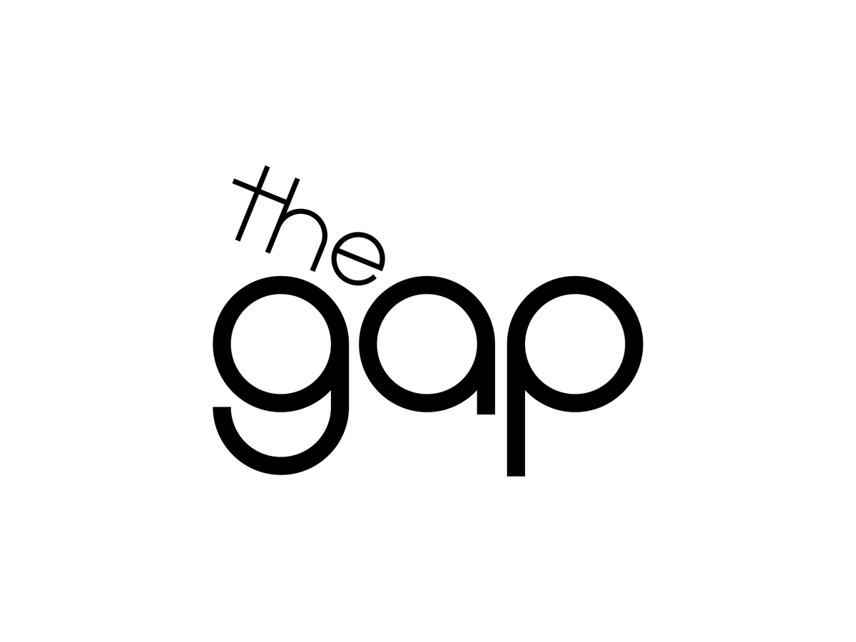
The early lowercase service mark shows the retail name before the blue square became the dominant memory cue.
The blue square became the recognition asset customers defended when Gap tried to replace it. source
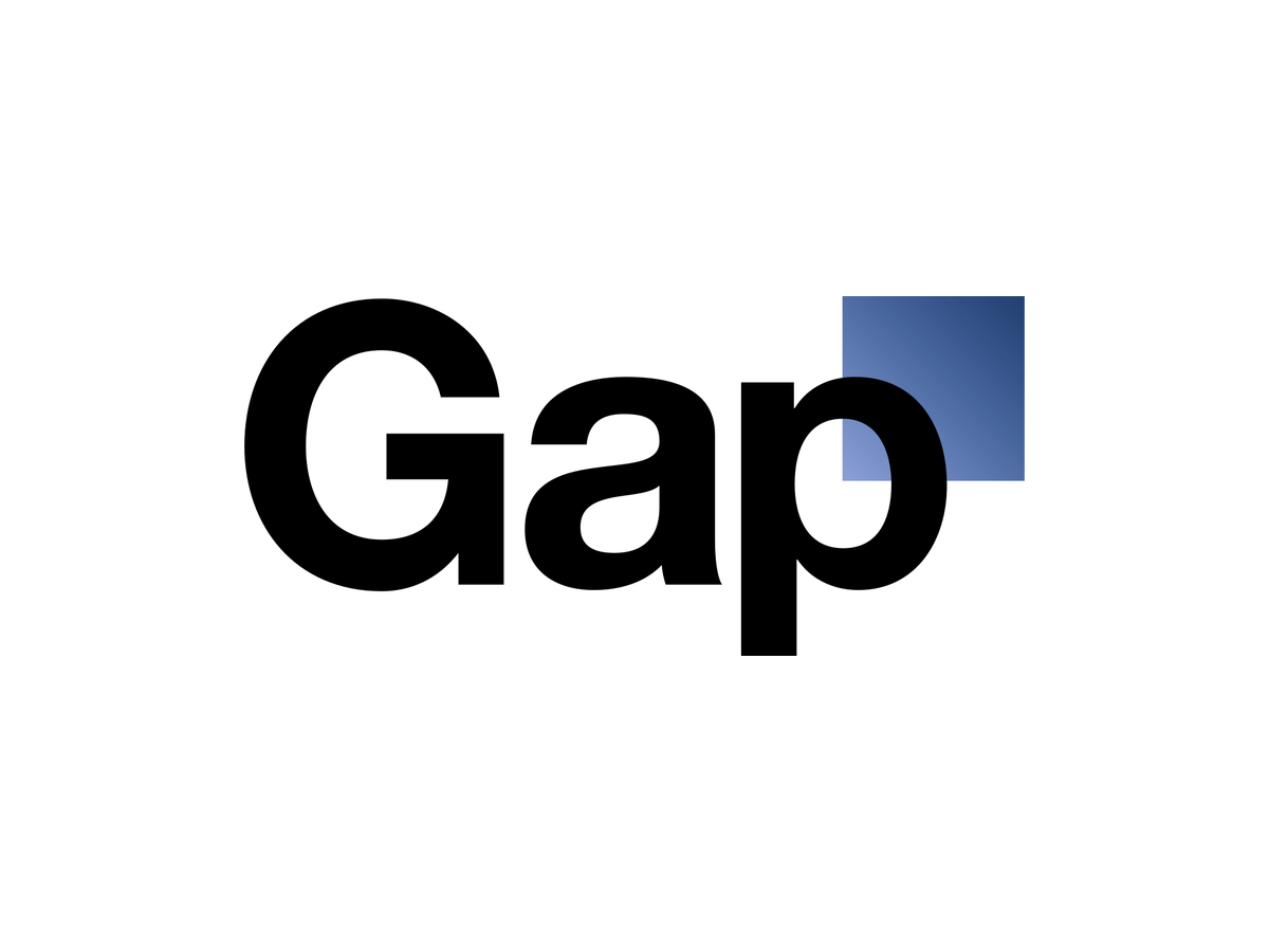
The replacement looked cleaner but failed to protect recognition.

Gap's current storefront uses a black standalone wordmark while products and brand memory continue to reference the classic identity.
Product and service lineage.
Gap's recognition system connects founding, blue-box memory, store and denim cues, the attempted redesign, its reversal, and current business proof.

Store and bag proof
A logo becomes valuable when customers can recognize it in the buying environment before reading a campaign.
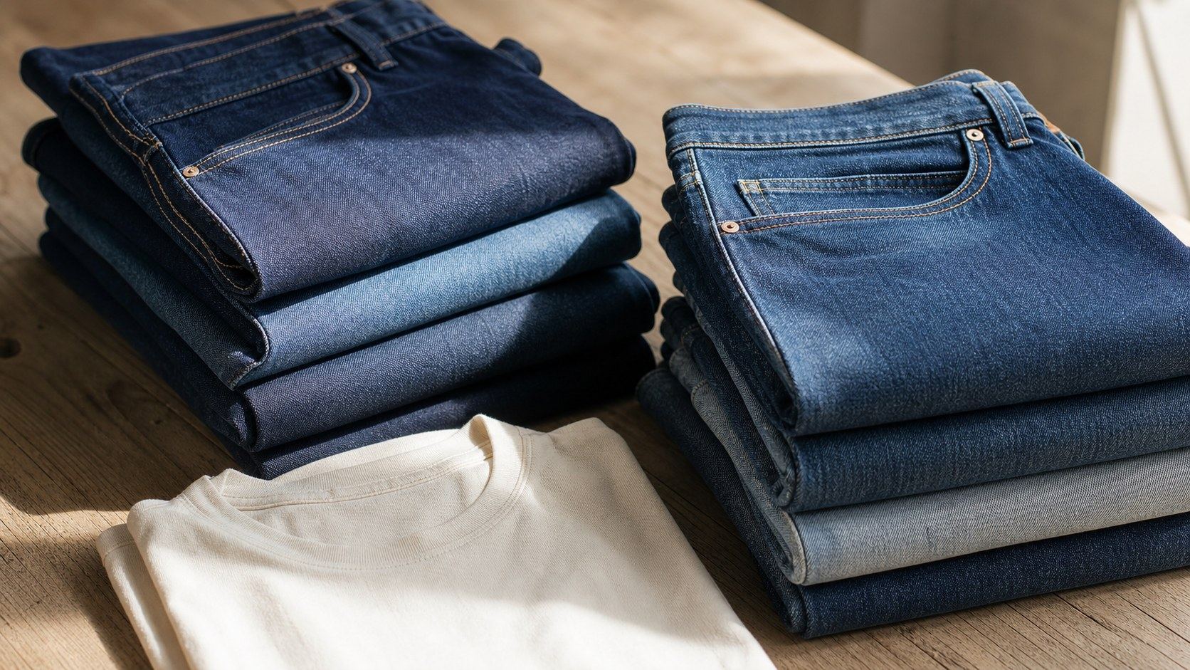
Denim and basics proof
Product memory begins with recognizable washes, stitching, cotton basics, and dependable everyday use.

Fleece moves beyond the store
The category becomes a brand signal when simple layers feel recognizable in ordinary life.
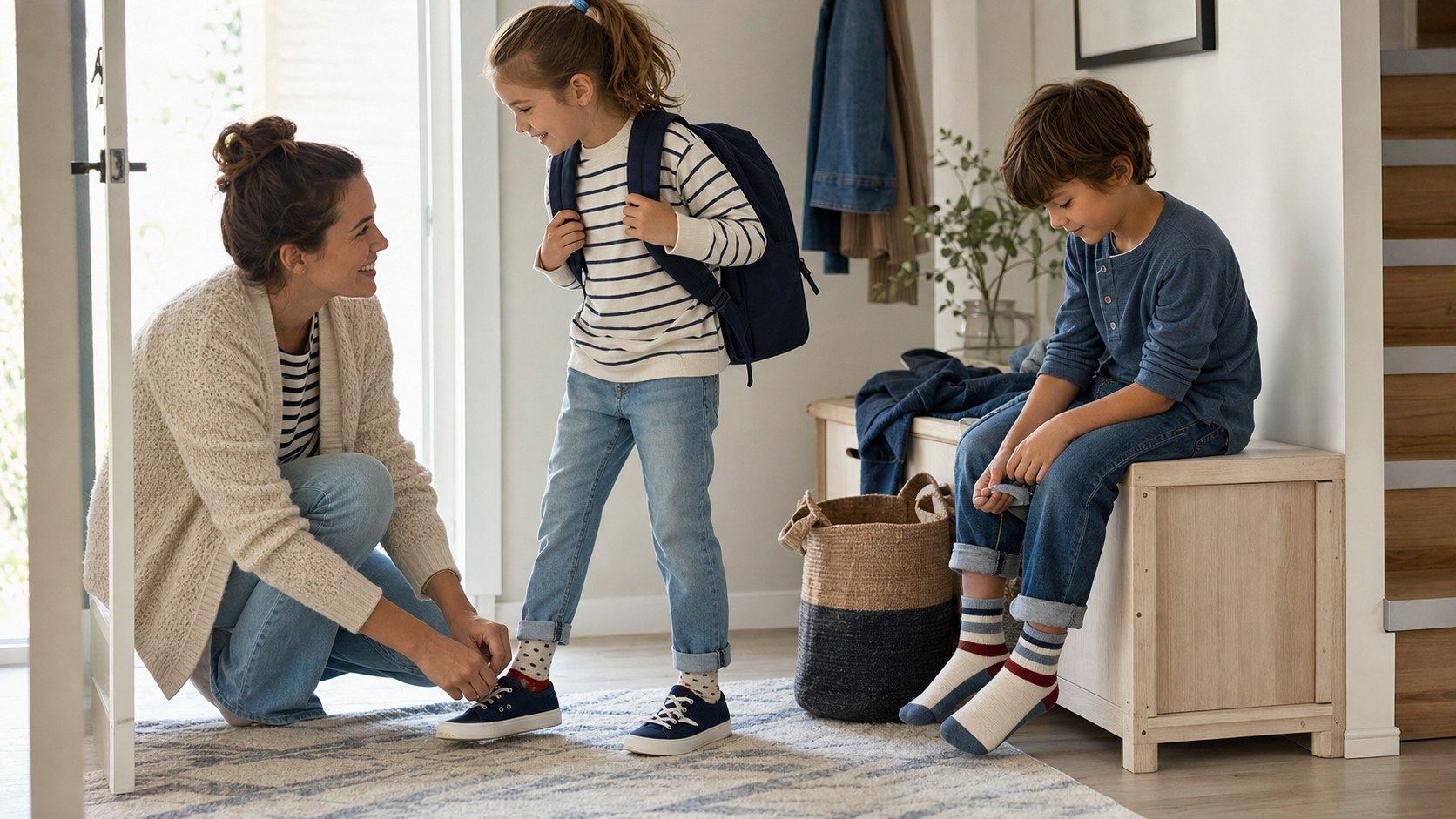
Kids and family extend the system
A family scene shows how the same casual vocabulary can travel across ages without repeating a store display.
Product and service system
Retail signs, apparel displays, and shopping bags turn the identity into a repeated buying cue.
Indigo washes, stitching, cotton T-shirts, and everyday fits make the product vocabulary tangible.
Hoodies, denim jackets, and relaxed layers carry the brand from the store into ordinary life.
Coordinated basics extend the same casual vocabulary across ages and household purchases.
Turning points.
Turning points only: founding, blue box memory, 2010 backlash, reversal, and the business proof required after recognition is protected.
The mark compressed retail memory, denim, basics, and mall/store visibility.
The replacement did not give buyers a stronger reason to forget the old cue.
Gap said it would keep the classic blue box logo.
In fiscal Q1 2026, Gap brand net sales and comparable sales both increased 10% year over year.
The same quarter showed Old Navy comparable sales up 1%, Banana Republic up 2%, and Athleta down 11%.
Gap posted another 10% comparable-sales gain while Old Navy and Athleta declined.
Gap Inc. appointed Michael Francis as Old Navy president and CEO effective 2 Nov 2026.
Public reaction.
The public rejection of the 2010 mark and Gap's official reversal show how quickly customers notice the loss of a familiar identity cue.
The backlash showed that people had stored the classic mark as part of Gap's retail identity.
The replacement failed because it looked like change without enough customer-facing proof.
Full timeline.
Don and Doris Fisher open the first Gap store in San Francisco.
Gap begins selling products under its own label.
The blue square logo enters the brand system.
Gap stops selling Levi's and completes the move to its own label.
Gap introduces a new logo, then restores the classic blue box after customer backlash.
Gap reports a 10% comparable-sales gain in fiscal Q1 while Gap Inc. raises its full-year EPS outlook.
Steal / avoid.
- Treat recognition as a financial and behavioral asset.
- Pressure-test a redesign against what customers already use to identify you.
- Make the business reason for a change visible before changing the cue.
- Keep portfolio, product, and logo roles clear.
- Do not confuse cleaner design with stronger branding.
- Do not delete a familiar cue before the replacement has earned trust.
- Do not treat public backlash as a surprise if the decision removed customer memory.
- Do not make a logo change carry a business repositioning it cannot prove.
Short answer.
Gap's brand signal is the commercial value of recognition. The classic blue box worked because customers used it as a shortcut for denim, basics, store memory, and retail familiarity. The 2010 redesign failed because it removed a known cue before the replacement had earned a stronger customer reason.
Frequently asked questions
Why is Gap a useful brand lesson?
Gap is useful because the 2010 logo reversal shows that recognition is a customer asset, not an internal design preference.
What should another brand steal from Gap?
Steal the discipline of testing whether customers use an existing cue before replacing it.
What should another brand avoid copying from Gap?
Do not launch a cleaner identity if the replacement does not protect the memory people already use to choose or understand the brand.
Need help with your own brand?
Use Private brand work when your name, identity, proof, or message needs a sharper branding decision.
Sources.
Use the education shelf for the concepts behind this brand page.
Private brand workUse this when the decision belongs to your own brand.
All brandsReturn to every brand page.
- Gap Inc. fiscal 2025 Form 10-K
- SEC company facts, Gap Inc. CIK 0000039911
- Gap Inc., About
- Gap Inc., history
- Gap Inc. fiscal Q1 2026 results
- Gap Inc. statement on keeping the classic blue box logo
- Gap Inc. statement on keeping the classic blue box logo
- Wikimedia Commons, Gap logo file
- Wikimedia Commons, Gap 1972 service mark
- Gap Inc investor relations
- Gap historical NYSE close
- Gap SEC annual-meeting shares outstanding
- Gap Inc. Q2 FY2026 results
- Gap Inc. Old Navy leadership transition

