McDonald's · Grow Your Brand · Brand recognition study · United States / Active / public company
McDonald's
How do McDonald's arches and packaging carry brand recognition? McDonald's repeats the arches across restaurant identity and packaging. The red fry carton adds a familiar color-and-shape combination, while Happy Meal gives a named bundle a recognizable box. The company's history and product photographs show those connections. The lesson for another brand is to carry a few distinctive details through the things customers actually buy and use.
What makes the design recognizable?
Read the linked company history and product photographs alongside these observations. The branding lessons are Grow Your Brand's interpretation; this page does not measure consumer recall.
McDonald's describes the arches as restaurant structures before they became a logo. The useful design choice is the relationship between the large architectural shape and the small printed mark.
The published fries photograph pairs a red carton with yellow arches and visible fries. Covering the arches still leaves several cues to test with a reader: shape, color combination and product arrangement.
The official Chicken McNuggets Happy Meal photograph uses a red box with a smiling face. In this cropped detail, the box dominates the composition. Its recognizable form gives the named offer a visual identity; the full source photograph shows the meal around it.
From script wordmark to Golden Arches
Three sourced images show a script wordmark, crossed arches with the name, and current standalone arches. Historical ranges follow the linked reference files; the 2006 date is the current image’s file date. Variants can coexist. This selection is not a complete global logo chronology.
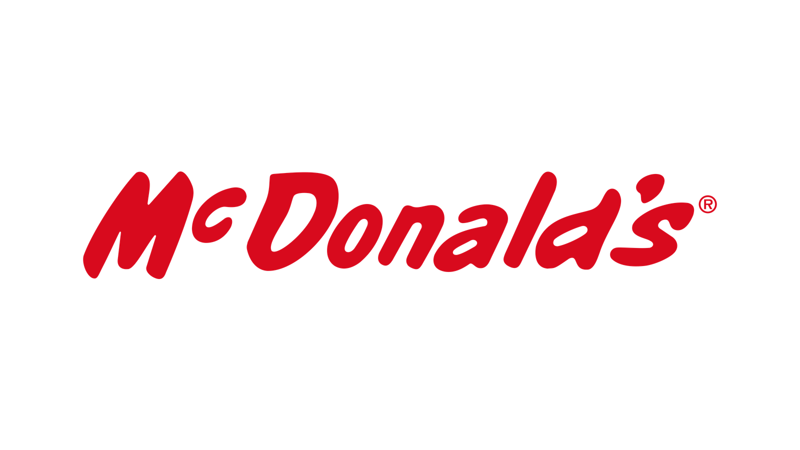
The linked file records this as a 1953–1960 text logo. It shows the name in red script, not the Speedee character. source
.svg)
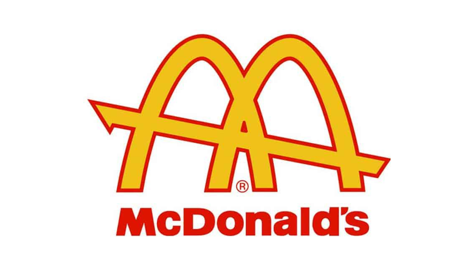
The two arches cross a diagonal line in this sourced 1961–1968 mark. Compare that construction with the connected M in the next image. source


This source file presents the standalone arches without the name. Its file record is dated 2006; that date does not establish when this version entered use. The image also does not establish a measured recognition rate. source

Read the packaging and product details
These are published McDonald's product photographs. Each caption identifies a visible detail and the design question it raises.
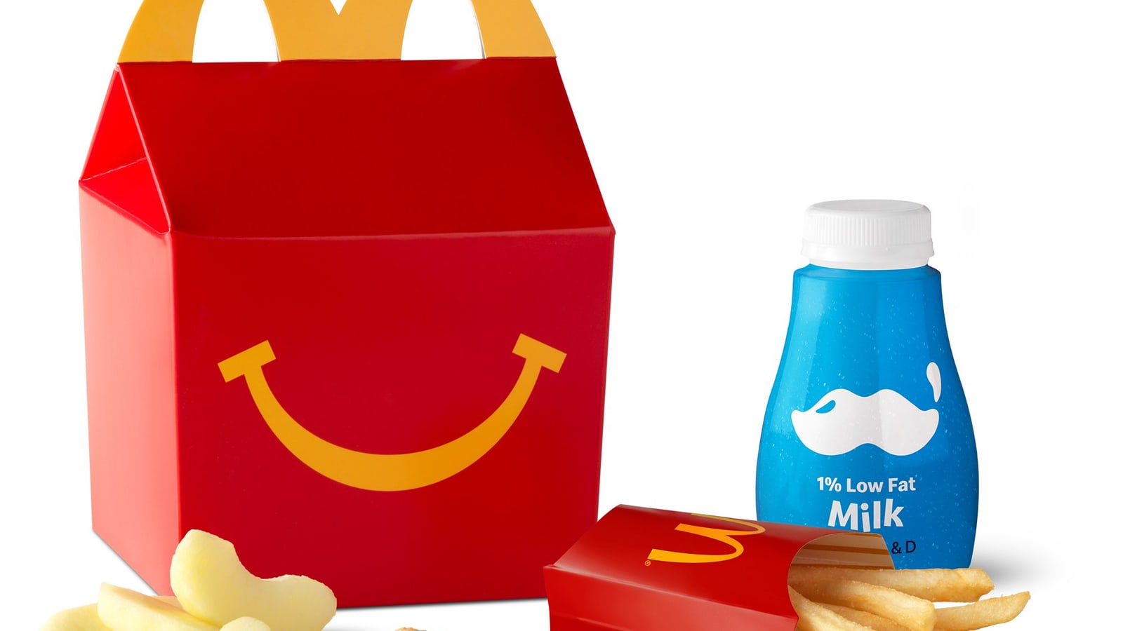
Happy Meal: the box carries the name
The smiling red box fills this detail of the official photograph. Follow the source to inspect the complete meal and handle shape. The visible box gives the named offer a distinct form even when the individual items are outside the crop.
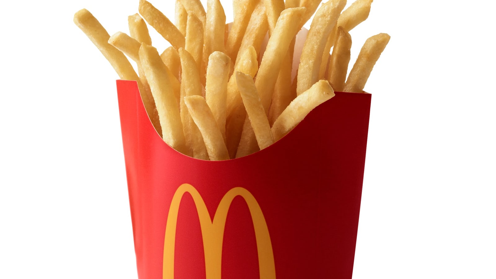
Fries: the container does a job
The photograph shows fries above a red carton with yellow arches; its base is outside this crop. McDonald's separately dates the red fry box to 1970 and describes fast filling and containment as its design aims. Those functional claims come from the linked history, not from this photograph.
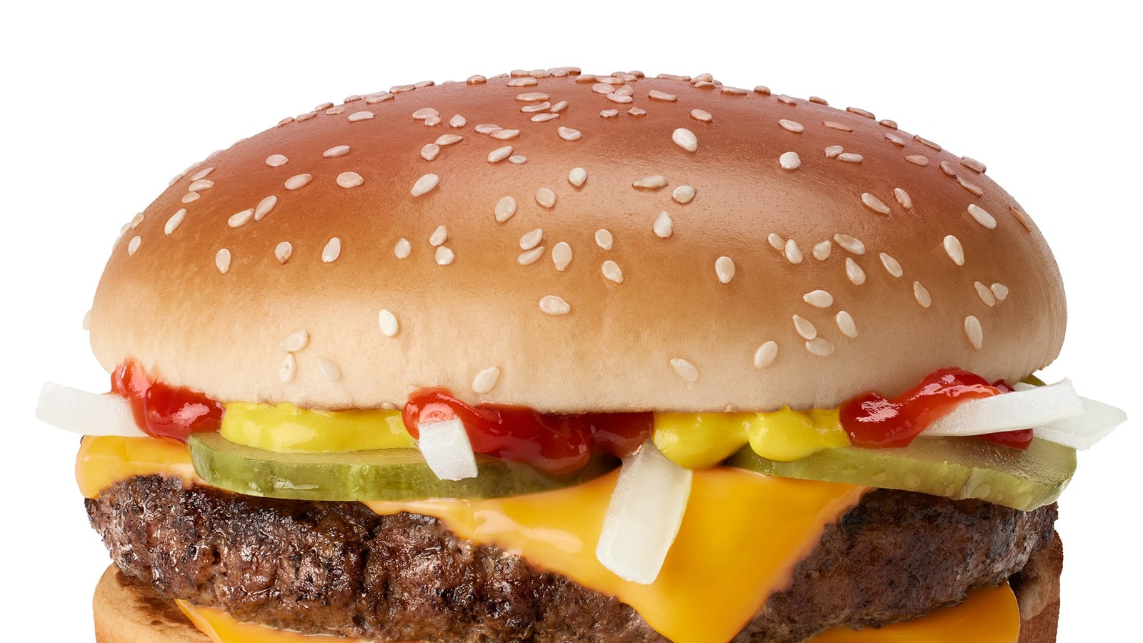
Quarter Pounder: show the actual product
The official photograph shows the burger outside its packaging. Compare the food itself with the named offer. Product imagery has to explain what someone will receive, even when the surrounding brand is already familiar.
What the colors show, and what they do not
Red and yellow appear together in the official fries photograph. This is an observation about a particular design, not evidence that red makes people hungry.
Compare the actual red carton and yellow symbol with the same shape in other colors. A recognition test can reveal whether the combination matters; the photograph alone cannot.
Start with the carton, package or product people will encounter. Ask people to identify the brand without being given its name. Record what they recognize and confuse before deciding to change the palette.
Apply the method to your own brand
- Pick one recognizable shape and test whether it still identifies your product at the sizes and places people actually see it.
- Give packaging a practical job as well as a recognizable appearance. Test handling and use alongside visual recall.
- Name an offer around a distinct buying choice, then make its contents easy to recognize.
- Copying red and yellow and assuming they will create the same recognition.
- Treating a photograph or an editorial score as evidence of consumer recall.
- Removing the name from a design before testing whether people can identify it.
Questions about the McDonald's example
Frequently asked questions
Where did the Golden Arches come from?
McDonald's company history traces the arches to its 1953 restaurant design. Its packaging history describes a later move from the building shape to crossed arches and then a connected M. The dated logo files above show selected stages.
Is the 1953–1960 image Speedee?
No. The image shown here is a red script wordmark, as the linked Wikimedia Commons record identifies it. Speedee was a separate character. A service-era date does not make this wordmark a picture of that character.
Does red make people hungry?
The sources on this page do not establish that claim. They show where McDonald's uses red and yellow. Consumer research would be needed to test appetite or recognition effects.
What can a smaller brand apply?
Choose a cue that belongs to your product, repeat it where customers buy or use it, and test whether people recognize it without prompting. Copying McDonald's colors is not the same exercise.
Need help with your own brand?
Use Private brand work when your name, identity, proof, or message needs a sharper branding decision.
Sources and further reading
Use the education shelf for the concepts behind this brand page.
Private brand workUse this when the decision belongs to your own brand.
All brandsReturn to every brand page.
- McDonald's packaging history, December 2020
- McDonald's company history
- McDonald's official fries photograph, May 2023
- McDonald's official Happy Meal photograph, May 2023
- McDonald's official Quarter Pounder photograph
- 1953–1960 / script wordmark source file
- 1961–1968 / crossed arches source file
- 1968–2006 / connected M source file
- Current standalone arches; source file dated 2006
.svg)