Shell · Grow Your Brand · Shell strategy case study · United Kingdom / active
Shell
Shell is trying to change the destination without losing the engine. The pecten can stretch from fuel forecourts to LNG, lubricants, power, and charging. The hard part is proving that the portfolio is changing as quickly as the language.
Positioning, name, and architecture.
Shell built recognition through a simple shell symbol, yellow and red retail surfaces, and a global service-station network. That system now has to carry two stories at once: today's hydrocarbon economics and tomorrow's lower-carbon offer.
A globally recognized retail and industrial system spanning fuels, LNG, lubricants, trading, power, and charging
Shell positions itself as an energy supplier that can fund and operate the transition. The proof has to appear in the portfolio, not only the promise.
The Shell name came from the seashells imported by Marcus Samuel's family business before the company entered oil trading.
Powering Progress
Branded house across industrial energy and consumer mobility
The pecten connects businesses with very different buying cycles, risks, and proof standards.
Makes performance visible at the pump.
premium fuel: premium road fuel source
Extends the forecourt into electric charging.
mobility service: EV charging source
Carries the transition and energy-security argument at infrastructure scale.
industrial energy: liquefied natural gas source
Transfers the masterbrand into industrial and consumer maintenance.
product portfolio: lubricants source
Naming and tagline progression
You can be sure of Shell
Let's go
Powering Progress
Market and scale snapshot.
Shell's 2025 results show the scale of the current engine: strong cash generation and profit still sit beside the long transition claim.
Consolidated 2025 revenue reported in the annual filing.
Income attributable to Shell plc shareholders in 2025.
Cash flow from operating activities in 2025.
Shell plc is the listed owner; net debt reported at the end of 2025.
Color system.
Yellow creates visibility at speed. Red adds urgency and ownership. Together they turn a road-side canopy into a brand beacon.
How the palette behaves
Shell yellow: visibility and optimism. forecourts and pecten field.
Shell red: energy and ownership. pecten outline and retail accents.
Deep navy: industrial authority. corporate and investor communication.
Recognition assets.
Few energy identities are as portable. The pecten works without the company name, but that strength also means every strategic contradiction lands on the same symbol.
Shape and color deliver recognition from a distance and at road speed.
Canopy, totem, pump, shop, and uniform repeat one navigation language.
Every future-facing claim sits beside the current oil, gas, and LNG engine.
Scores.
Recognition is exceptional. Transition proof is harder because the operating portfolio changes more slowly than campaigns, color, or public language.
The pecten is globally legible without a wordmark.
Reliable energy is clear; the transition pace is harder to read.
Forecourts and packaging repeat the same high-visibility system.
The masterbrand is strong, but the portfolio spans very different businesses.
The brand remains credible when new offers inherit the same availability, safety, and operating discipline as the legacy network.
Shell's 2025 results show the scale of the current engine: strong cash generation and profit still sit beside the long transition claim.
energy-transition pressure case
Shell plc is active. This is a transition-risk case, not a bankruptcy or shutdown case.
How the logo changed.
Shell did not abandon its core symbol. It removed detail until the pecten could do more work at smaller sizes and greater distances.

The first mark used a dark, literal mussel shell tied closely to the company name. source
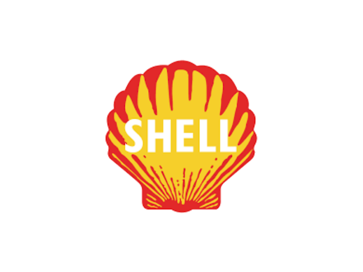
Red and yellow arrive, and the name sits directly inside the pecten. source


The warmer red and yellow pecten stands alone as the current masterbrand signal. source
Product and service lineage.
Shell's system expanded from imported kerosene and fuel distribution into an integrated portfolio that now has to accommodate power and charging.

LNG carries industrial-scale proof
Integrated gas links the transition story to long-lived infrastructure and global trade.

Charging extends the forecourt habit
Shell can reuse locations, navigation, and retail behavior while the energy source changes.
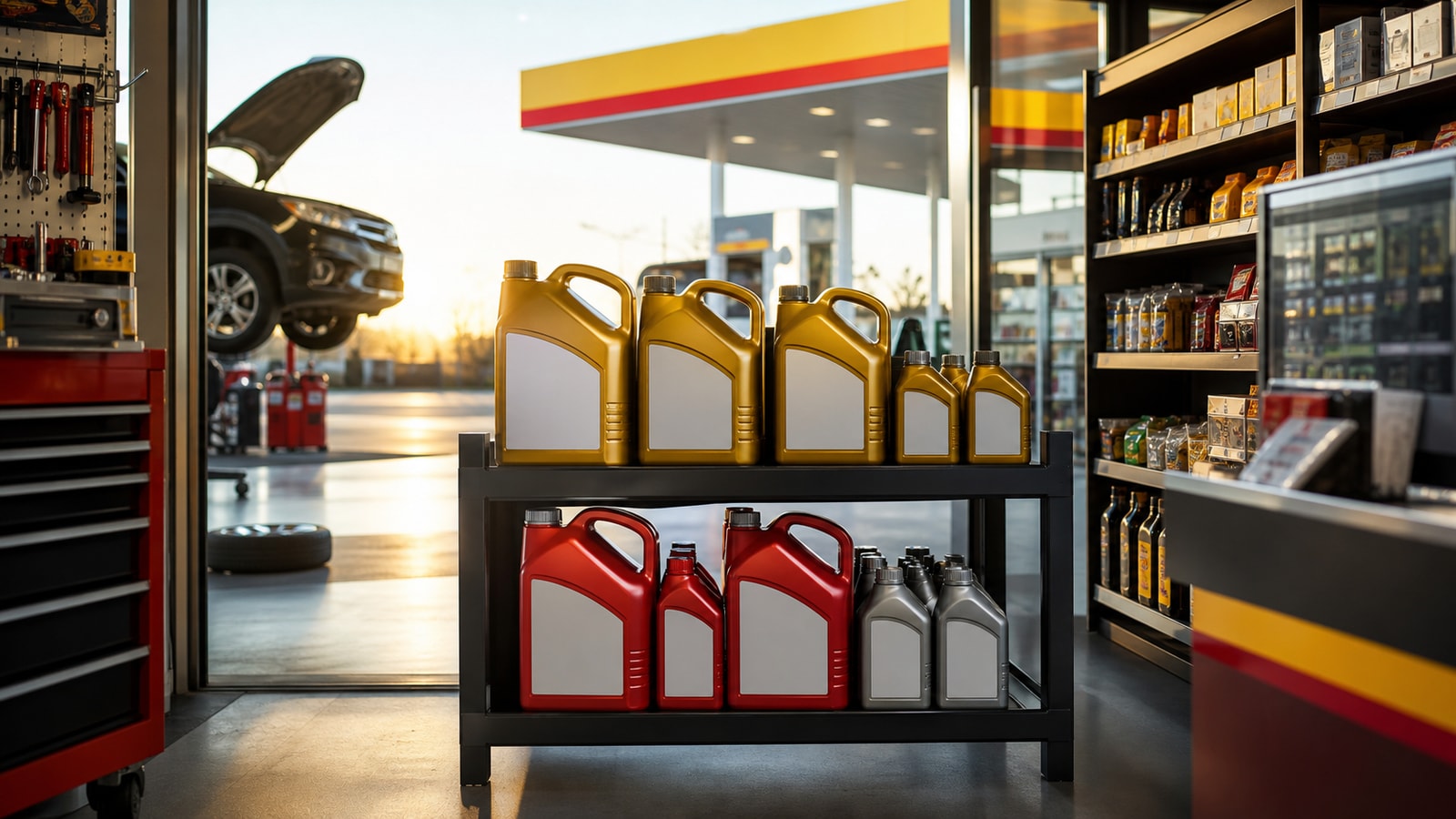
Retail makes the portfolio tangible
Drivers experience the brand through location, uptime, price, service, and product availability.
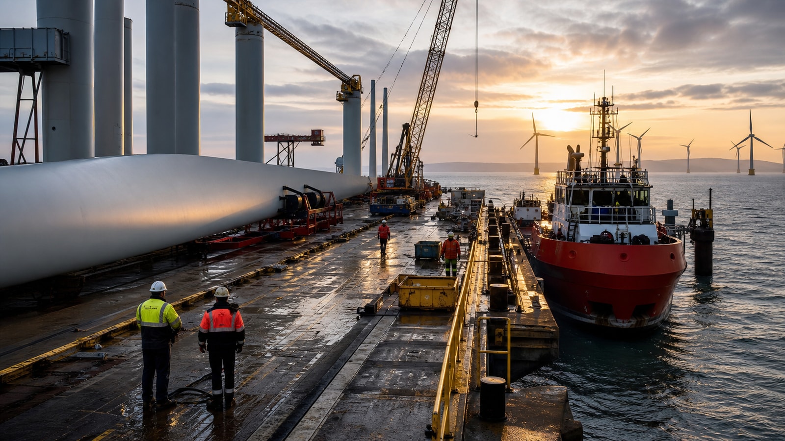
New energy still needs industrial proof
Wind, power, and lower-carbon assets must meet the same safety, uptime, and return standards as the legacy portfolio.
Product and service system
Supply and distribution created the original scale.
The pecten became a road-side navigation system.
The portfolio moved deeper into global infrastructure.
New mobility offers test whether recognition can transfer to a changing energy mix.
Turning points.
The key events are not a collapse timeline. They show how the symbol and portfolio were repeatedly simplified, expanded, and reinterpreted.
Where the strategy is under pressure
The transition promise must coexist with a large hydrocarbon portfolio and shareholder expectations for cash returns.
Shell prioritizes disciplined returns, LNG growth, upstream value, retail mobility, and selected lower-carbon investments.
The brand risk increases whenever public transition language moves faster than capital allocation, emissions performance, or customer-visible portfolio change.
Strategy timeline
Royal Dutch and Shell Transport combine operations.
Raymond Loewy simplifies the pecten.
The group simplifies its structure and becomes Shell plc.
Shell restates a disciplined integrated-energy strategy.
Public reaction.
Shell earns exceptional recognition and constant scrutiny. The same visibility that protects distribution makes inconsistencies easy to see.
The pecten can identify Shell without the wordmark.
Legacy earnings and transition claims are judged under the same highly visible mark.
Full timeline.
The Shell Transport and Trading Company is formed.
A literal mussel shell becomes the first recorded trademark.
The pecten adopts red and yellow.
Raymond Loewy delivers a cleaner pecten.
Shell introduces the warmer red and yellow colors used today.
Shell simplifies its share structure and changes its name to Shell plc.
Shell reports USD 42.86 billion in operating cash flow.
Steal / avoid.
- Build one symbol that works before the name.
- Turn physical locations into repeated navigation proof.
- Make future claims traceable to operating assets and capital.
- Do not confuse recognition with permission.
- Do not let transition language outrun visible portfolio change.
- Do not hide different business economics behind one broad word.
Short answer.
Shell is an active British integrated-energy company. Its brand advantage is the globally recognized pecten and yellow-red retail system. Its brand risk is strategic proof: customers and investors compare transition language with the oil, gas, LNG, retail, power, and charging portfolio that produces current results.
Frequently asked questions
Why is the Shell logo a shell?
The name came from the Samuel family's seashell trading business. The company turned that name into a literal symbol and gradually simplified it.
When did Shell remove its name from the logo?
Shell's simplified pecten became strong enough to stand alone in the 1990s; the current primary symbol does not need the wordmark.
Is Shell a failed brand?
No. Shell is active. This page treats Shell as an energy-transition pressure case, not a failed-company case.
Need help with your own brand?
Use Private brand work when your name, identity, proof, or message needs a sharper branding decision.