Brand System / Search / Internet Services / 1998 / 2015-present
Google Operating Layer Case
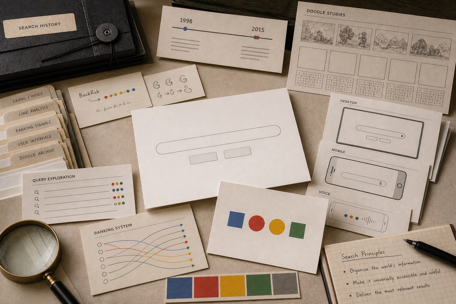
Google made search feel usable through a spare homepage, multicolor wordmark, Doodles, four-color G, dots, and an identity that could move from desktop search to phones, voice, apps, and small screens.

Short Answer
Google Operating Layer Case is a brand system case about Google in 1998 / 2015-present. The brand made a technical index read as approachable by giving it one clean surface and one repeatable color system. A utility brand gets stronger when the interface does not fight the job. Google records how a spare product surface can carry a playful identity without making the task read noisy.
Reader Task
What this entry should help you finish
Use this entry to finish four jobs: answer what happened to Google, see why it belongs in the brand system lane, inspect the decision consequence, and leave with the operator lesson. The point is not to remember the brand. The point is to know what decision, proof surface, or failure mode a team should check next. Then compare it with Android, Gemini, YouTube before turning the case into a rule.
What Google teaches
- Google says Larry Page and Sergey Brin built a Stanford search engine called BackRub, then renamed it Google.
- Google says the company was officially born after Andy Bechtolsheim wrote a $100,000 check in August 1998.
- Google says the first Doodle appeared in 1998, using the logo itself to tell visitors the staff was at Burning Man.
- Google Design says the 2015 identity kept the multicolor sequence while adding the logotype, dots, and Google G as a system.
- For operators, a technical product becomes easier to trust when the brand makes the main action easy to see.
Why This Brand Belongs In Grow Your Brand
Google belongs in Grow Your Brand because the page studies a specific brand decision, not a company profile. The decision sits in brand system and gives operators a way to see how operating layer changes commercial value.
The useful archive question is what changed in recognition, trust, demand, pricing power, category position, or public memory after the market saw the move.
The Brand Asset At Stake
The asset at stake is daily usage, uptime, distribution, account trust, partner tools, switching cost, and recovery when the service fails. That asset matters because it affects how people find, understand, choose, trust, or repeat the brand when the company is not in the room to explain itself.
For Google, the asset is not abstract equity. It has to show up in the buying surface, product surface, service route, source record, or repeated customer behavior.
What Changed
The brand made a technical index feel approachable by giving it one clean surface and one repeatable color system.
The change forced the market to decide whether the old shortcut still worked, whether the new proof was strong enough, and whether the brand had made the category easier or harder to understand.
What The Market Learned
The market learned to judge Google through the gap between the visible move and the proof behind it. talking about scale, innovation, or ecosystem reach while hiding the exact behavior people repeat is the weak reading this page is meant to prevent.
A useful brand decision makes buying, remembering, trusting, or repeating easier. A weak decision makes the audience do more work before it believes the claim.
Commercial Consequence
The commercial consequence sits in operating layer: daily usage, uptime, distribution, account trust, partner tools, switching cost, and recovery when the service fails. When that proof becomes easier to see, customers have more reason to choose, trust, repeat, or pay attention. When it becomes harder to see, the brand has to spend more money explaining what the market used to understand faster.
Google matters because the decision changed more than presentation. It changed buyer confidence, memory, category position, or repeat behavior in search / internet services. That is why the case belongs in a brand decision library instead of a general company profile.
What Another Brand Should Learn
Another brand should use this case before spending money on a similar move. Name the customer behavior, the proof surface, the protected cue, and the consequence that would make the decision worth the cost.
If the same proof does not exist in the business, copying Google would copy the surface while missing the reason the decision mattered.
The Decision Context
Search had a hard brand problem. The product value sat inside crawling, links, ranking, speed, and relevance. The user mostly wanted one thing: a box that returned a useful answer.
Google's brand advantage came from keeping that job visible. The white homepage, multicolor wordmark, Doodles, and later identity pieces gave the engine a public face without cluttering the search task.
The Early Signal Was Simplicity
Google says Page and Brin first built BackRub at Stanford, then renamed the search engine Google. The company says Google Inc. was officially born after Andy Bechtolsheim wrote a $100,000 check in August 1998.
That origin matters because the brand did not have to sell a portal, a media property, or a desktop full of features. It could make the search box the main object and let the wordmark carry the human signal.
The Color System Had To Travel
Google's own 2015 identity write-up describes the homepage as a multicolor logo above a single input field. The same piece says the new identity reduced the brand into three states: logotype, dots, and the Google G.
That change made sense because search no longer lived only on one desktop page. The color sequence had to work on phones, voice moments, product icons, browser tabs, and small screens without asking the user to relearn the brand each time.
The Signal Reading
Google belongs in Grow Your Brand because the brand made a vast index feel light enough to use every day.
For operators, the rule is useful. If the product is complex, make the main action brutally clear. Let the identity add memory around the action, not friction in front of it.
Where The Strategy Can Break
Google should not be read as a clean success label. The useful question is where the brand system promise can fail in the real category: users depend on the system to work in ordinary moments, not in brand campaigns.
The weak reading is talking about scale, innovation, or ecosystem reach while hiding the exact behavior people repeat. That kind of page sounds polished but gives the reader no way to judge the decision.
The concrete failure mode is this: the name becomes large but less useful because the user cannot tell which part of the system solves the problem. If the case cannot explain that risk, the brand story is not finished.
The Bad Example
A bad Google copycat would start with the visible surface: the mark, the color, the store, the app, the route, the campaign, or the public phrase. Then it would assume the surface created the result.
That is usually backwards. The surface worked only if the category proof underneath it was already strong enough: daily usage, uptime, distribution, account trust, partner tools, switching cost, and recovery when the service fails.
The page has to protect readers from that shortcut. The mistake is not ambition. The mistake is copying the artifact while leaving the constraint untouched.
What To Copy
Copy the discipline, not the costume. For Google, the discipline sits in the link between search / internet services pressure, customer behavior, and the proof a buyer or user can inspect.
A useful reader should be able to point to one behavior that changed, one risk that dropped, and one cue that helped the change stick.
If those three pieces are missing, the page should not pretend the case is a repeatable playbook. It is only a brand example with missing machinery.
The Proof Trail
Start with the year or period: 1998 / 2015-present. Then ask what was visible to the market at that time, what changed after the decision, and what evidence still exists now.
The source list gives the inspection trail. Use it to separate what Google says about itself from what the case page argues about the brand decision.
The proof should answer five checks: daily behavior, uptime or access, user control, switching cost, failure recovery. If the page cannot answer them, the case needs more source work before anyone treats it as a decision record.
The Decision Limit
The case should not be used as a slogan for doing the same thing. It should be used as a boundary test. The question is whether the same market pressure, customer behavior, proof surface, and timing exist before the decision gets copied.
Google gives Grow Your Brand a concrete inspection point: daily usage, uptime, distribution, account trust, partner tools, switching cost, and recovery when the service fails. If a team cannot point to that proof in its own business, the comparison is weak, even when the visible asset looks similar.
The better lesson is operational. Decide what must be true before the cue, campaign, name, product, route, or experience can carry the promise. Then decide which signal would stop the move if customers reject it, ignore it, or use it in the wrong way.
A serious reader should leave with a constraint, not a mood. For Google, the constraint sits in search / internet services: who is choosing, what risk they are managing, which proof they can inspect, and what would make the promise collapse under normal use.
The final check is the comparison set. Put Google beside two adjacent cases and ask what changed in each file: the cue, the behavior, the channel, the proof, the public language, or the operating burden. The answer keeps the case from becoming trivia.
This is where Grow Your Brand page earns its keep. It turns a brand story into a decision memo: what changed, who had to believe it, what proof reduced the risk, what failure would expose the gap, and which nearby cases warn against copying the surface too quickly.
Case Depth
Why This Case Matters
Google matters because it records how a technical utility can read approachable without making the interface noisy.
The case is useful for AI-era brands because the public memory still begins with a simple action: ask, search, find. The identity has to support that job before it decorates it.
Operator Misread
What Operators Usually Misunderstand
- The shallow reading is that Google is a playful color system. The practical reading is that play was allowed because the main product surface stayed brutally clear.
- Operators often add personality before protecting the task. Google shows the reverse order: reduce the task first, then let identity carry warmth around it.
Source-Backed Timeline
The Decision Timeline
- 1998 Google says the company was born after Andy Bechtolsheim wrote a $100,000 check, while the product kept the search action simple.
- 1998 The first Doodle used the logo as a living surface without changing the basic search job.
- 2015 Google Design described a system of logotype, dots, and the Google G for smaller screens and more contexts.
- Search-to-AI era The same brand now has to carry search, apps, voice, mobile interfaces, and AI-adjacent memory without cluttering the main action.
Compare Next
Related Cases
Do not read Google alone. Compare it against nearby cases: Android, Gemini, YouTube.
Sources
People Also Ask
What happened to Google?
Google Operating Layer Case is a brand system case about Google in 1998 / 2015-present. The brand made a technical index read as approachable by giving it one clean surface and one repeatable color system. A utility brand gets stronger when the interface does not fight the job. Google records how a spare product surface can carry a playful identity without making the task read noisy.
Why is Google a brand system case?
Google is filed as a brand system case because the visible consequence sits in that decision pattern. The brand made a technical index feel approachable by giving it one clean surface and one repeatable color system.
What can brands learn from Google?
A utility brand gets stronger when the interface does not fight the job. Google shows how a spare product surface can carry a playful identity without making the task feel noisy.
Is Google still operating?
Grow Your Brand marks Google as Active / continuing. That means the brand, company, platform, product system, or parent organization is still operating, continuing, or being actively resolved.
What should Google be compared with?
Compare Google with Android, Gemini, YouTube to see the same decision pattern from nearby cases.