Grow Your BrandBranding Guide2026-07-18
Grow Your BrandBrand pages, branding guides, and private brand work in separate lanes.

2026 case study · Godrej Industries

Godrej’s new GI mark passed launch. The internet found the similarity overnight.

Godrej Industries needed a corporate identifier after a major group restructuring. The April 2026 launch instead became a due-diligence case study when the new geometric mark drew immediate comparisons with an Australian agency identity. The lesson is not to accuse. It is to screen for resemblance before the public does.
22 April 2026 Godrej Industries Group unveiled the refreshed identity and GI corporate identifier.
₹5 lakh crore The identity launched beside a stated 2031 market-capitalization ambition.
Hard lesson Run global visual-similarity and public-perception checks before a high-stakes identity launch.
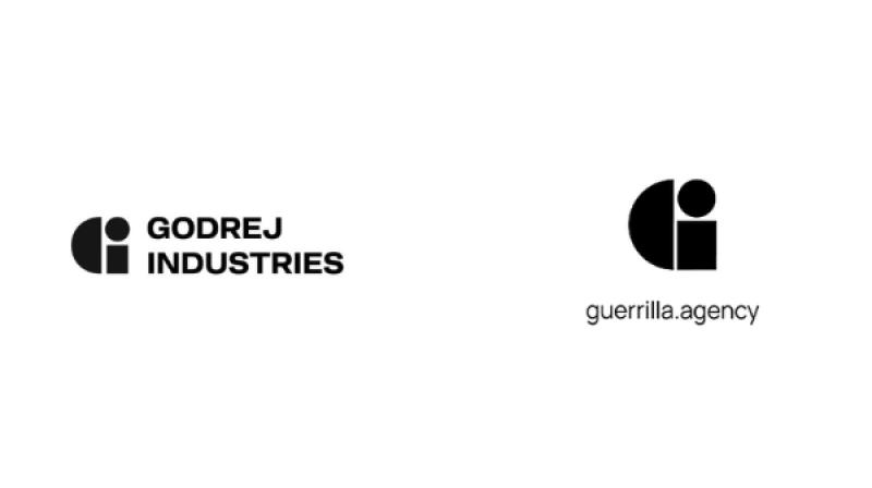
Editorial comparison of the 2026 Godrej Industries GI identifier and the existing Guerrilla agency mark, as published by Manifest Media.

Core failure

Legal clearance is not the same as visible distinctiveness.

The comparison became the story because the two geometric identifiers could be read as closely related before Godrej’s broader identity system had time to explain itself.
Godrej Industries Group's black geometric GI identifier beside its corporate wordmark.
Godrej said the GI mark was a corporate identifier designed to sit beside the established Godrej signature, not replace it on consumer products.
Visual proof

What the documented visuals add.

These source-backed assets do the teaching: cue, surface, comparison, and proof.
Side-by-side editorial comparison of Godrej Industries' GI identifier and Guerrilla agency's mark.
Public comparison Resemblance became the launch headline The public did not meet the strategy deck first. It met two simple geometric marks side by side.
Godrej Industries' 2026 GI identifier and corporate wordmark.
New identifier Godrej needed a group-level distinction The new mark had a real architecture job after the 2024 restructuring, but that job did not remove similarity risk.
Guerrilla agency's existing black geometric identity mark and wordmark.
Earlier mark A small agency already occupied the shape Search scope cannot stop with large competitors or the client’s category. The internet compares across borders and industries.
01

What happened.

The architecture problem was real. After the Godrej family’s 2024 restructuring created separate enterprise and industries groups, both retained the familiar Godrej signature and needed clearer corporate distinction.
Godrej launched a broader identity system. The April 2026 release introduced the GI identifier, GI Sans, a sonic identity, a signature fragrance, and the purpose line ‘Crafting tomorrow since 1897.’
The mark comparison outran the system story. Within a day, marketing and design coverage placed the new GI identifier beside Guerrilla agency’s existing geometric mark.
Godrej defended the work. The company said the in-house DISCO team created an original, legally sound corporate identifier and that resemblance among elementary geometric forms can occur.
That defense did not close the perception gap. A mark can be legally defensible and still create an avoidable distinctiveness problem for investors, partners, employees, and the design community.
02

The brand problem.

The failure was not the need for change. It was treating clearance as a legal gate when the launch also needed a visible-distinctiveness gate.

Search scope

Category checks were too narrow

A corporate mark can be compared with any memorable identity online, not only direct competitors.

Shape economy

Minimal geometry compresses difference

Semicircles, circles, and bars leave fewer distinctive choices, so spacing and construction carry more risk.

Architecture story

The identifier’s job needed context

If the public cannot see why a new mark exists, resemblance becomes easier to notice than strategy.

Launch sequence

The internet supplied the first frame

Comparison images circulated faster than Godrej’s explanation of the group structure and broader system.

Reputation load

A legacy name raises the standard

A 129-year-old group positioned around craft and tomorrow is judged against a higher originality expectation.

Response burden

Clarification started in debt

Once similarity is the headline, every defense sounds reactive even when the design process was independent.

03

The financial and strategic context.

This was not a cosmetic side project. The identity was attached to a large portfolio and an explicit growth ambition.

Signal
Public fact
Brand implication
Decision lesson
Portfolio reach
Godrej said its businesses serve more than 1.1 billion people globally.
Small identity confusion can travel across many audiences.
Scale the clearance process to the audience, not the design-team headcount.
Valuation
The group cited an aggregate valuation of about US$20 billion at 31 March 2026.
The mark sits beside substantial corporate value.
Treat visual originality as a governance issue, not a taste issue.
2031 ambition
The launch named a ₹5 lakh crore market-capitalization ambition.
The identity was meant to signal future growth.
Pressure-test whether the mark adds confidence or creates an avoidable side story.
Business breadth
The portfolio spans consumer products, real estate, financial services, agriculture, chemicals, and ventures.
A corporate identifier must work across very different proof surfaces.
Test the mark in investor, employer, partner, and operating contexts.
Identity investment
The system included custom type, sound, scent, and visual language.
The logo was only one component, but it became the shortcut for the entire program.
The weakest public cue can define perception of the whole system.
04

Use this before approving a new identity.

Approve when
  • The team has run reverse-image, trademark, design-database, and broad web searches across categories and countries.
  • Independent reviewers can explain what makes the mark visibly ownable without hearing the strategy first.
  • The identity architecture makes clear whether the mark replaces, endorses, or sits beside the existing name.
  • Comparison testing includes small agencies, products, apps, and symbols outside the immediate category.
  • A response plan names what evidence the company can show if similarity questions appear.
Hold when
  • Legal clearance is the only originality test.
  • The mark uses elementary geometry but depends on a long explanation to feel different.
  • The public launch precedes cross-market visual screening.
  • Leadership sees comparison risk as a design-team issue instead of a governance issue.
  • The broader identity system is being used to excuse a weak primary identifier.
05