Rebrand / Software / Operating Systems / 1975 / 2012-present
Microsoft Operating Layer Case
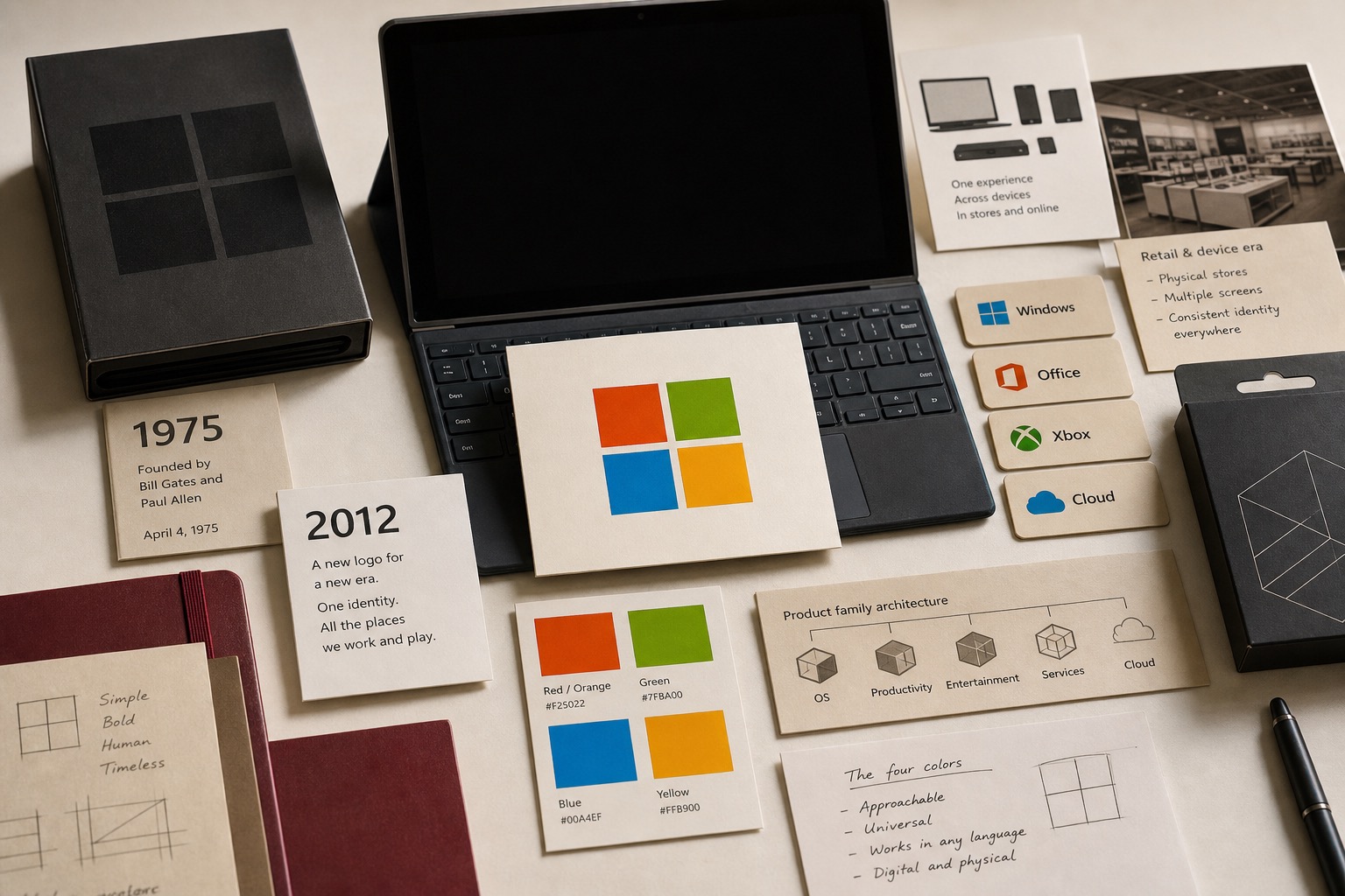
Microsoft used the 2012 logo to connect Windows 8, Windows Phone 8, Xbox services, Office, retail stores, PCs, phones, tablets, and TVs through one four-color parent signal.

Short Answer
Microsoft Operating Layer Case is a rebrand case about Microsoft in 1975 / 2012-present. The 2012 mark turned a company with many product doors into one readable parent signal. A software company gets easier to read when each product door points back to the same parent signal. Microsoft records how a logo can become routing, not decoration.
Reader Task
What this entry should help you finish
Use this entry to finish four jobs: answer what happened to Microsoft, see why it belongs in the rebrand lane, inspect the decision consequence, and leave with the operator lesson. The point is not to remember the brand. The point is to know what decision, proof surface, or failure mode a team should check next. Then compare it with Google, Android, IBM before turning the case into a rule.
What Microsoft teaches
- Microsoft Learn says Bill Gates and Paul Allen completed Altair BASIC and sold it to MITS in February 1975.
- The same Microsoft timeline says Gates used the name Micro-soft in a July 29, 1975 letter to Allen.
- Microsoft's 2012 logo post says the company had not updated its logo in 25 years.
- The same Microsoft post tied the change to Windows 8, Windows Phone 8, Xbox services, the next Office release, PCs, phones, tablets, TVs, stores, and ads.
- For operators, parent identity has to help people sort the product set before they choose a product.
Why This Brand Belongs In Grow Your Brand
Microsoft belongs in Grow Your Brand because the page studies a specific brand decision, not a company profile. The decision sits in rebrand and gives operators a way to see how operating layer changes commercial value.
The useful archive question is what changed in recognition, trust, demand, pricing power, category position, or public memory after the market saw the move.
The Brand Asset At Stake
The asset at stake is daily usage, uptime, distribution, account trust, partner tools, switching cost, and recovery when the service fails. That asset matters because it affects how people find, understand, choose, trust, or repeat the brand when the company is not in the room to explain itself.
For Microsoft, the asset is not abstract equity. It has to show up in the buying surface, product surface, service route, source record, or repeated customer behavior.
What Changed
The 2012 mark turned a company with many product doors into one readable parent signal.
The change forced the market to decide whether the old shortcut still worked, whether the new proof was strong enough, and whether the brand had made the category easier or harder to understand.
What The Market Learned
The market learned to judge Microsoft through the gap between the visible move and the proof behind it. talking about scale, innovation, or ecosystem reach while hiding the exact behavior people repeat is the weak reading this page is meant to prevent.
A useful brand decision makes buying, remembering, trusting, or repeating easier. A weak decision makes the audience do more work before it believes the claim.
Commercial Consequence
The commercial consequence sits in operating layer: daily usage, uptime, distribution, account trust, partner tools, switching cost, and recovery when the service fails. When that proof becomes easier to see, customers have more reason to choose, trust, repeat, or pay attention. When it becomes harder to see, the brand has to spend more money explaining what the market used to understand faster.
Microsoft matters because the decision changed more than presentation. It changed buyer confidence, memory, category position, or repeat behavior in software / operating systems. That is why the case belongs in a brand decision library instead of a general company profile.
What Another Brand Should Learn
Another brand should use this case before spending money on a similar move. Name the customer behavior, the proof surface, the protected cue, and the consequence that would make the decision worth the cost.
If the same proof does not exist in the business, copying Microsoft would copy the surface while missing the reason the decision mattered.
The Decision Context
Microsoft had a parent-brand problem that looked simple from the outside and hard from the inside. Windows, Office, Xbox, phones, stores, cloud services, and devices all had to feel connected without flattening each product into the same thing.
That made the 2012 logo more than a sign-off. It had to give customers a way to read the company before they picked a product door.
The Company Started With Software
Microsoft Learn says Gates and Allen completed Altair BASIC and sold it to MITS in February 1975. The same timeline says Gates used Micro-soft in a July 29 letter to Allen before the partnership name became official.
That origin matters because Microsoft did not start as a device brand or a media brand. Its public signal had to sit on top of software, partners, licenses, developers, stores, and later hardware.
The Four Squares Had To Sort The Product Set
Microsoft's 2012 post said it had been 25 years since the logo had been updated. The timing was attached to a wave of launches: Windows 8, Windows Phone 8, Xbox services, and the next Office release.
The useful part was the routing job. Microsoft said the symbol's colored squares were meant to express the product portfolio, while the Segoe wordmark connected the logo back to product and marketing use. The parent brand became a way to hold many surfaces in one view.
The Signal Reading
Microsoft belongs in Grow Your Brand because the mark was asked to carry a company that no longer lived only on the desktop.
For operators, the rule is plain. When the product set sprawls, the parent signal has to reduce sorting cost. Color, type, motion, retail, and product UI should help the user know whose system they are inside.
Where The Strategy Can Break
Microsoft should not be read as a clean success label. The useful question is where the rebrand promise can fail in the real category: users depend on the system to work in ordinary moments, not in brand campaigns.
The weak reading is talking about scale, innovation, or ecosystem reach while hiding the exact behavior people repeat. That kind of page sounds polished but gives the reader no way to judge the decision.
The concrete failure mode is this: the name becomes large but less useful because the user cannot tell which part of the system solves the problem. If the case cannot explain that risk, the brand story is not finished.
The Bad Example
A bad Microsoft copycat would start with the visible surface: the mark, the color, the store, the app, the route, the campaign, or the public phrase. Then it would assume the surface created the result.
That is usually backwards. The surface worked only if the category proof underneath it was already strong enough: daily usage, uptime, distribution, account trust, partner tools, switching cost, and recovery when the service fails.
The page has to protect readers from that shortcut. The mistake is not ambition. The mistake is copying the artifact while leaving the constraint untouched.
What To Copy
Copy the discipline, not the costume. For Microsoft, the discipline sits in the link between software / operating systems pressure, customer behavior, and the proof a buyer or user can inspect.
A useful reader should be able to point to one behavior that changed, one risk that dropped, and one cue that helped the change stick.
If those three pieces are missing, the page should not pretend the case is a repeatable playbook. It is only a brand example with missing machinery.
The Proof Trail
Start with the year or period: 1975 / 2012-present. Then ask what was visible to the market at that time, what changed after the decision, and what evidence still exists now.
The source list gives the inspection trail. Use it to separate what Microsoft says about itself from what the case page argues about the brand decision.
The proof should answer five checks: daily behavior, uptime or access, user control, switching cost, failure recovery. If the page cannot answer them, the case needs more source work before anyone treats it as a decision record.
The Decision Limit
The case should not be used as a slogan for doing the same thing. It should be used as a boundary test. The question is whether the same market pressure, customer behavior, proof surface, and timing exist before the decision gets copied.
Microsoft gives Grow Your Brand a concrete inspection point: daily usage, uptime, distribution, account trust, partner tools, switching cost, and recovery when the service fails. If a team cannot point to that proof in its own business, the comparison is weak, even when the visible asset looks similar.
The better lesson is operational. Decide what must be true before the cue, campaign, name, product, route, or experience can carry the promise. Then decide which signal would stop the move if customers reject it, ignore it, or use it in the wrong way.
A serious reader should leave with a constraint, not a mood. For Microsoft, the constraint sits in software / operating systems: who is choosing, what risk they are managing, which proof they can inspect, and what would make the promise collapse under normal use.
The final check is the comparison set. Put Microsoft beside two adjacent cases and ask what changed in each file: the cue, the behavior, the channel, the proof, the public language, or the operating burden. The answer keeps the case from becoming trivia.
This is where Grow Your Brand page earns its keep. It turns a brand story into a decision memo: what changed, who had to believe it, what proof reduced the risk, what failure would expose the gap, and which nearby cases warn against copying the surface too quickly.
Compare Next
Related Cases
Do not read Microsoft alone. Compare it against nearby cases: Google, Android, IBM.
Sources
.svg)
People Also Ask
What happened to Microsoft?
Microsoft Operating Layer Case is a rebrand case about Microsoft in 1975 / 2012-present. The 2012 mark turned a company with many product doors into one readable parent signal. A software company gets easier to read when each product door points back to the same parent signal. Microsoft records how a logo can become routing, not decoration.
Why is Microsoft a rebrand case?
Microsoft is filed as a rebrand case because the visible consequence sits in that decision pattern. The 2012 mark turned a company with many product doors into one readable parent signal.
What can brands learn from Microsoft?
A software company gets easier to read when each product door points back to the same parent signal. Microsoft shows how a logo can become routing, not decoration.
Is Microsoft still operating?
Grow Your Brand marks Microsoft as Active / continuing. That means the brand, company, platform, product system, or parent organization is still operating, continuing, or being actively resolved.
What should Microsoft be compared with?
Compare Microsoft with Google, Android, IBM to see the same decision pattern from nearby cases.