identify the real problem
Branding guide · original URL preserved
Should We Rebrand or Reposition?
Use this rebrand vs reposition decision tree to choose rebrand, reposition, refresh, proof repair, or stop before budget, agency work, and rollout risk move.
Direct AnswerReposition when the current name, mark, and memory still help but the buyer, category, offer, or comparison is wrong. Rebrand when the identity itself blocks the new position, carries damaged trust, creates search or category confusion, or cannot bridge the audience shift. Refresh when recognition still works and the system only needs cleaner execution. Repair proof when the promise, product, service, offer, or sales path is the weak part. Stop when the team cannot name the business problem, the recognition asset to protect, the proof that will change, and the rollback condition.
Read the verdict before the deck.The five possible verdicts.
The question is not design first. It is problem reading.A company can feel stale for five different reasons. Only one of them requires a full rebrand. The first job is to name which layer is actually broken.
Should We Rebrand Or Reposition
decision · proof · use
01
Direct Answer
Direct AnswerReposition when the current name, mark, and memory still help but the buyer, category, offer, or comparison is wrong. Rebrand when the identity itself blocks the new position, carries damaged trust, creates search or category confusion, or cannot bridge the audience shift. Refresh when recognition still works and the system only needs cleaner execution. Repair proof when the promise, product, service, offer, or sales path is the weak part. Stop when the team cannot name the business problem, the recognition asset to protect, the proof that will change, and the rollback condition.
02
Read the verdict before the deck.
Read the verdict before the deck.The five possible verdicts.
Evidence 2Separate identity, position, proof, and execution.
Evidence 3Use the questions before budget moves.
Evidence 4Old Spice, Airbnb, Domino's, Gap, X, and JCPenney.
Evidence 5Move from opinion to written approval.
03
The question is not design first. It is problem reading.
The question is not design first. It is problem reading.A company can feel stale for five different reasons. Only one of them requires a full rebrand. The first job is to name which layer is actually broken.
Evidence 2If the business still earns trust under the current name and people can still find, refer, and recognize it, do not throw away that memory to solve a positioning problem. Change the buyer frame, category language, offer hierarchy, proof, page, sales deck, or distribution story first.
Evidence 3If the identity points to the wrong business, carries public damage, confuses search, blocks a merger or market shift, or makes the new promise unbelievable on contact, repositioning alone will underperform. The old signal will keep pulling the market back to the old reading.
Evidence 4If the logo, colors, type, page system, or templates are messy but the category, buyer, and reputation are still correct, the answer is a refresh. If the promise sounds better than the operation, the answer is proof repair before any new story ships.
Evidence 5A useful decision names the verdict before the agency deck. The verdict should be one of five: keep the brand and reposition, refresh the system, rebrand, repair proof, or stop.
Evidence 6These files show the decision fork under pressure. The right lesson is the mechanism, not the surface style.
Old Spice repositioning worked because buyer, voice, product, and channel moved together
Airbnb identity carried a broader marketplace position and needed trust proof around it
Domino's product proof changed before the story asked for belief
Gap a visual rebrand did not solve the category and product problem underneath
X a name change carried search, language, and public habit cost
JCPenney repositioning broke a trained value habit before a new one was trusted
04
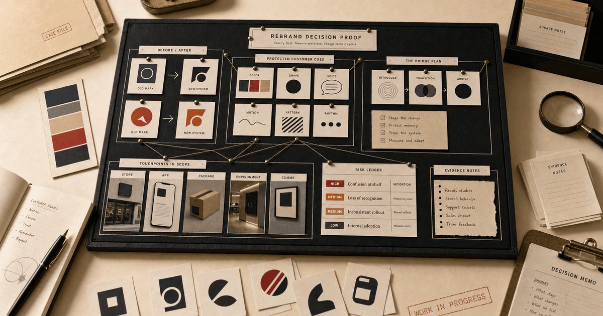
Use the five-verdict decision tree.
Use the five-verdict decision tree.Do not ask whether the new brand looks better. Ask which business problem exists and which lever can actually fix it.
Evidence 2Choose reposition when the name, mark, reputation, search footprint, and customer memory still help, but the buyer, category, offer, comparison, or sales story is wrong.
Evidence 3Write the old position, the new position, the buyer behavior that must change, and the bridge that protects current recognition.
Evidence 4Choose refresh when the market already understands the brand and the problem is execution: dated visuals, loose guidelines, weak templates, poor page hierarchy, or inconsistent proof display.
Evidence 5List the recognition cues that stay untouched and the surfaces that will be cleaned.
Evidence 6Choose rebrand when the current identity blocks the next business: wrong category, wrong audience, merger logic, trust damage, name confusion, legal constraint, or a signal that cannot carry the new position.
Evidence 7Name the specific identity asset that is causing drag and the replacement cue that will bridge memory.
Evidence 8Choose proof repair when the story is ahead of the product, service, offer, reviews, operations, delivery, pricing, or sales path. A new identity will make the promise easier to attack.
Evidence 9Name the operating proof that must change before the market is asked to believe the new claim.
Evidence 10Stop when leadership cannot name the business problem, the protected recognition asset, the customer risk, the search and AI migration plan, and the rollback condition.
Evidence 11No written problem, no protected cue, no test, no rollback means no approval.
Evidence 12If the name, category, or public language changes, old pages, reviews, snippets, articles, directories, social handles, and AI summaries will keep retrieving the old frame.
Evidence 13Map old queries, new queries, redirect targets, third-party profiles, entity names, and answer-engine files before launch.
Evidence 14Define the number that lets someone pause or reverse the change if recognition, qualified leads, branded search, conversion, sales, or trust drops.
Evidence 15Use a specific threshold, date, owner, and reversal action.
Verdict 4: Repair proof first
05
The expensive mistake is approving the surface before the proof.
The expensive mistake is approving the surface before the proof.A decision page has to prevent a bad approval, not merely define a term.
Evidence 2The weak version starts with a familiar sentence: the logo feels old, the website looks tired, the name sounds generic, the message feels flat, or AI describes the brand like everybody else. Those may be real symptoms. They are not yet a decision reason.
Evidence 3The useful move is to name the broken layer. Is the customer unable to recognize the brand, trust the proof, understand the offer, repeat the name, cite the source, or take the next action? Each answer points to a different repair.
Evidence 4Do not let the team buy a new surface while the old constraint stays untouched. If the problem is proof, the work is proof. If the problem is retrieval, the work is source and category clarity. If the problem is recognition, the work is protecting the cue before changing it.
Evidence 5The stop rule should be written before the spend moves: what signal pauses the project, who owns the decision, and what happens if the change makes branded search, qualified leads, trust, or buyer comprehension worse?
Evidence 6Old Spice, Airbnb, Domino's, Gap, X show why the same surface move can mean different things under different constraints.
Old Spice repositioning worked because buyer, voice, product, and channel moved together
Airbnb identity carried a broader marketplace position and needed trust proof around it
Domino's product proof changed before the story asked for belief
Gap a visual rebrand did not solve the category and product problem underneath
X a name change carried search, language, and public habit cost
JCPenney repositioning broke a trained value habit before a new one was trusted
06
Move from this check into the written decision.
Should We Rebrand? : check whether the identity is the real problem.
Brand Refresh vs Rebrand : separate cleanup from a memory reset.
Brand decision memo template : turn the verdict into approval language.
07
Should We Rebrand or Reposition? FAQ
Should We Rebrand or Reposition? FAQReposition if the current identity still helps and the buyer, category, offer, or comparison is wrong. Rebrand if the identity itself blocks the new position, carries damaged trust, creates category confusion, or cannot bridge the audience shift.
Evidence 2Rebranding changes the signal: name, mark, voice, identity system, or public cue. Repositioning changes how the market places the brand against alternatives, often while preserving the name and recognition assets.
Evidence 3Repositioning is enough when customers still recognize and trust the brand, but the company needs a sharper buyer, category frame, offer hierarchy, proof story, or competitive comparison.
Evidence 4A reposition needs a rebrand when the current identity makes the new position unbelievable, confusing, legally risky, search-hostile, or attached to damage the business cannot credibly bridge.
Evidence 5Refresh when the recognition system works and the problem is execution: cleaner visuals, stronger guidelines, clearer pages, better proof display, or more consistent messaging.
Evidence 6Bad reasons include founder boredom, trend pressure, copying a competitor, weak website conversion, vague modernization, or using a new logo to avoid fixing proof, offer, product, or sales problems.
Evidence 7Decide the business problem, protected recognition cue, new proof, search and AI migration plan, test surface, rollout owner, budget risk, and rollback condition before approving the work.
Should we rebrand or reposition?
What is the difference between rebranding and repositioning?
When is repositioning enough?
When does a reposition need a rebrand?
Should we refresh instead of rebrand?
What is a bad reason to rebrand?
What should we decide before a rebrand?
08