The Home Depot · Grow Your Brand · Retail Help cue · Project Helper, Warehouse System, Color Memory, Operational Trust
The Home Depot
The Home Depot turns orange into project help. A Home Depot brand page on the orange apron, warehouse scale, project confidence, associate help, fiscal 2025 sales, logo continuity, and the lesson: color works when customers know what help it points to.
Positioning, name, and architecture.
Three evidence checks every brand page needs before the page talks about scale, color, or public reaction.
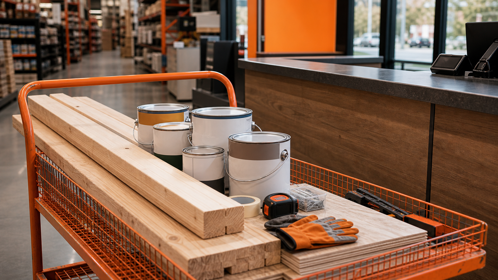
The orange apron makes help visible inside warehouse scale.
The Home Depot positions home improvement as a large project system made findable.
For: Homeowners, pros, and project buyers who need large selection to feel navigable, affordable, and supported.
Judged against: Home improvement retailers judged against Lowe’s, Menards, Ace Hardware, local lumberyards, Amazon, Walmart, and specialty suppliers.
- Large-format selection gives the customer many project options.
- Associate help and project language reduce intimidation.
- Orange appears on aprons, signage, carts, services, digital surfaces, and delivery/pickup behavior.
The name combines home with depot: a practical place to get project supplies.
Public brand cue: How doers get more done
Name type: descriptive / place
- 1978: The Home Depot name frames the store as a project supply base.
- 1989: Orange stencil identity becomes more standardized.
- Current: Doer language keeps the brand focused on project action.
branded house with service and pro extensions
The master orange system leads retail, pro, rental, service, and private-label surfaces.
Parent: The Home Depot, Inc.
- The Home Depot Pro
- Tool Rental
- Home Services
- Husky
- HDX
- Hampton Bay
- Lifeproof
Market and scale snapshot.
The brand is bigger than an orange square. It is a store operating system: scale, assortment, help, and project routing.
Fiscal 2025 net sales.
Fiscal 2025 net earnings.
The Home Depot fiscal 2025 Form 10-K period.
NYSE-listed The Home Depot, Inc.
Color system.
Home Depot orange is valuable because it points to a person, aisle, cart, project, or next step.
Recognition assets.
Memory pieces the brand can use before someone finishes a sentence.
Orange apron
The color points to a person who can help.
Warehouse scale
The store feels useful when scale is organized by project.
Project route
Selection, advice, price, and pickup all have to connect.
Scores.
Use these scores to compare recognition, trust, proof, pressure, and risk at a glance.
Orange and stencil mark are immediate retail cues.
Strong when help and availability are visible.
The brand wins when shoppers find the next step.
Thin staffing weakens the color cue.
Name, ticker, category, and route are clear.
How the logo changed.
The mark has to keep recognition intact while the brand adapts to new products, places, and screens.
Product / service lineage.
The Home Depot turns retail scale into project confidence through orange, associates, aisles, pro services, rental, pickup, and private-label proof.


1978
The Home Depot starts as a home-improvement warehouse concept.
Brand impact: Format cue.
1980s
Orange stencil identity and apron behavior make help visible at store scale.
Brand impact: Recognition behavior.
2000s
Pro, services, rental, and digital ordering expand the project route.
Brand impact: Operating system.
2025
Fiscal 2025 net sales reach USD 164.683B.
Brand impact: Scale proof.
Event board.
Home Depot pressure appears when scale stops feeling helpful.
Store navigation
If aisles, signage, and associate help fail, the warehouse becomes friction.
Impact: Usability risk.
Pro versus homeowner
The same orange system has to serve weekend projects and professional purchasing.
Impact: Audience stretch.
Digital pickup
Online orders still need store-level handoff proof.
Impact: Channel proof.
Public reaction.
Customers judge Home Depot by whether a difficult project becomes clearer.
The orange apron is powerful when shoppers feel helped.
If no one can help, the orange cue loses its meaning.
Full timeline.
Steal / avoid.
- Make color point to a useful behavior people can find in the real world.
- Put the strongest brand cue on the person who solves the customer problem.
- Turn scale into help rather than inventory alone.
- Do not treat a famous color as brand equity if staffing and navigation do not support it.
- Do not make the store feel bigger than the customer project.
- Do not separate the brand promise from the employee behavior that proves it.
Short answer.
The Home Depot branding case is bigger than the orange square. The orange apron, warehouse layout, project language, carts, services, and pickup route make help easier to find.
Why is Home Depot orange effective?
Because it points to help, project action, and store navigation rather than decoration alone.
How does the orange apron support the store promise?
It puts the help cue on the associate customers can ask before the warehouse scale becomes confusing.
What should another brand steal from The Home Depot?
Make color point to a useful behavior people can find in the real world.
Need help with your own brand?
Use Private brand work when your name, identity, proof, or message needs a sharper branding decision.
Sources.
Related Grow Your Brand page
Related Grow Your Brand page
Related Grow Your Brand page
The Home Depot 2025 Form 10-K · The Home Depot, About Us · The Home Depot, Timeline and History · The Home Depot, Our Values · 1000logos, Home Depot logo history images · Wikimedia Commons, TheHomeDepot logo file