HSBC · Grow Your Brand · Global Bank / Cross-border Trust · United Kingdom / Hong Kong roots / active
HSBC
HSBC: the hexagon turns cross-border banking into a single recognition system. A brand page for HSBC: the red-white hexagon, Hong Kong and Shanghai origin, London parent structure, four-business architecture, sourced FY2025 finance, and the pressure of making a global bank feel clear in local markets.
Positioning, name, and architecture.
Three evidence checks before the page talks about scale, color, or public reaction.
A Hong Kong and Shanghai origin story joined to a London-listed parent and a red-white mark that can travel across markets.
HSBC positions banking as cross-border access: one public mark, many regulated local surfaces, and a promise that must stay clear through branches, cards, apps, wealth, and corporate banking.
HSBC comes from The Hongkong and Shanghai Banking Corporation. The initials keep the origin while making the name portable.
Opening up a world of opportunity
masterbrand with regulated local entities and specialist businesses
The HSBC mark leads, but trust is carried by local banks, product lines, and regulated entities. Hang Seng must be treated as part of the Hong Kong architecture, not as a campaign.
Market and scale snapshot.
Use only sourced, stable owner and category facts. Do not invent valuation when the brand does not publish a clean public number.
FY2025 reported revenue in HSBC Annual Report and Accounts 2025.
FY2025 profit before tax; profit after tax was USD 23.131b.
The card uses annual-report finance and listing identifiers, not an unsourced live valuation.
LSE HSBA, HKEX 5, NYSE ADS HSBC; ordinary-share ISIN GB0005405286.
Color system.
Red should work as a bank-recognition cue, not as a full-page flood.
Red creates a fast visual hit in a conservative banking category.
White gives the symbol its cross shape and keeps the system clean enough for finance.
Black and grey keep the red mark from making the page feel promotional.
The palette works only when the mark is attached to a clear product, market, or regulated entity.
Recognition assets.
Memory pieces the brand can use before someone finishes a sentence.
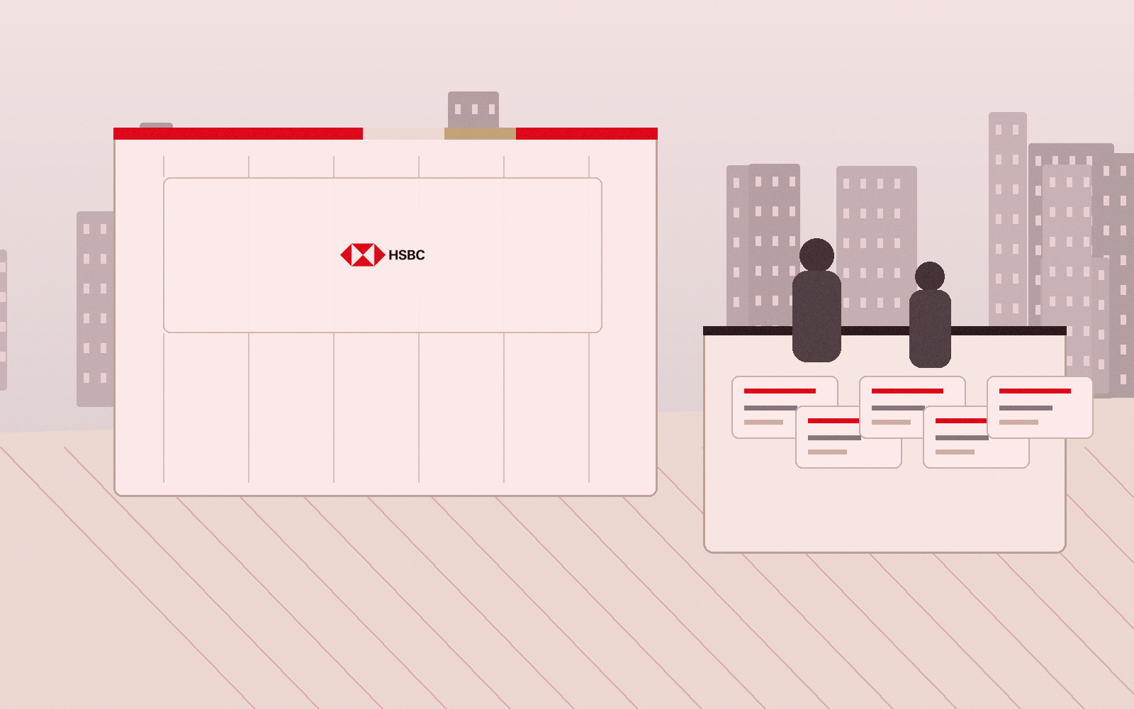
The symbol can carry recognition in a branch window, card corner, app tile, or airport corridor.
Hong Kong and Shanghai are not decoration. They explain why the brand is judged through cross-border access.
A global mark fails when the legal entity, branch, support path, or wealth lane is unclear.
Scores.
Use these scores to compare recognition, trust, proof, pressure, and risk.
The hexagon and initials are globally legible.
The FY2025 four-business structure helps, but local-entity complexity remains.
Bank trust has to survive regulation, risk, and service recovery.
The red-white symbol is simple and hard to miss.
Branches, cards, apps, wealth offices, and corporate banking all need to prove the same mark.
The public brand, parent company, listings, and business lines can be stated cleanly.
A global bank has many legal and product lanes that can confuse readers.
A portable acronym and symbol can keep a complex business searchable.
How the logo changed.
Use source-backed logo evidence only; the page does not invent old marks.
HSBC adopted the unified brand and red-white hexagon globally in 1998; this card uses the verified 2018 source file on a fixed canvas.
The current mark is used as a controlled source canvas rather than a generated or redrawn logo. source
Product and service lineage.
For HSBC, product proof is a system of local and cross-border banking surfaces.
The mark has to travel
HSBC needs one mark to work across Hong Kong, London, Shanghai, cards, apps, wealth offices, and corporate banking.
Local service carries global trust
The customer does not meet a holding company. They meet a branch, card, app, adviser, or support path.

Architecture needs labels
Hong Kong, UK, institutional banking, and wealth should be separated clearly so the brand is not one vague entity.
Turning points.
Events that changed what buyers could see, buy, repeat, or trust.
Hong Kong and Shanghai explain the brand, but the page has to show today's parent and business structure.
It gives a complex bank one public recognition cue.
A bank brand loses trust when regulated entities and product lanes are squeezed together.
Different buyer jobs need different proof, even under one mark.
Public reaction.
The useful reaction is about trust and pressure, not sentiment counts.
The public judges HSBC through account access, risk news, branch service, app reliability, and cross-border usefulness.
The more global the bank becomes, the more the page has to label what belongs where.
The weak point is not recognition. It is whether every surface explains the bank cleanly.
Full timeline.
Founded in Hong Kong and Shanghai.
Expansion reaches seven countries across Asia, Europe, and North America.
The Shanghai Bund office opens; Stephen and Stitt become visible HSBC memory assets.
Hang Seng Bank joins the group after HSBC takes a majority stake.
Midland Bank acquisition changes the parent structure and London role.
The unified HSBC brand and hexagon are adopted globally.
FY2025 reporting uses four businesses and USD 68.274b reported revenue.
Steal / avoid.
- Use one symbol to simplify a complex service system.
- Keep origin visible without letting it confuse current headquarters and parent structure.
- Label business lanes plainly when the company is regulated and global.
- Let source-backed financial terms sit inside a fixed comparable finance card.
- Do not call HSBC Hong Kong-headquartered today.
- Do not use old business division names as current architecture.
- Do not call profit after tax net profit without checking the official label.
- Do not invent ESG leadership or logo meaning beyond the official sources.
Short answer.
HSBC is useful as a brand lesson because the red-white hexagon makes a complex global bank easier to recognize. The hard part is not the mark. The hard part is keeping the London parent, Hong Kong and Shanghai origin, local entities, wealth lane, institutional lane, and official financial labels clear enough that the brand does not flatten into one vague bank.
The red-white hexagon and HSBC initials. They make the bank recognizable across branches, cards, apps, airports, and corporate banking surfaces.
Use a simple portable mark to make a complex service system easier to find and explain.
Do not copy global scale language if the reader cannot understand the parent, local entity, product lane, and source-backed proof.
Need help with your own brand?
Use Private brand work when your name, identity, proof, or message needs a sharper branding decision.
.svg)