Standard Chartered · Grow Your Brand · Cross-border Bank / Network Promise · United Kingdom / active
Standard Chartered
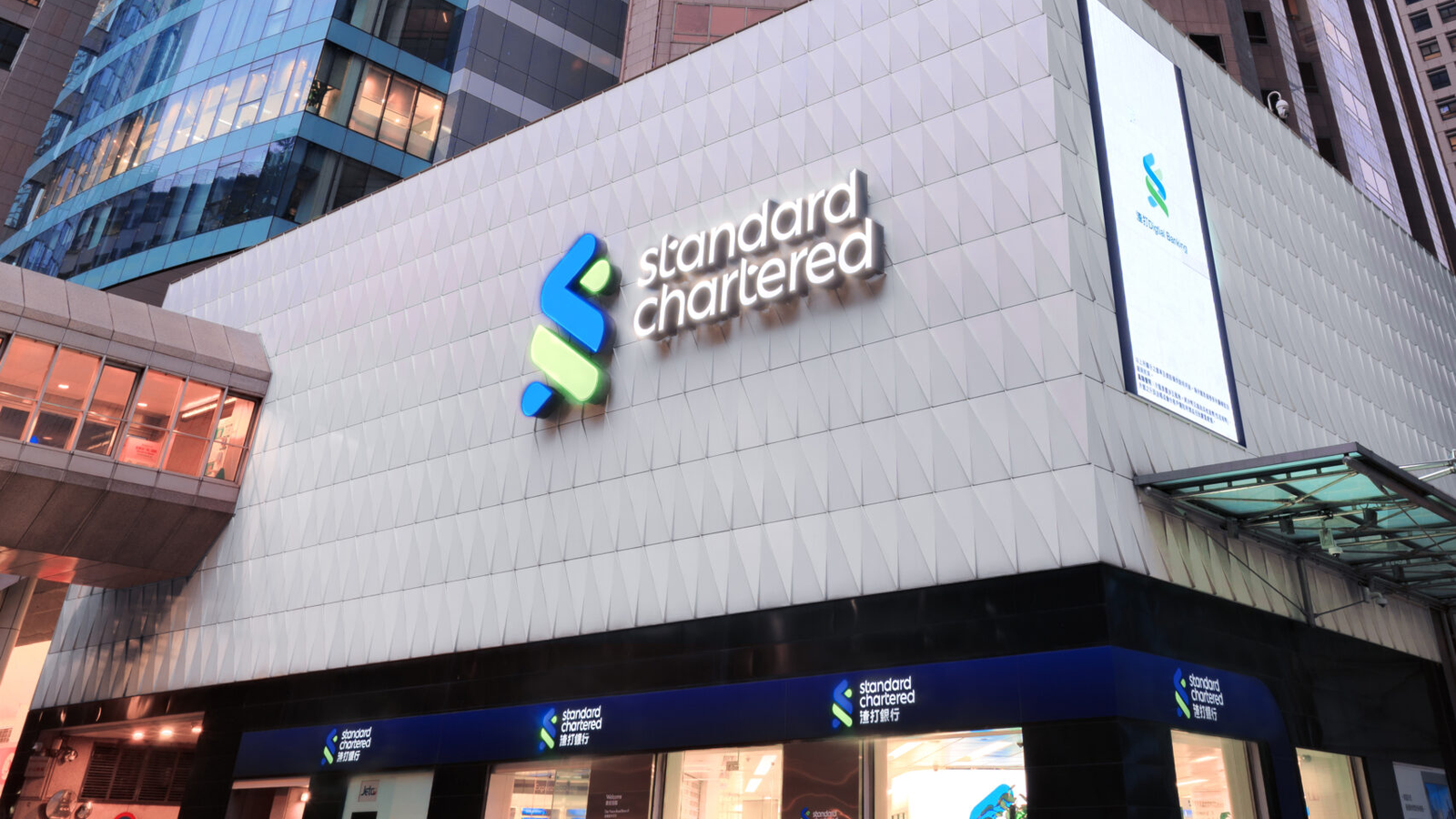
Standard Chartered: the blue-green mark turns cross-border banking into a network promise. A brand page for Standard Chartered: the blue-green SC mark, London parent, Asia Africa Middle East footprint, Here for good promise, sourced FY2025 finance, and the need to keep wealth, retail, and corporate banking lanes readable.
Positioning, name, and architecture.
Three evidence checks before the page talks about scale, color, or public reaction.
A London parent with deep Asia, Africa, and Middle East network cues and a blue-green mark protected across the system.
Standard Chartered positions banking as cross-border connection: network access, wealth expertise, and institutional service carried by one blue-green mark.
The name combines the Standard Bank and Chartered Bank histories after their 1969 merger.
Here for good
branded house with client segments and venture brands
The SC mark leads, but the page should label client segments and venture brands so the system does not become one vague international bank.
client segment
institutional and cross-border finance lane trade, markets, and capital access
client segment
affluent, retail, and advisory lane international banking
innovation lane
digital venture and platform proof SC Ventures
geographic lane
Asia, Africa, and Middle East place proof 54-location network
Market and scale snapshot.
Use only sourced, stable owner and category facts. Do not invent valuation when the brand does not publish a clean public number.
FY2025 reported operating income in Standard Chartered annual report summary.
FY2025 reported profit before tax; profit for the period was USD 5.097b.
The card uses annual-report finance and listing identifiers, not a live valuation.
LSE STAN and Hong Kong 02888; ISIN GB0004082847.
Color system.
Blue and green should make the network memorable without turning finance into soft purpose language.
Blue keeps the bank credible.
Green gives the mark a growth and network cue.
White space prevents the two-color system from becoming busy.
The palette works when service and geography are named clearly.
Recognition assets.
Memory pieces the brand can use before someone finishes a sentence.
Blue and green make the mark distinct in a category that often defaults to blue alone.
Here for good is useful only when tied to real client segments and markets.
The page has to show what the bank connects, not only that it is global.
Scores.
Use these scores to compare recognition, trust, proof, pressure, and risk.
The blue-green SC mark is distinctive.
Institutional age and network scale help.
The bank has a clear international banking story.
Affluent and private banking lanes are visible.
Digital and venture claims need specific surfaces.
Parent, ticker, and client segments are clear.
The long history helps only if current markets are clear.
Bank reputation claims require careful sourcing.
How the logo changed.
Use the verified current mark once, then explain the recognition system without pretending there is a dated logo progression.
The current mark is used from an official or verified source on a fixed canvas, not redrawn. source

Standard Chartered recognition also depends on office, market, and cross-border service surfaces. No historical logo progression is claimed without dated source assets. source
Product and service lineage.
For Standard Chartered, service proof is cross-border corporate banking plus affluent wealth access.
Network is the product
The brand should show markets, payments, trade, capital, and client access rather than generic global reach.
System scale needs place proof
Singapore office proof shows regional scale and keeps the system lane distinct from the London hero.

Office proof keeps the network visible
Cross-border banking needs visible market locations, not just a global promise.

Growth-market proof needs place
The blue-green mark works harder when the page shows specific markets and service settings.
Turning points.
Events that changed what buyers could see, buy, repeat, or trust.
The promise should be treated as a brand line, not proof by itself.
Corporate and Investment Banking plus Wealth and Retail Banking give readers a cleaner map.
The brand works when it shows what it connects.
Footprint language needs annual-report support.
Public reaction.
The useful reaction is about trust and pressure, not sentiment counts.
Corporate clients and affluent clients need different proof from the same mark.
Here for good has to be backed by products, markets, and risk discipline.
The blue-green symbol is simple; the bank architecture is what needs explanation.
Full timeline.
Chartered Bank is founded. The name starts with trade-route banking.
Standard Bank is founded. The second name root adds another international banking line.
Standard Bank and Chartered Bank merge. The current parent name becomes a merged institutional signal.
Standard Chartered expands after the Grindlays acquisition period. The bank deepens Asia and emerging-market scale before the modern network promise.
Here for good becomes the public positioning line. Purpose copy raises proof pressure for a regulated bank.
The bank organizes around cross-border corporate and client lanes. The page must label client segments instead of saying global reach.
Standard Chartered reports USD 20.942b operating income. Scale proof supports the network story without live market cap.
Chartered Bank is founded in London.
The bank begins client operations in Mumbai, Kolkata, and Shanghai.
Standard Bank and Chartered Bank merge to form Standard Chartered.
Standard Chartered reports FY2025 operating income and profit before tax.
Steal / avoid.
- Use a distinct two-color mark in a blue-heavy category.
- Make cross-border capability visible through real client jobs.
- Separate corporate, wealth, retail, and venture lanes.
- Do not treat Here for good as proof by itself.
- Do not call it a UK retail bank.
- Do not invent logo symbolism or market-cap numbers.
Short answer.
Standard Chartered is useful as a brand lesson because its blue-green mark makes a cross-border banking network easier to remember. The page only works when it separates corporate banking, wealth, retail banking, ventures, markets, and the Here for good promise into clear proof lanes.
The blue-green SC mark, the Standard Chartered name, and the Here for good promise.
Use a simple visual mark to make a complicated cross-border service system easier to navigate.
Do not use purpose language without service, market, and risk proof.
Need help with your own brand?
Use Private brand work when your name, identity, proof, or message needs a sharper branding decision.