Gap Brand Signal Card · Part of Grow Your Brand · Iconic / Recognition-Risk Case · Logo Equity, Retail Basics, Rebrand Risk, House of Brands
Gap Brand Signal Card
Gap proved that a cleaner redesign can still weaken the brand if it spends recognition the market has not agreed to replace. A Brand Signal Card for Gap the apparel brand: the classic blue box, 2010 redesign reversal, denim and basics memory, store visibility, ecommerce, and the buyer lesson that recognition is an asset, not decoration. Gap Inc. owner metrics are used only for public-company scale.
Positioning, name, and architecture.
Three evidence checks every Brand Signal Card needs before the page talks about scale, color, or public reaction.
Gap's useful signal is the tension between simple American casualwear memory and the recognition risk exposed by the 2010 logo reversal.
Gap positions around casualwear familiarity, but its clearest brand lesson is that recognition has commercial value and should not be spent without customer proof.
For: Apparel buyers, denim shoppers, basics shoppers, mall and ecommerce customers, families, and brand teams watching whether retail identity still protects customer memory.
Judged against: Mainstream apparel brands, denim labels, mall retailers, direct-to-consumer basics, fast fashion, department stores, and house-of-brands portfolios.
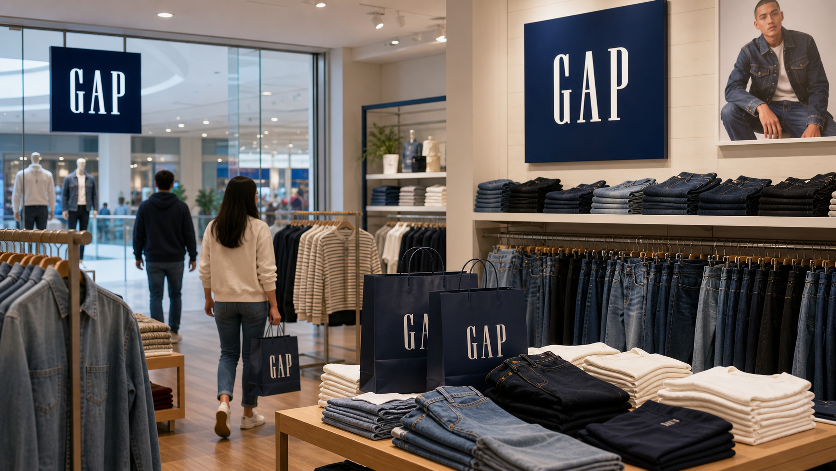
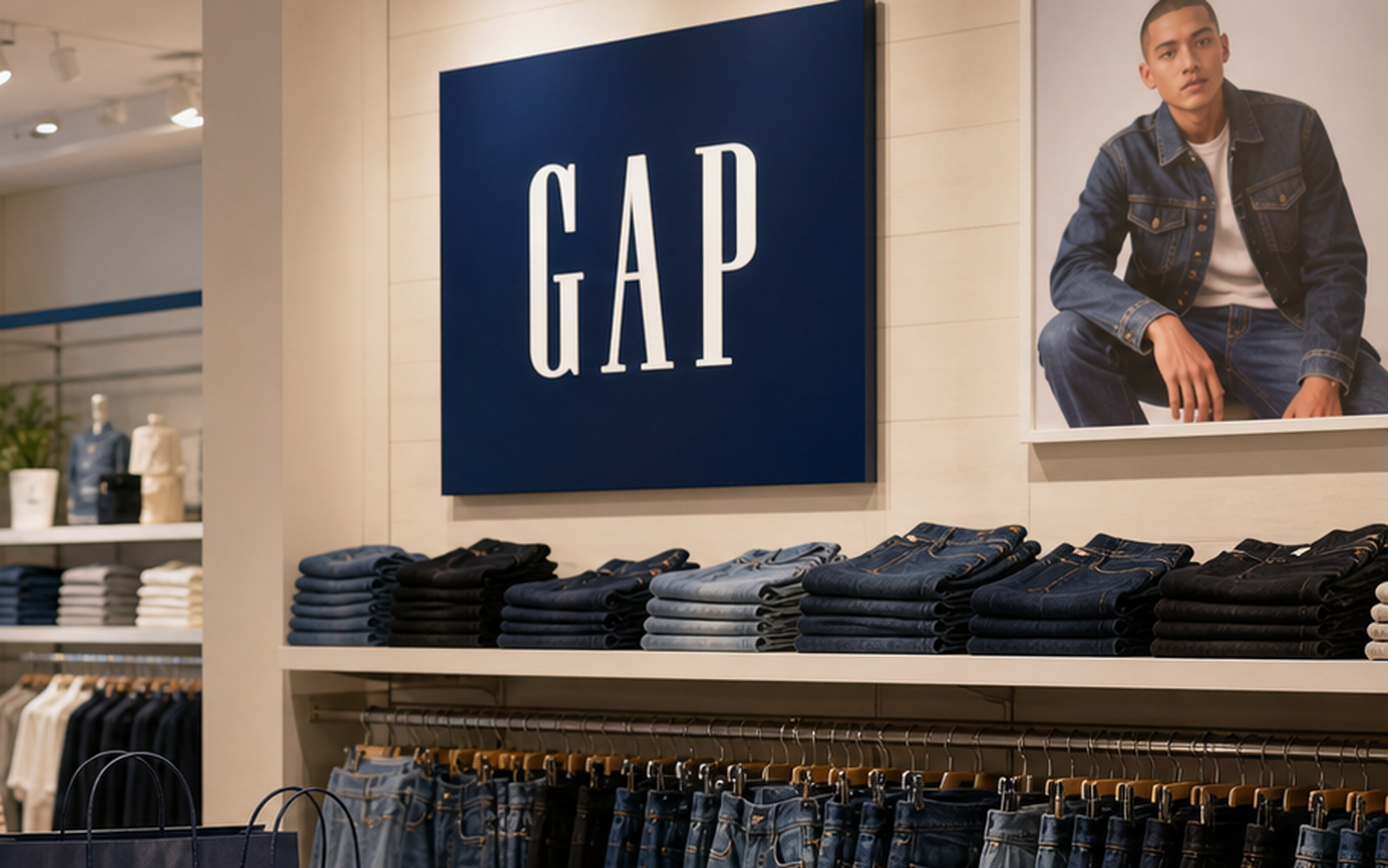
- The classic blue box carried enough public memory that the 2010 replacement was reversed quickly.
- Gap Inc. still operates a house of brands including Old Navy, Gap, Banana Republic, and Athleta.
- The logo lesson is buyer-facing: a simpler mark is not automatically a stronger cue.
Gap was founded in San Francisco in 1969; the name is tied to the generation gap framing of the period and became shorthand for accessible casualwear.
Current line or principle: The current signal is carried by denim, basics, store memory, ecommerce, the house of brands, and the classic square mark.
Name type: short retail name / apparel brand
- 1969 origin: A short name helped the store feel simple and contemporary.
- blue box memory: The square mark became a recognition shortcut for casual retail.
- 2010 reversal: A cleaner replacement failed because the customer did not grant the old cue permission to disappear.
house of apparel brands with Gap as the recognition lesson
Gap Inc. is the reporting company and portfolio owner. This card focuses on the Gap brand and the classic logo equity exposed by the 2010 reversal.
Parent: The Gap, Inc.
- Gap
- Old Navy
- Banana Republic
- Athleta
- ecommerce
- company-operated stores
- franchise locations
Market and scale snapshot.
This card is about Gap the apparel brand. The numbers below use Gap Inc. public-company filings only for owner scale: fiscal 2025 net sales, net income, store footprint, portfolio scope, and the public-float proxy disclosed in the Form 10-K.
Fiscal 2025 net sales from Gap Inc. Form 10-K for the year ended January 31, 2026.
Fiscal 2025 net income from Gap Inc. Form 10-K and SEC company facts.
SEC public-float proxy as of August 1, 2025, not a live full-company market cap.
Company-operated stores as of January 31, 2026; franchise agreements in about 35 countries.
Navy square, white type, denim, and retail restraint.
Gap's useful palette is not decorative. Navy and white carry the classic box, denim memory, store signage, shopping bags, and the stability the 2010 redesign failed to replace.
Recognition assets.
Memory pieces the brand can use before someone finishes a sentence.
Classic blue box
The square protected customer memory better than the replacement did.
Denim and basics
Apparel recognition comes from repeat product cues, not only typography.
Redesign without permission
The 2010 backlash showed how fast a familiar cue can become commercially sensitive.
Scores.
Use these scores to compare recognition, trust, proof, pressure, and risk at a glance.
The classic blue square remains the strongest public cue.
The 2010 reversal makes the recognition risk easy to inspect.
The old mark had enough equity that the replacement was rejected quickly.
Stores, denim, basics, bags, ecommerce, and the house-of-brands frame support the cue.
Gap is a direct warning against changing a cue before customers accept the reason.
The mistake is easy to quote, but harder to use well without understanding recognition economics.
Pages must distinguish Gap the brand from Gap Inc. the parent portfolio.
How the logo changed.
The mark has to keep recognition intact while the brand adapts to new products, places, and screens.
Retail recognition lineage.
Gap's page is a brand-recognition lesson: founding, blue box memory, store and denim cues, attempted redesign, reversal, and the ongoing need to keep the business as clear as the mark.

1969
Gap is founded in San Francisco and grows around accessible casualwear.
Signal impact: a short name anchors a retail idea
Blue box
The square becomes a simple recognition cue for denim, basics, bags, and store signage.
Signal impact: mark becomes memory
House of brands
Gap Inc. grows across Old Navy, Gap, Banana Republic, and Athleta.
Signal impact: brand clarity has to survive portfolio scale
2010
The redesigned mark is introduced and then reversed after backlash.
Signal impact: customers defend the old cue
Now
Gap's signal depends on product clarity, retail relevance, and whether the classic mark still points to a useful offer.
Signal impact: recognition needs business proof
Event board.
Turning points only: founding, blue box memory, 2010 backlash, reversal, and the business proof required after recognition is protected.
The blue box became shorthand
The mark compressed retail memory, denim, basics, and mall/store visibility.
Impact: The logo became an asset customers used.
The 2010 redesign removed too much
The replacement did not give buyers a stronger reason to forget the old cue.
Impact: Cleaner design did not equal stronger branding.
The reversal made the lesson public
Gap said it would keep the classic blue box logo.
Impact: Recognition proved more valuable than internal preference.
Public reaction.
No invented sentiment count. This card reads reaction through the public rejection of the 2010 mark, the official reversal, and the broader lesson that customers can notice identity loss immediately.
Positive / recognition
The backlash showed that people had stored the classic mark as part of Gap's retail identity.
Negative / redesign risk
The replacement failed because it looked like change without enough customer-facing proof.
Full timeline.
Steal / avoid.
- Treat recognition as a financial and behavioral asset.
- Pressure-test a redesign against what customers already use to identify you.
- Make the business reason for a change visible before changing the cue.
- Keep portfolio, product, and logo roles clear.
- Do not confuse cleaner design with stronger branding.
- Do not delete a familiar cue before the replacement has earned trust.
- Do not treat public backlash as a surprise if the decision removed customer memory.
- Do not make a logo change carry a business repositioning it cannot prove.
Short answer.
Gap's brand signal is the commercial value of recognition. The classic blue box worked because customers used it as a shortcut for denim, basics, store memory, and retail familiarity. The 2010 redesign failed because it removed a known cue before the replacement had earned a stronger customer reason.
Why is Gap a useful brand lesson?
Gap is useful because the 2010 logo reversal shows that recognition is a customer asset, not an internal design preference.
What should another brand steal from Gap?
Steal the discipline of testing whether customers use an existing cue before replacing it.
What should another brand avoid copying from Gap?
Do not launch a cleaner identity if the replacement does not protect the memory people already use to choose or understand the brand.
Compare this signal.
Use Gap as the starting point for logo equity, rebrand risk, and how customer memory can reject a design decision.
Nike mark portability
A simple mark gets stronger when behavior keeps feeding it.
CompareAirbnb symbol trust
A new symbol works only when the new behavior is believable.
GuideBrand Messaging
Use this when the reason for change needs proof.
RequestPrivate brand work
Use this when a rebrand decision needs a private risk check.
Making a signal decision of your own?
Use Private Brand Work when your own name, identity, proof, or message needs the same pressure test.
Sources.
Related Grow Your Brand page
Related Grow Your Brand page
Related Grow Your Brand page
Related Grow Your Brand page
Gap Inc. fiscal 2025 Form 10-K · SEC company facts, Gap Inc. CIK 0000039911 · Gap Inc., About · Gap Inc., history · Gap Inc. statement on keeping the classic blue box logo · CNNMoney, Gap scraps new logo · Wikimedia Commons, Gap logo file