Make the brand easy to spot
This color should appear where recognition matters most.
Branding guide · Colors
Color is a cue, not decoration. The job is to make recognition easier while keeping contrast, accessibility, category context, and real surfaces under control.

recognition · contrast · surface · memory
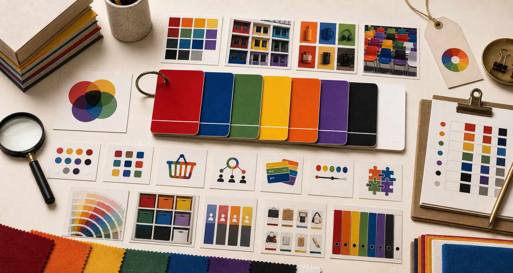
A palette is useful only when each color has a job and a boundary.
This color should appear where recognition matters most.
Use it for signals and actions, not for full-page noise.
The background should support reading and images.
Error, success, warning, and data colors need their own logic.
Color problems often look like taste problems. They are usually role problems.
It collapses on forms, buttons, product photos, or search results.
Brand color is used for body copy, pale buttons, or low-contrast fields.
The palette makes the brand feel like another category before copy can correct it.
The page has no hierarchy because accent, primary, and background all compete.
The system looks good on one monitor and fails everywhere else.
The brand becomes harder to recognize because it blends in.
Use the matrix before locking a palette or changing a known cue.