Sets temperature and category expectation
Blue can calm, red can activate, black can formalize, but context changes the read.
Branding guide · Identity
Identity is not the logo alone. It is the shared behavior of name, color, mark, type, shape, voice, image style, slogan, and proof across every surface where people meet the brand.

name · color · mark · type · voice
Each element carries a different part of the job.
The brand controls identity. The market forms image. The gap is where brand work starts.
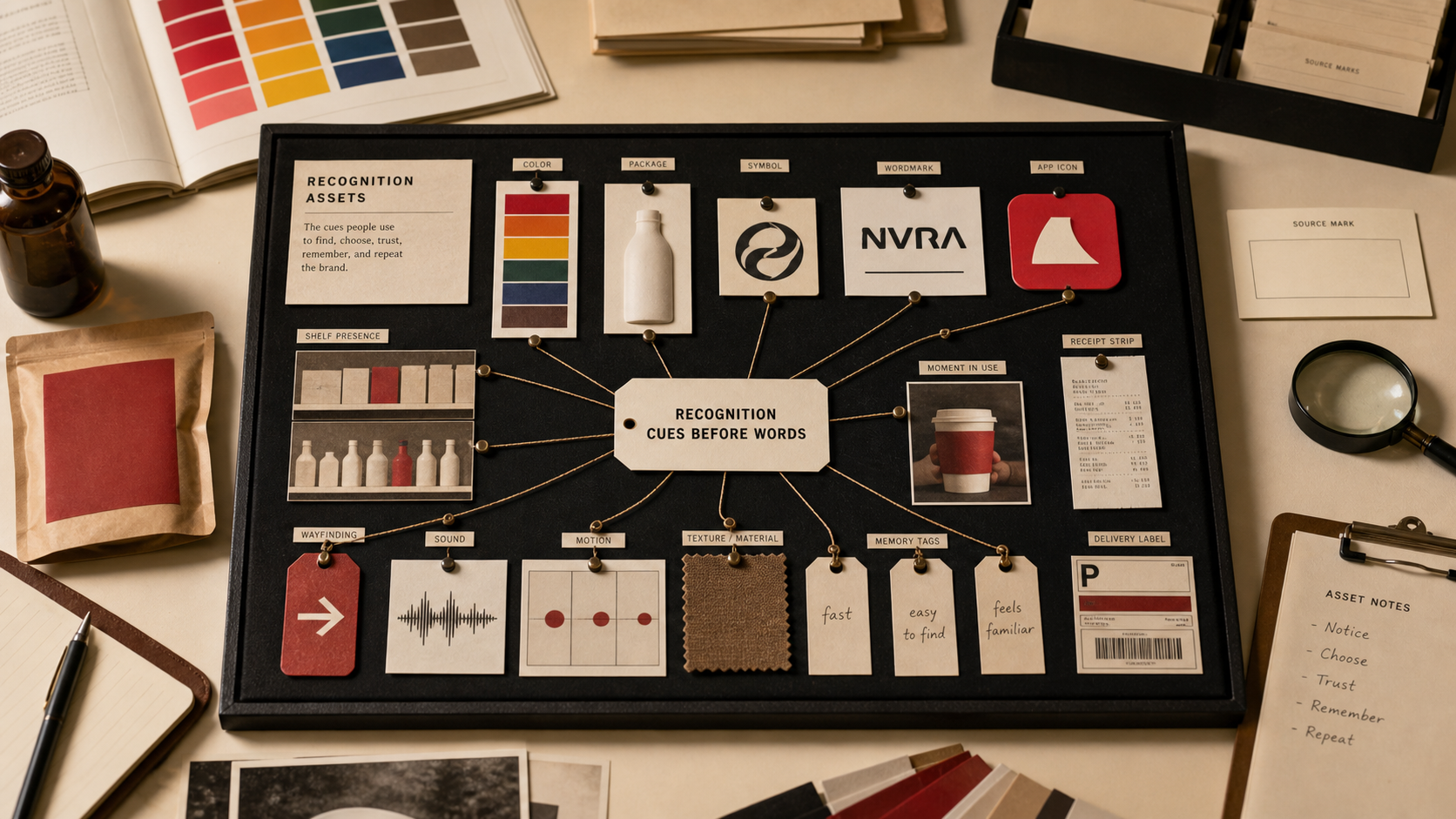
Cues work because people read patterns quickly.
Blue can calm, red can activate, black can formalize, but context changes the read.
Round feels softer, angular feels sharper, symmetric feels controlled, irregular feels human.
Serif, sans, display, case, spacing, and weight change perceived authority.
Sound, spelling, word shape, and category clarity decide whether people repeat it.
The same promise can feel expert, warm, blunt, playful, or bureaucratic.
The cue earns meaning when the product or service keeps proving it.
If your name, color, message, mark, or page is making buyers hesitate, use Private brand work before the public surface hardens.