Growyourbrand.net Branding guides from Grow Your Brand June 2026
Grow Your Brand Plain brand guides for clearer words, stronger proof, and cleaner decisions.

Branding guide · Identity examples

Brand identity is the cue system people remember before they read.

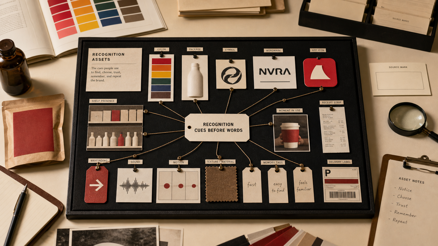
Identity is the visible and verbal shorthand for the brand: color, name, icon, wordmark, type, shape, packaging, and repeated behavior. The job is recognition first, feeling second, explanation last.

Build recognition.The cue should help people spot the brand before they read a paragraph.
Set expectation.Color, shape, and type should tell the buyer what kind of brand this is.
Match proof.The identity has to point back to product, service, origin, or behavior.
Brand identity cue board with color swatches, mark shapes, type samples, packaging notes, and recognition cards.

Brand Identity Examples

color · mark · word · shape · type

A brand identity works when the buyer can recognize the brand from a small cue and still feel the right category expectation.
Logo and wordmark review board with abstract shapes, icon marks, wordmarks, and typography cards.
The mark, word, color, and type should behave like one system. If each cue tells a different story, the buyer has to reconcile the brand for you.
01

What brand identity means.

Identity is the recognition layer.It is the set of cues people use to identify the brand quickly: name, color, mark, type, shape, image style, packaging, and repeated behavior.
Identity creates expectation.A crown, swoosh, blue box, golden arch, red bullseye, or geometric wordmark tells the buyer what kind of promise to expect.
Identity is not decoration.A cue earns its place when it makes the brand easier to recognize, trust, compare, or remember.
02

Published brand examples.

These examples come from the published Grow Your Brand brand pages. They show how a cue works before the full page explanation arrives.

Apple

Icon plus simple word

The apple mark and clean surfaces make the brand feel controlled, usable, and system-led.

Nike

Abstract motion mark

The swoosh does not draw a shoe. It cues speed, movement, and performance.

Rolex

Crown plus serif form

The crown cues status and ownership. The serif wordmark keeps the signal formal.

Tiffany & Co.

Color as property

The blue box makes recognition happen before product detail or copy.

McDonald's

Shape and color at distance

The arches, red, and yellow work as roadside memory, appetite cue, and speed signal.

FedEx

Wordmark with hidden motion

The arrow inside the letters turns a delivery name into a speed cue.

Mastercard

Overlapping circles

The mark makes network, exchange, and payment feel simple at small size.

IKEA

Block color and blunt type

Blue, yellow, and heavy letterforms support value, scale, and practical retail.

03

Icon, wordmark, or both.

The right mark type depends on where people meet the brand and how much meaning the name already carries.

Choice
What it does
Good use
Risk
Wordmark
Makes the name the main cue
New brands, search-heavy brands, names that need learning
Weak at tiny size if the letters have no distinctive shape
Icon mark
Gives the brand a fast visual shortcut
Apps, packaging, retail, sport, social avatars
A random icon that people cannot connect to the brand
Icon plus wordmark
Teaches the mark while protecting the name
Most growing brands before the icon is famous
Two elements fighting for attention
Monogram
Compresses a long or formal name
Luxury, fashion, finance, professional services
Low meaning for new buyers
Mascot or character
Adds personality and memory
Food, entertainment, kids, games, creator-led brands
Hard to make credible in serious categories
No separate mark
Keeps identity language-led
Editorial, founder-led, luxury, or specialist services
Harder to recognize in small digital spaces
04

Abstract marks versus literal marks.

Abstract marks are not better. Literal marks are not weaker. The question is how much the buyer already knows.

Mark type
Cue
Use when
Watch for
Literal object
Immediate category or metaphor
The product is unfamiliar or needs fast explanation
Looking generic because many brands can use the same object
Abstract shape
Feeling before explanation
The brand has enough media, packaging, or repetition to teach the cue
Meaningless geometry with no memory hook
Motion shape
Speed, energy, progress
Sport, delivery, mobility, software action, performance
Fake dynamism when the product is slow or careful
Container shape
Trust, enclosure, safety, system
Finance, infrastructure, security, logistics, healthcare
Feeling stiff or bureaucratic
Organic shape
Human, natural, flexible, alive
Food, wellness, hospitality, creative products
Feeling soft when the brand needs precision
Heraldic or badge shape
Authority, age, club, certification
Luxury, sport teams, institutions, craft, provenance
Borrowed heritage with no proof behind it
05

Shape cues and emotion.

Shapes create fast expectation. They do not create trust by themselves. The cue has to match the brand's behavior.

Shape
Common read
Brand use
Bad use
Circle
Complete, social, soft, continuous
Networks, community, payment, care, movement
Too friendly for a precision or authority brand
Square
Stable, orderly, reliable, contained
Tools, infrastructure, retail systems, B2B, storage
Static feeling for a brand built on motion
Triangle
Direction, pressure, hierarchy, ascent
Performance, engineering, outdoor, change, ambition
Aggressive feel in a care or family context
Arrow
Speed, delivery, progress, conversion
Logistics, software flows, sport, navigation
Overpromising speed the operation cannot deliver
Shield
Protection, security, official confidence
Insurance, security, healthcare, enterprise trust
Cliche authority when the service is not serious
Crown
Status, ownership, ceremony
Luxury, awards, watches, hospitality, membership
Cheap premium signal without product proof
Star
Achievement, rating, aspiration
Entertainment, retail rating, sport, children, recognition
Generic excellence symbol with no evidence
06

Type and font cues.

Typography changes how the same name feels. A font choice can make a brand feel official, friendly, cheap, technical, old, fast, or soft.

Type cue
Often feels like
Good use
Risk
Serif
Editorial, formal, crafted, older
Luxury, publishing, food, culture, legal, hospitality
Fake heritage if the brand has no proof
Geometric sans
Modern, engineered, neutral
Technology, tools, finance, systems, architecture
Too common to remember by itself
Humanist sans
Readable, practical, warmer
Service, education, healthcare, public-facing brands
Quiet to the point of invisibility
Condensed type
Pressure, speed, editorial punch
Sport, fashion, headlines, packaging with little space
Hard reading and aggressive tone
Rounded type
Soft, friendly, approachable
Kids, care, food, social apps, everyday products
Low authority in a high-stakes category
Script
Personal, handmade, expressive
Food, beauty, creator-led, hospitality
Hard to scale, hard to read, or too sentimental
Custom letters
Ownable memory
Mature brands that need a distinctive word shape
Decoration that makes the name harder to read
07

Identity approval checklist.

Approve when
  • The brand is recognizable from one small cue.
  • Color, mark, wordmark, and type point to the same category expectation.
  • The identity works in favicon, social avatar, packaging, mobile, search, and footer size.
  • The emotional cue matches the product and service behavior.
  • The system can be used by someone who did not attend the brand meeting.
Hold when
  • The cue looks good only on a presentation slide.
  • The mark needs a paragraph to explain.
  • Color, name, and type each imply a different kind of brand.
  • The identity copies a category leader without the same proof.
  • The emotion is borrowed from a moodboard instead of earned by the offer.
08

Use this for your brand.

Private brand work

Bring the cue problem to a real decision.

If your name, color, message, mark, or page is making buyers hesitate, use Private brand work before the public surface hardens.

Hire usRequest Private brand workUse this when the decision affects sales, trust, launch, rebrand risk, or buyer clarity.
09