Signal Status
Active Brands Page 2
The operating-brand side of Grow Your Brand: current companies, continuing brand systems, live strategic resets, and unresolved status-watch files.
- Lane files
- 410 Operating or unresolved brands
- Separated
- 25 Terminal files kept apart
- Page
- 2/18 Case-list pagination
Short Answer
Active Brands collects Grow Your Brand cases where the brand, company, platform, product system, or parent organization is still operating, continuing, or unresolved.
Shelf Rule
Operating status gets its own shelf.
An active brand file means the organization, product system, platform, or parent brand is still in motion. It is not praise.
Status Boundary
Active is operating state, not praise.
Use this lane when the brand, company, platform, product system, or parent organization is still in motion. A bad decision by an active company belongs here until the operating system itself is gone.
Compare these files by present decision pressure: the market is still watching, buying, leaving, forgiving, or waiting for the next move.
Active Brands Case Files, Page 2
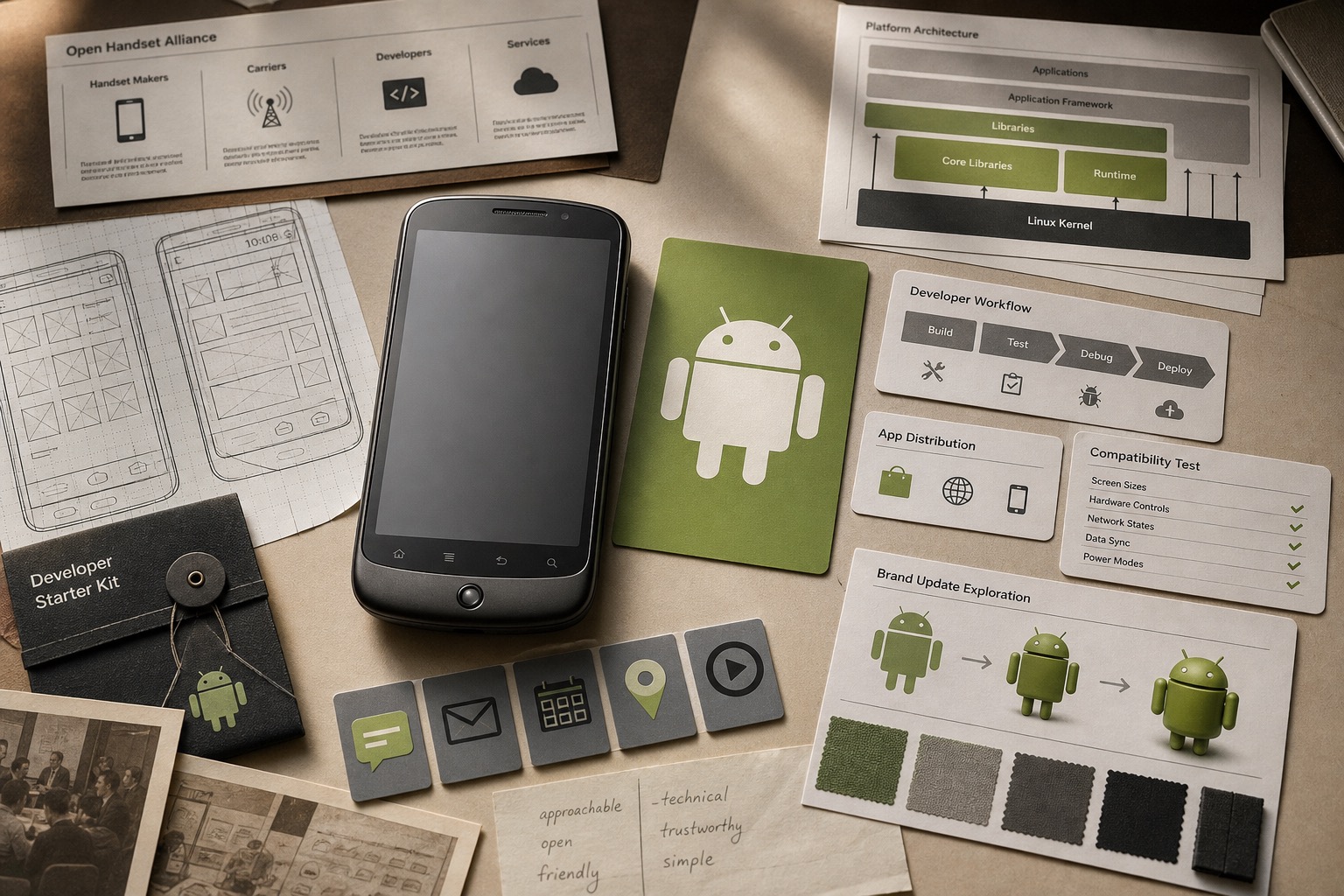
Android / 2007-present
Android: Launch case in Mobile Operating Systems
Android is the open-platform case for turning a simple robot cue, device choice, developer access, Google services, OEM partnerships, and app distribution into mobile-scale memory.
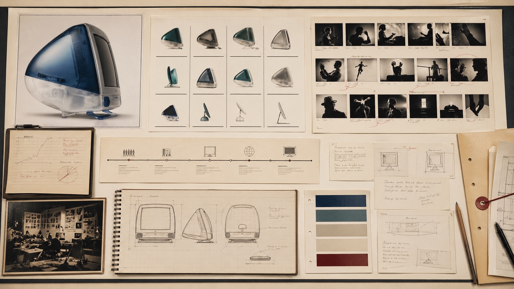
Apple / 1997-1998
Apple: Comeback case in Technology
Apple's late-1990s recovery worked because the brand promise, product simplification, direct selling, and iMac proof all pointed at the same idea.
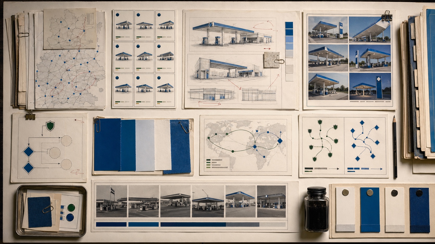
Aral / 2002-2004
Aral: Rebrand case in Fuel Retail
Aral is the brand-architecture case for keeping local fuel-station equity visible after parent ownership changes, instead of forcing every market into one corporate mark.
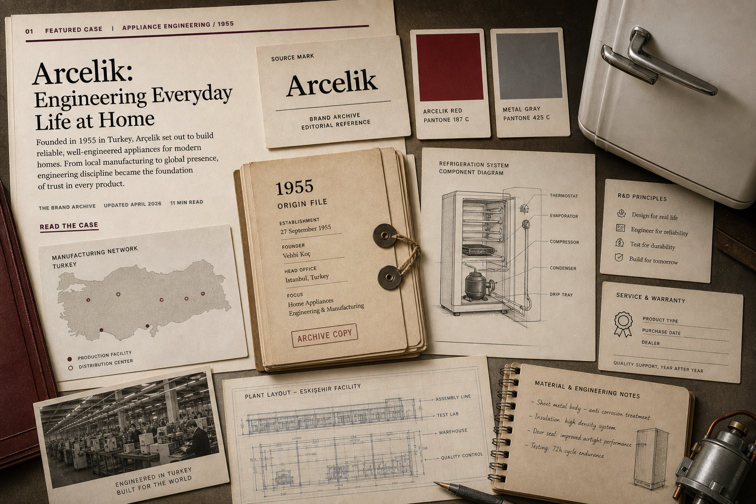
Arçelik / 1955-present
Arçelik: Brand System case in Appliances / Engineering
Arcelik is the appliance-brand case for turning manufacturing scale, R&D, Beko portfolio reach, energy standards, service, and export confidence into household trust.

Aritzia / 1984-present
Aritzia: Brand System case in Fashion retail / House brands
Aritzia is the fashion-retail case for turning boutiques, house labels, styling advice, fit confidence, seasonal capsules, and everyday-luxury pricing into one shopping system.
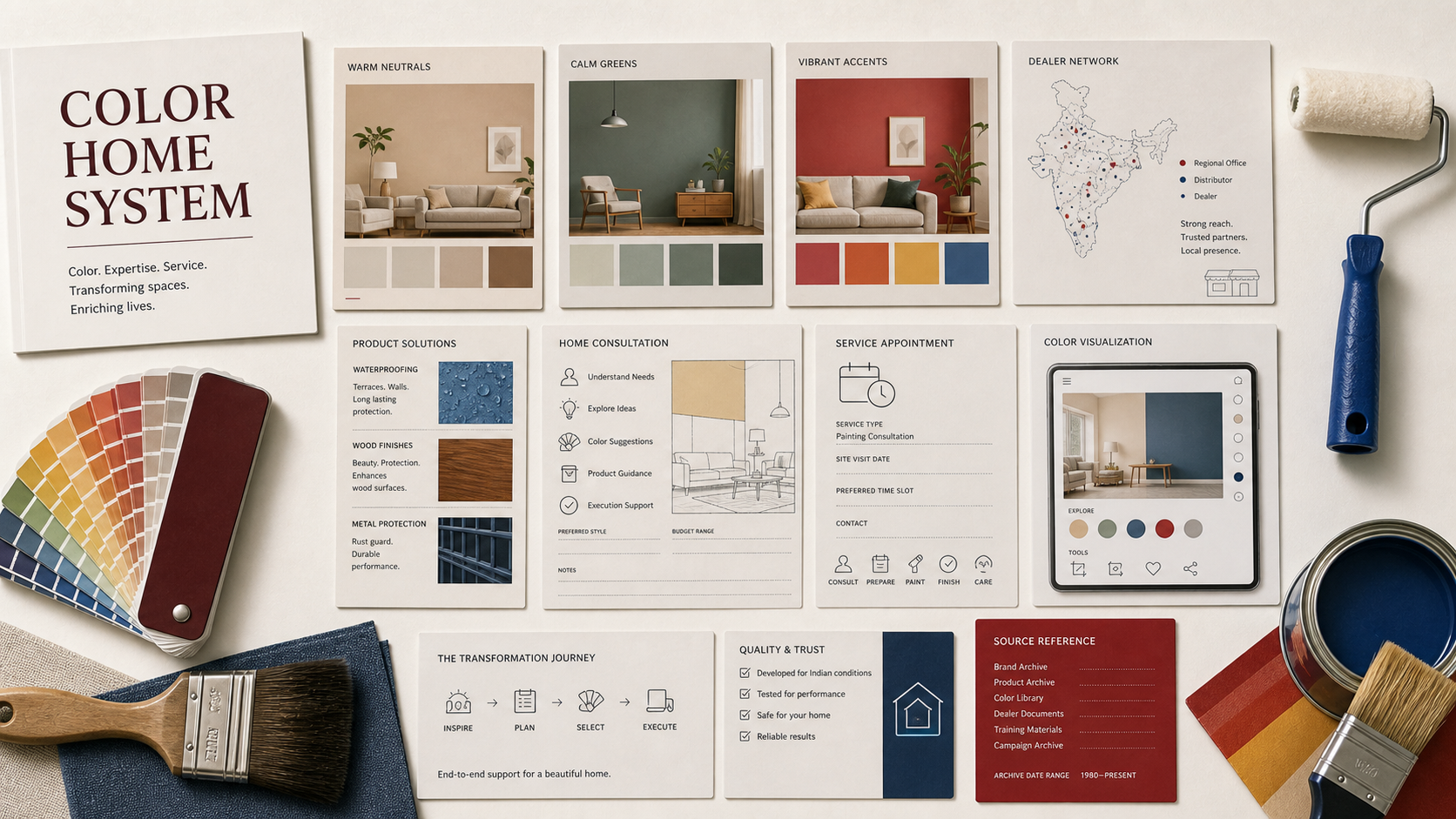
Asian Paints / 1942-present
Asian Paints: Brand System case in Paint / home improvement
Asian Paints is the home-improvement case for turning color selection, dealer reach, visualization tools, waterproofing, painting services, and product range into purchase confidence.
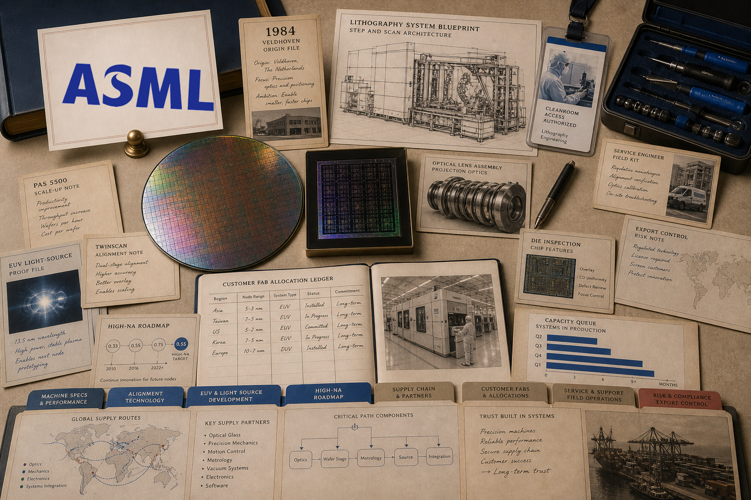
ASML / 1984-present
ASML: Infrastructure case in Semiconductor equipment / Lithography
ASML is the infrastructure-brand case for turning lithography machines, EUV progress, service capacity, customer dependence, and supply-chain scarcity into public proof.
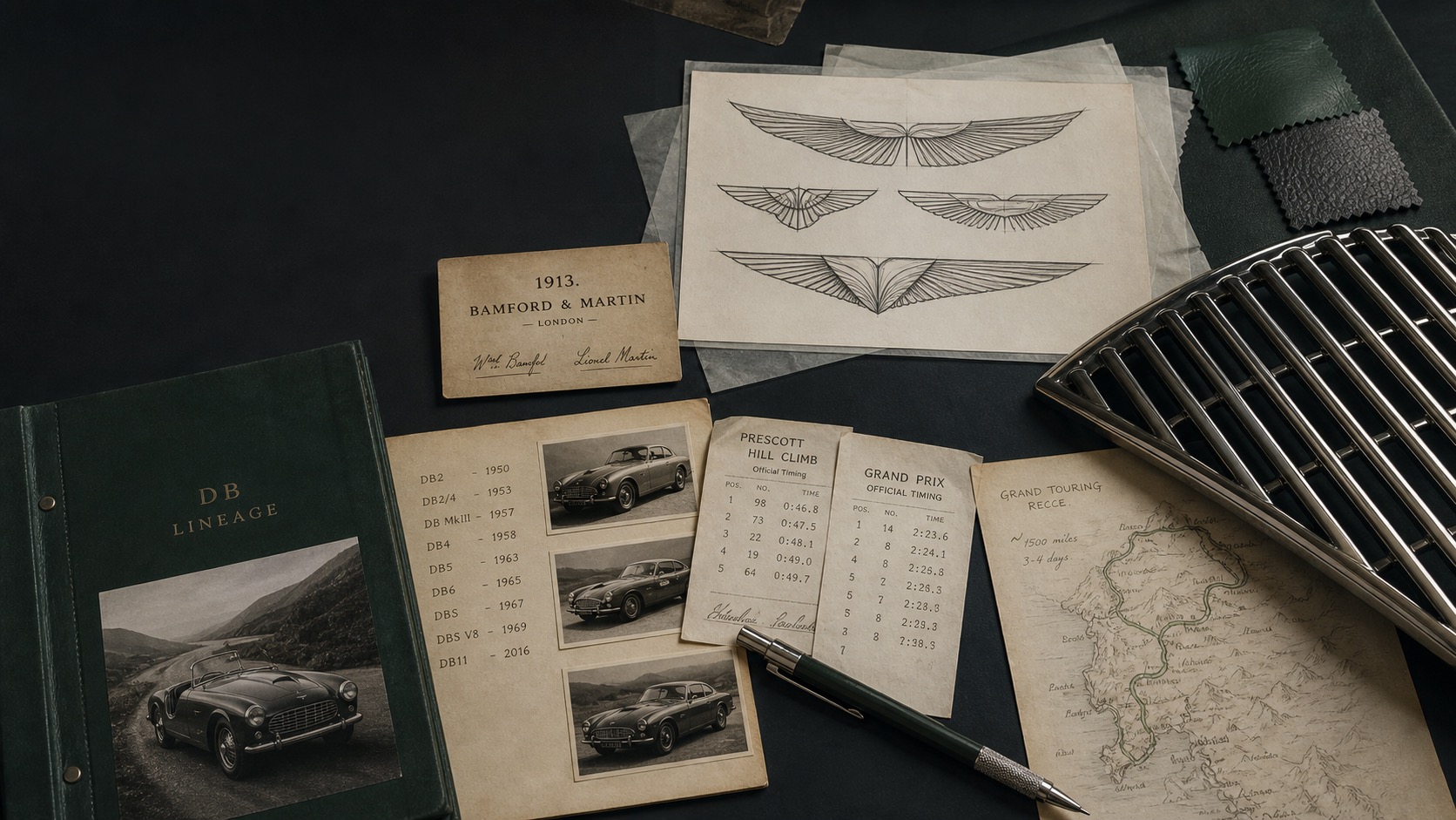
Aston Martin / 1913-present
Aston Martin: Brand System case in Automotive / Grand Touring
Aston Martin is the automotive-myth case for connecting wings, DB lineage, British grand touring, racing credibility, cabin craft, and product scarcity into one premium signal.
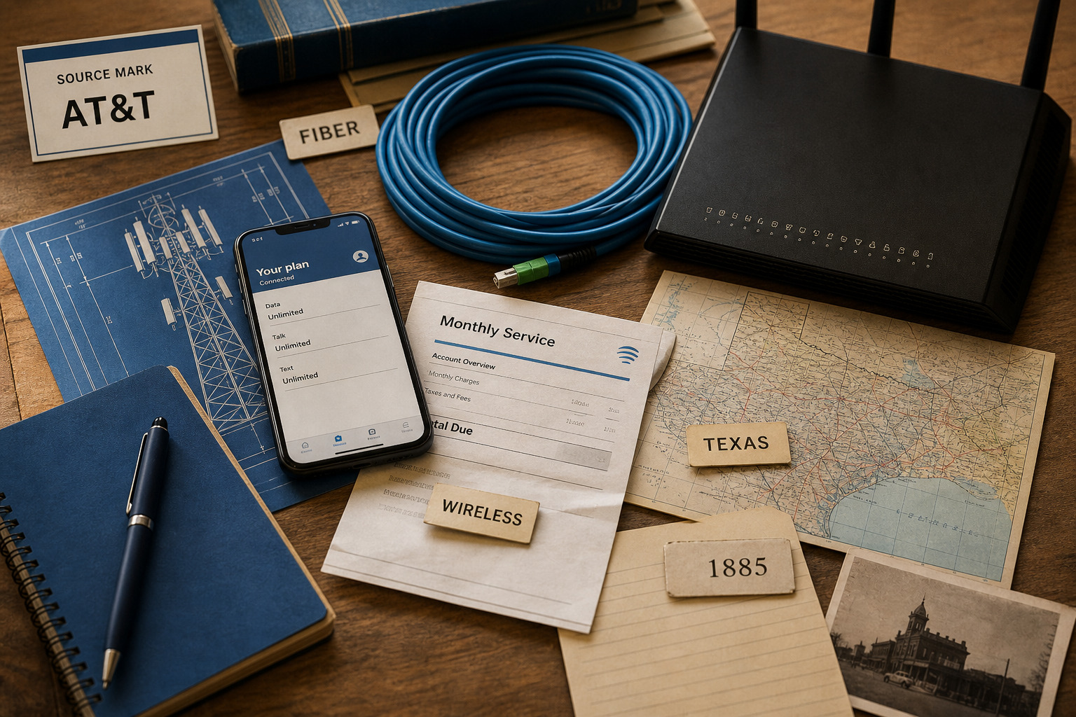
AT&T / 1885-present
AT&T: Brand System case in Telecom / Connectivity
AT&T is the telecom case for turning wireless plans, fiber access, business connectivity, coverage memory, account service, and network investment into household and enterprise trust.
Atlassian / 2002-present
Atlassian: Brand System case in Team Software
Atlassian is the team-software case for turning Jira issues, Confluence documents, team rituals, marketplace extensions, and work transparency into a shared operating record.
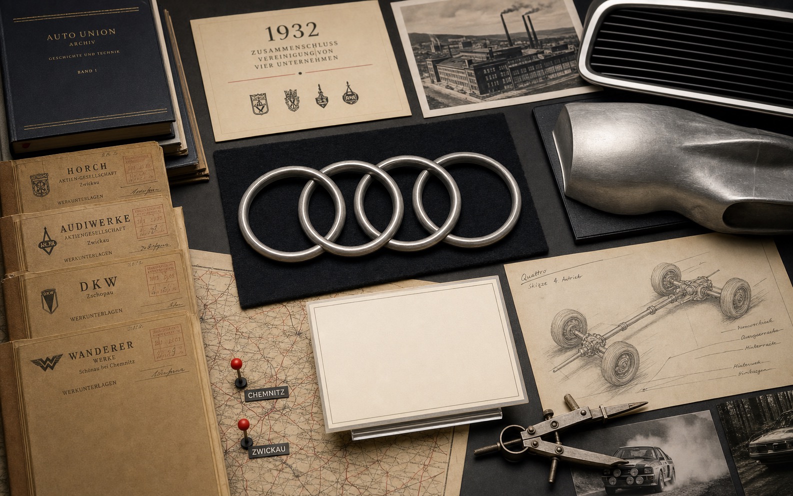
Audi / 1932-present
Audi: Brand System case in Automotive
Audi is the brand-architecture case for turning the Auto Union merger, four-ring symbol, engineering language, motorsport memory, and premium product discipline into one recognition system.
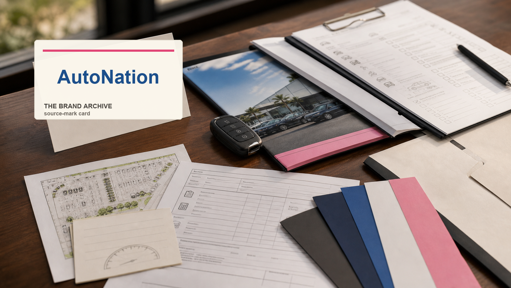
AutoNation / 1996-present
AutoNation: Brand System case in Automotive retail / Dealership network
AutoNation is the automotive-retail case for turning franchise dealerships, vehicle inventory, trade-ins, finance desks, service bays, and national retail recognition into a lower-risk car purchase.
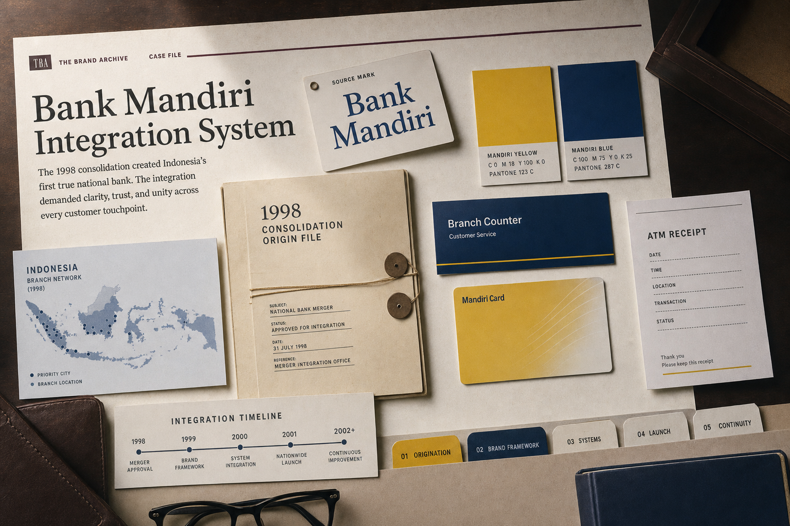
Bank Mandiri / 1998-present
Bank Mandiri: Brand System case in Banking / National finance
Bank Mandiri is the merger-born banking case for turning state-bank consolidation, branch reach, yellow-blue recognition, cards, ATMs, digital banking, and national finance trust into one system.
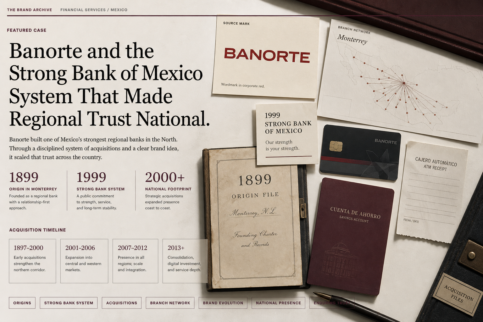
Banorte / 1899-present
Banorte: Brand System case in Banking / Financial trust
Banorte is the banking-trust case for turning regional origin, Mexican ownership memory, branch and ATM access, digital banking, financial group scale, and strong-bank language into national confidence.
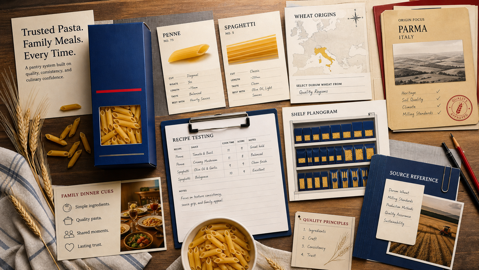
Barilla / 1877-present
Barilla: Brand System case in Food / Pasta
Barilla tracks how a staple brand turns recognition, shape clarity, shelf consistency, recipe usefulness, and meal memory into repeat purchase trust.
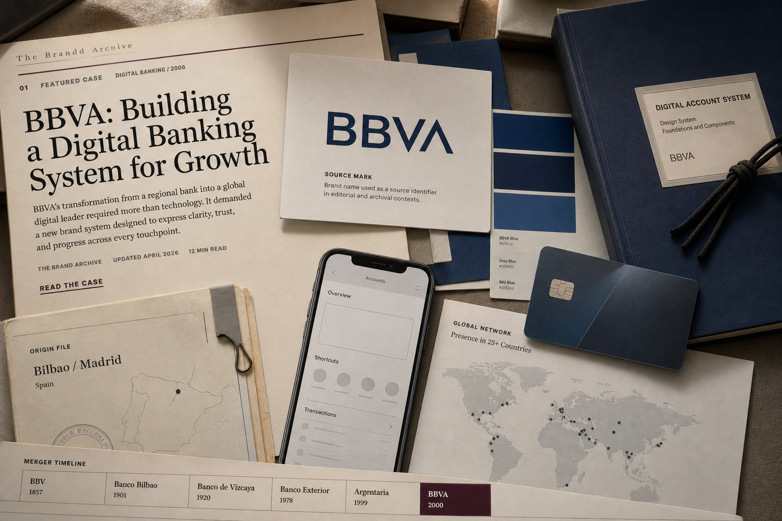
BBVA / 1857-present
BBVA: Brand System case in Banking / Digital finance
BBVA is the digital-banking trust case for carrying old institutional proof into mobile accounts, branch continuity, card use, global scale, and a blue interface system.
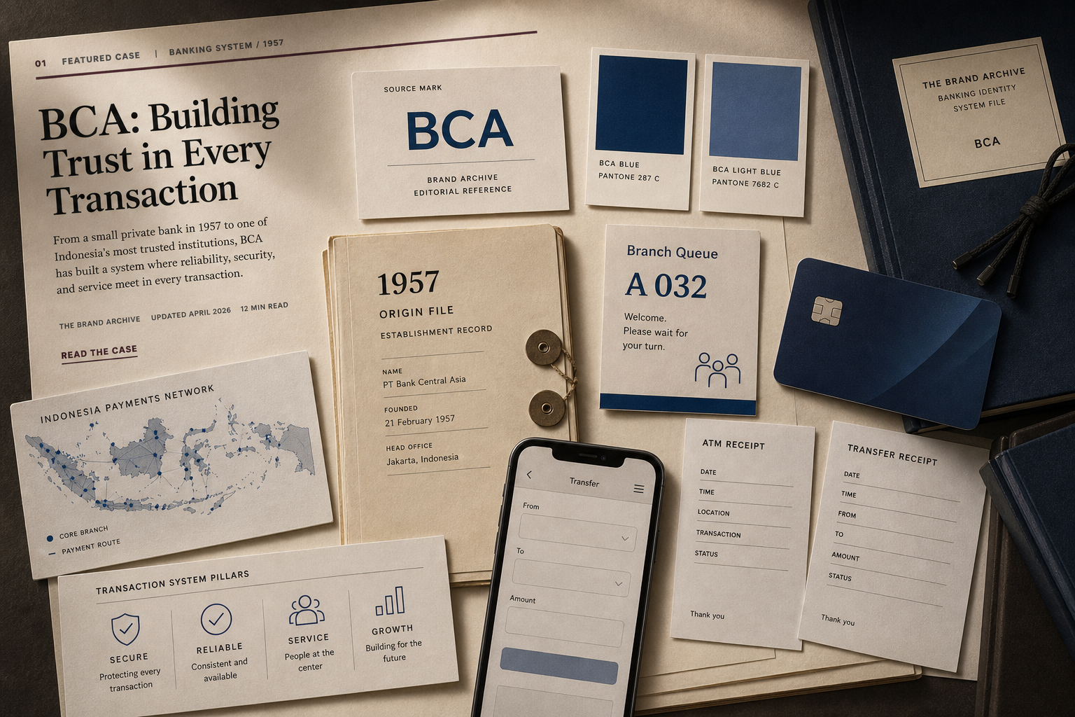
BCA / 1957-present
BCA: Brand System case in Banking / Payment infrastructure
BCA is the daily-transaction trust case for connecting branches, ATMs, cards, mobile banking, merchant payments, account products, and service access into one Indonesian money route.
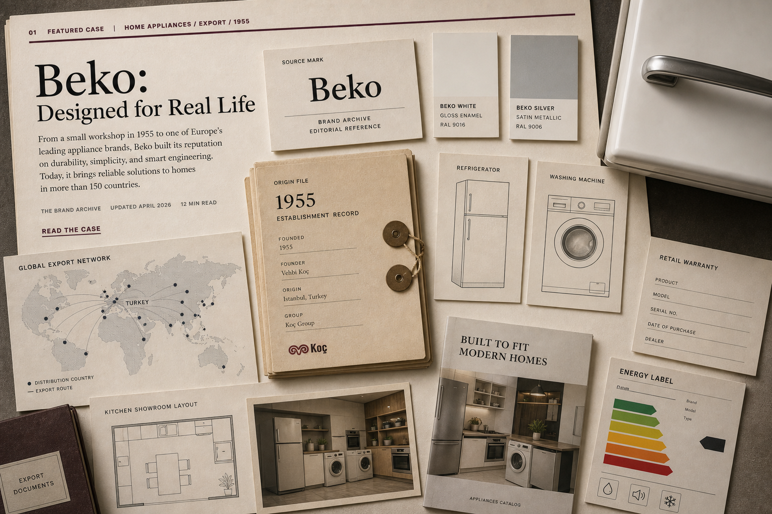
Beko / 1955-present
Beko: Brand System case in Home appliances / Export retail
Beko is the appliance-export trust case for connecting refrigerators, washing machines, retail price access, warranty confidence, service support, European distribution, and Turkish manufacturing.
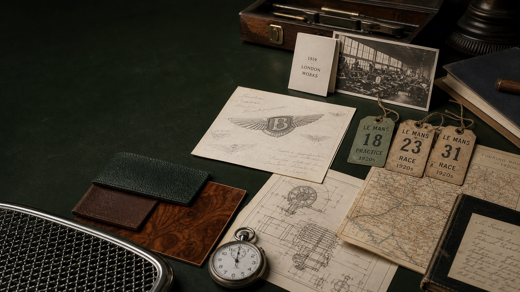
Bentley / 1919-present
Bentley: Brand System case in Automotive / Grand Touring
Bentley is the luxury-performance proof case for connecting the Winged B, grand touring, cabin craft, Mulliner personalization, motorsport memory, and high-speed comfort.
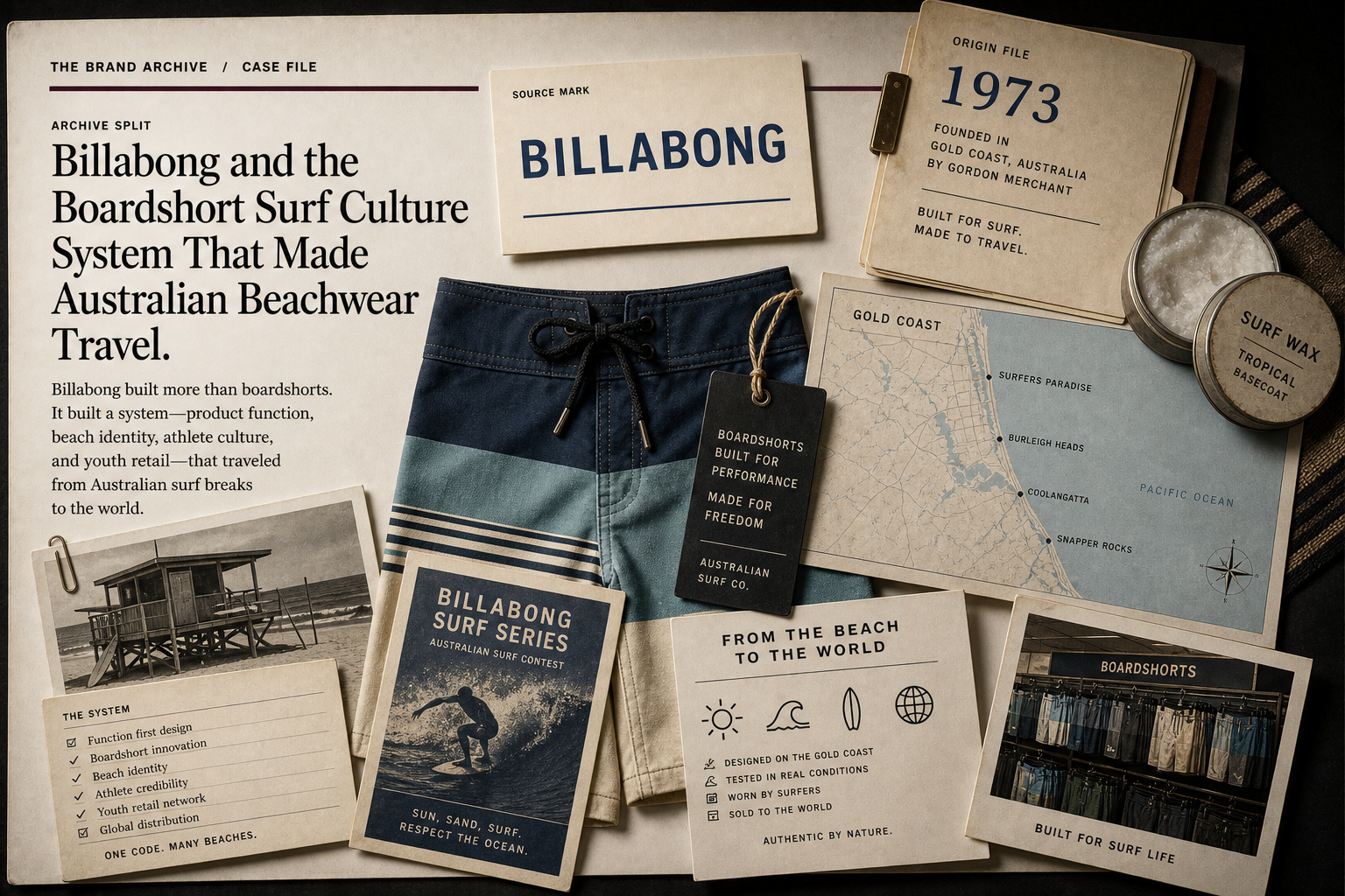
Billabong / 1973-present
Billabong: Brand System case in Surfwear / Youth retail
Billabong is the surf-culture apparel case for connecting boardshort utility, Gold Coast origin, team riders, wetsuits, retail distribution, and youth surf identity.
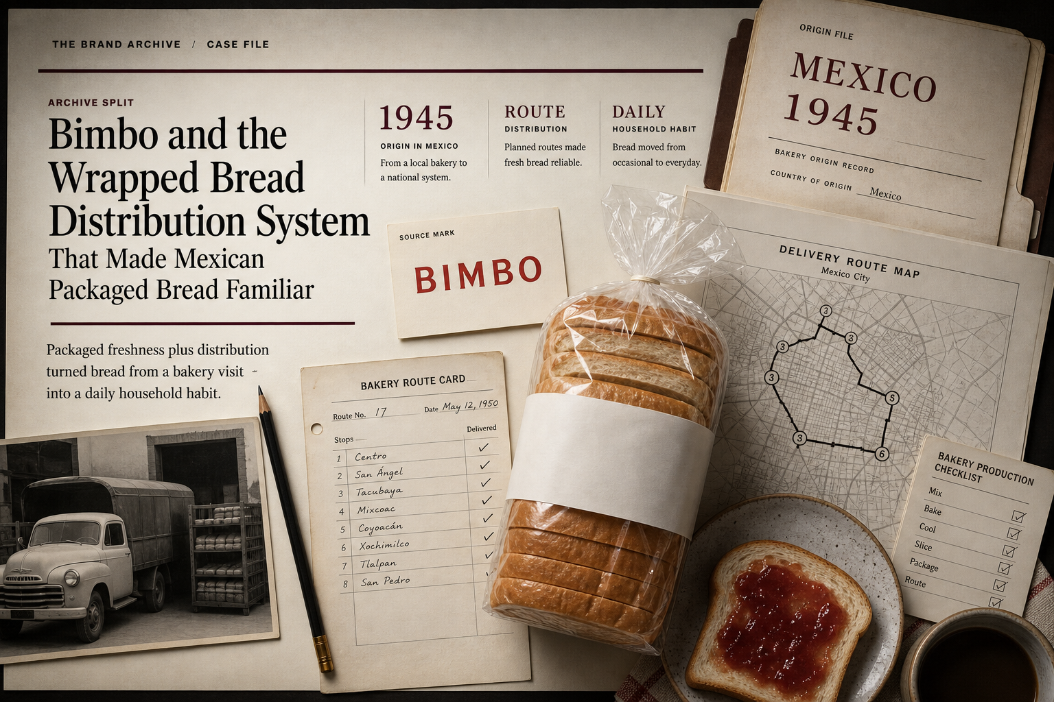
Bimbo / 1945-present
Bimbo: Brand System case in Packaged food / Bakery distribution
Bimbo is the packaged-bread distribution case for connecting the bear mark, wrapped freshness, route delivery, shelf availability, bakery scale, and household repeat buying.
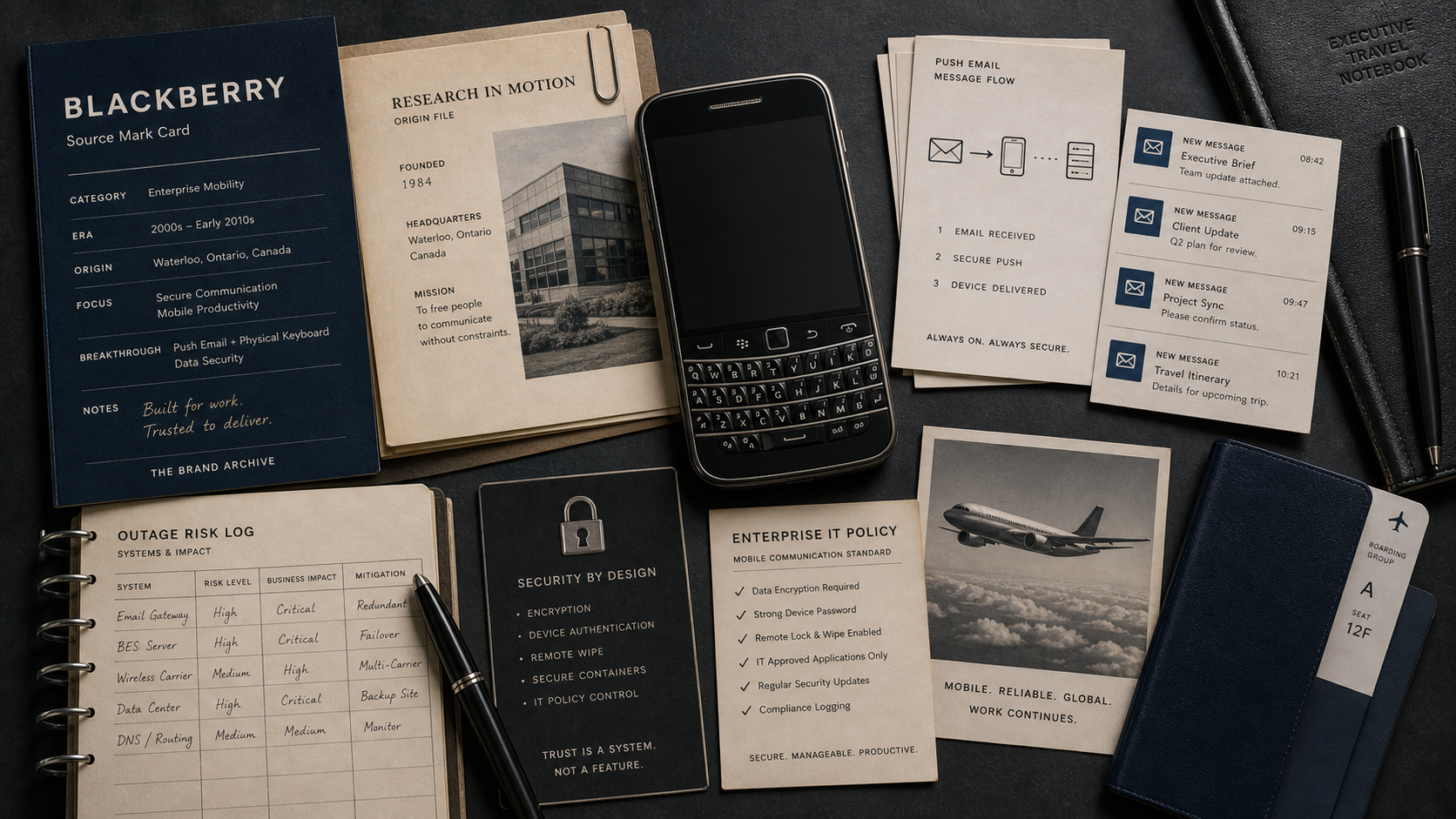
BlackBerry / 1984 / 1999-present
BlackBerry: Brand System case in Mobile devices / Enterprise security
BlackBerry is the mobile-work trust case for connecting the physical keyboard, push email, enterprise control, secure communications, QNX software, and the move beyond phones.
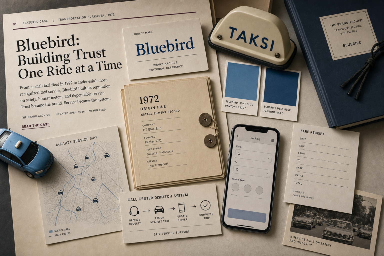
Bluebird / 1972-present
Bluebird: Brand System case in Transport / Taxi service
Bluebird is the taxi-trust case for connecting light-blue vehicle recognition, meters, dispatch, driver standards, receipts, app booking, and Indonesian street-level accountability.
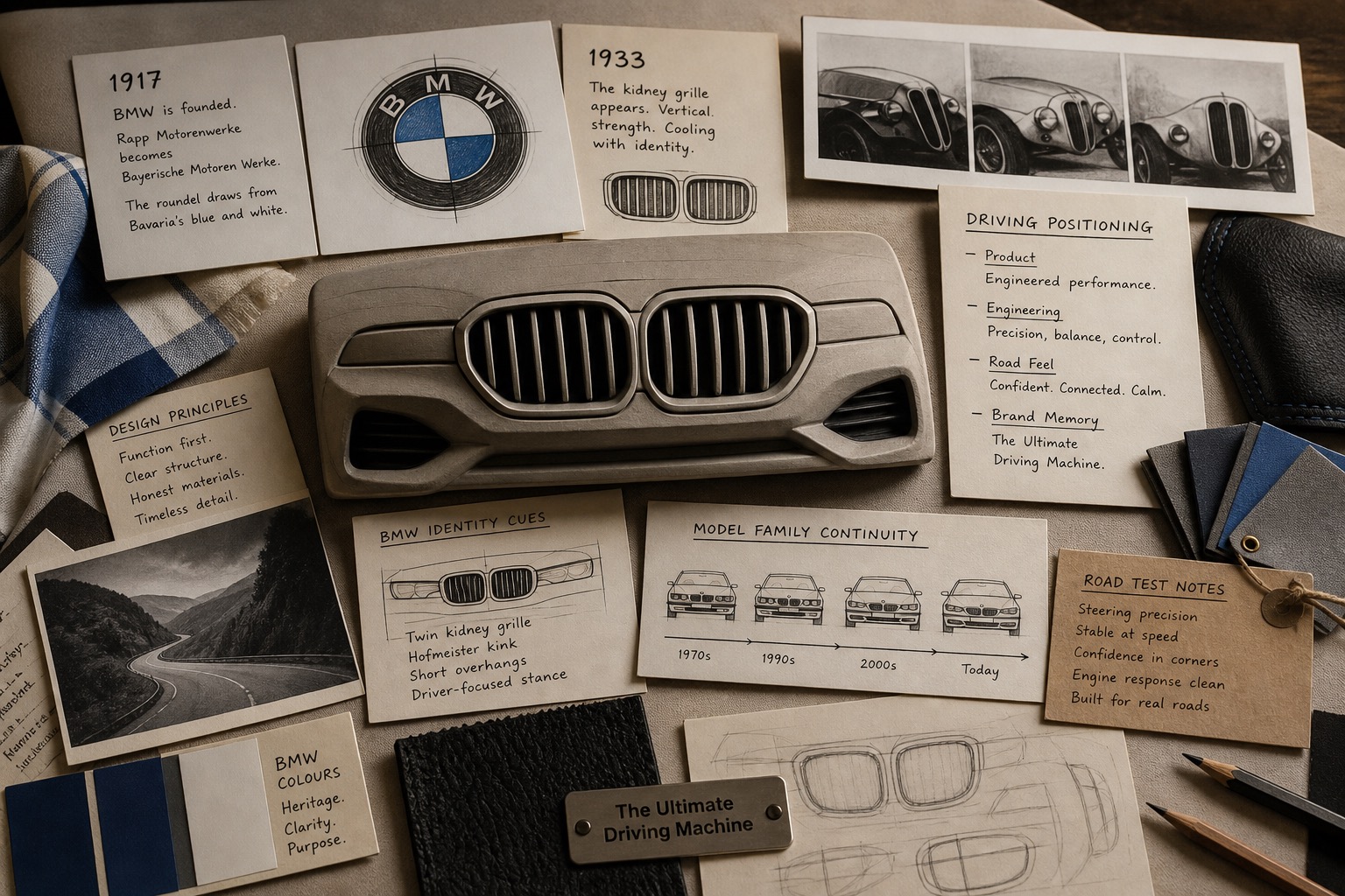
BMW / 1917 / 1933-present
BMW: Brand System case in Automotive
BMW is the driving-identity case for linking the kidney grille, roundel memory, model range, performance promise, electric transition, and controversial design change.
Active Brands FAQ
What belongs in Active Brands?
A case belongs here when the brand, company, platform, product system, or parent organization is still operating, continuing, or unresolved.
How is this different from Brand Failures?
Brand Failures are decision-type cases. Failed Brands are status cases. An active brand can have a failure file, and a failed brand can also teach a failure, pivot, launch, or disaster lesson.
Are these rankings?
No. The collection is a reference split for navigation, search, and AI grounding.