Grow Your Brand Branding guides from Grow Your Brand June 2026
Grow Your Brand Plain brand guides for clearer words, stronger proof, and cleaner decisions.

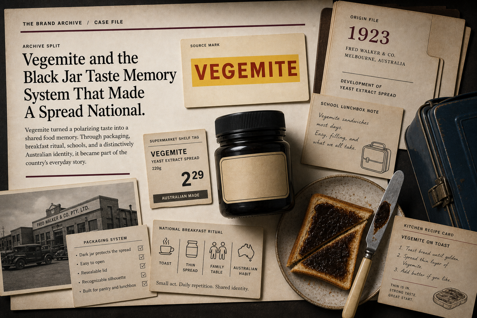
Branding guide · Color

Black and white branding can feel precise, premium, minimal, or empty.

Black and white can create authority, contrast, restraint, editorial clarity, and premium control. The risk is coldness, sameness, or a page that looks designed but says very little.

Know the signal.Use black and white when the brand needs authority, editorial clarity, premium restraint, or a strong neutral system.
Know the risk.Avoid black and white when minimalism hides missing content, warmth, proof, or category cues.
Tie it to proof.Color should point to product, service, source, behavior, or a real buying situation.
Product packaging surface showing black used for strong shelf memory and contrast.

Black and White in Branding

contrast · authority · restraint · clarity

Black and white is strongest when restraint is paired with proof and hierarchy.
Black product packaging surface showing shelf, taste, and recognition cues.
Use brand examples to study the cue, not to copy the surface.
01

What black and white in branding can signal.

The color is a cue, not proof.Use black and white when the brand needs authority, editorial clarity, premium restraint, or a strong neutral system.
The color changes by context.Category, culture, material, contrast, type, nearby colors, and product truth change the read.
The color needs a job.Primary cue, accent, field, state color, product family, or campaign color should not all behave the same way.
02

Where it can work.

Use the color when the category and proof can support the signal.

Category
Why it can help
What must support it
Luxury and fashion
Control, restraint, ceremony, and status
Product, craft, and service proof
Editorial and culture
Reading clarity and authority
Strong writing and source proof
Technology
Precision, focus, and interface control
Usability and product proof
Professional services
Seriousness and discretion
Specific expertise and buyer proof
Food and packaging
Shelf contrast and bold product memory
Taste and material proof
Performance brands
Force, edge, and speed
Product proof and active imagery
03

How it changes with type, shape, and neighbors.

The same color can feel different when the shape, font, contrast, or second color changes.

Pairing
Likely read
Good use
Risk
Black plus serif
Editorial, luxury, formal
Fashion, culture, law, hospitality
Fake premium
Black plus geometric sans
Technical, precise, modern
Tools, software, architecture
Cold sameness
White space plus black type
Clear, premium, restrained
Editorial, product pages, galleries
Empty page if content is thin
Black field plus white type
Night, stage, authority
Luxury, entertainment, performance
Reading fatigue
Black/white plus one accent
Controlled signal
CTAs, proof, product category cues
Accent becomes the real brand
Soft black
Less harsh, more editorial
Long reading, premium services
Low contrast if too soft
04

Where it fails.

Color failure is usually a role failure, a proof failure, or a category mismatch.

Empty minimalism

Empty minimalism

The page looks clean because there is not enough substance.

Coldness

Coldness

The brand feels distant when the buyer needs help.

Fake premium

Fake premium

Black styling tries to imply quality without product proof.

Hierarchy collapse

Hierarchy collapse

Everything is black text in boxes, so nothing leads.

Fatigue

Fatigue

Long white text on black fields becomes hard to read.

No category cue

No category cue

The brand looks elegant but unplaceable.

05

Black and White in Branding checklist.

Approve when
  • The brand has proof worthy of restraint.
  • Hierarchy is clear without relying on decoration.
  • Text is readable in long and short surfaces.
  • A secondary cue handles category or action.
  • The system works in print, mobile, and dark contexts.
Hold when
  • Minimal design is covering weak copy.
  • The brand needs warmth or approachability first.
  • Every section looks like the same framed box.
  • The premium signal has no product proof.
  • The page becomes stylish but hard to place.
06

Use this for your brand.

Private brand work

Bring the unclear cue into private review.

If the name, color, message, mark, or page is making buyers hesitate, use private brand work before the public surface hardens.

Private reviewRequest private brand workUse this when the decision affects sales, trust, launch risk, or buyer clarity.
07