Growyourbrand.net Branding guides from Grow Your Brand June 2026
Grow Your Brand Plain brand guides for clearer words, stronger proof, and cleaner decisions.

Branding guide · Color

Blue in branding can signal trust, but it can also disappear into the category.

Blue often reads as calm, competent, secure, and infrastructural. It works best when the brand needs reliability, distance, or technical trust, and fails when it becomes the same safe blue everyone else uses.

Use blue for reliability.Blue can support trust, order, infrastructure, and calm service expectations.
Watch category sameness.Finance, healthcare, travel, and B2B technology are crowded with blue.
Add proof and contrast.Blue needs sharper evidence, type, shape, or accent when the category is already blue.
Blue brand system board with trust, contrast, and category cue checks.

Blue in Branding

trust · calm · competence · sameness

Blue is useful when the brand needs steadiness. It is weak when it hides the brand inside a sea of safe category defaults.
Blue airline brand board with crown, route, and trust cue checks.
Blue becomes stronger when the surrounding system gives it a role.
01

What blue usually signals.

Blue often lowers the temperature.It can make a brand feel calmer, more controlled, more official, or more infrastructural.
Blue borrows from learned contexts.Sky, water, uniforms, banking, aviation, healthcare, and enterprise software all shape how blue is read.
Blue does not prove trust.If the service, product, support, or source material is weak, blue only makes the weak claim look more formal.
02

Where blue works.

Blue is strongest when the buyer wants risk reduced.

Category
Why blue can help
What must support it
Finance
Signals order, security, and institutional calm
Clear terms, proof, controls, and service behavior
Healthcare
Signals care, hygiene, calm, and system trust
Accessible design, plain language, and clinical proof
Travel
Signals sky, route, distance, and reliability
Operational reliability and clear service promises
Enterprise software
Signals competence and stability
Usable product proof and sharp positioning
Logistics
Signals network, infrastructure, and reliability
Delivery proof, tracking, and practical information
Professional services
Signals seriousness and discretion
Specific expertise, case proof, and restrained copy
03

How blue changes with shape and type.

Blue is not one signal. The shape and type around it change the feeling.

Pairing
Likely read
Good use
Risk
Blue plus geometric sans
Technical, orderly, neutral
Systems, tools, finance, software
Generic enterprise feel
Blue plus serif
Institutional, editorial, heritage
Law, banking, aviation, culture
Stiff or old without proof
Blue plus rounded type
Care, access, friendly utility
Healthcare, education, service apps
Too soft for high-stakes trust
Blue plus sharp angles
Precision, engineering, control
Industrial, defense, technical products
Coldness or aggression
Blue plus circles
Network, care, continuity
Payments, community, healthcare, travel
Safe but forgettable
Blue plus warm accent
Trust plus energy
B2B brands that need action, not just calm
Accent takes over if overused
04

When blue fails.

Blue fails when it is used as a trust costume instead of a system.

Safe sameness

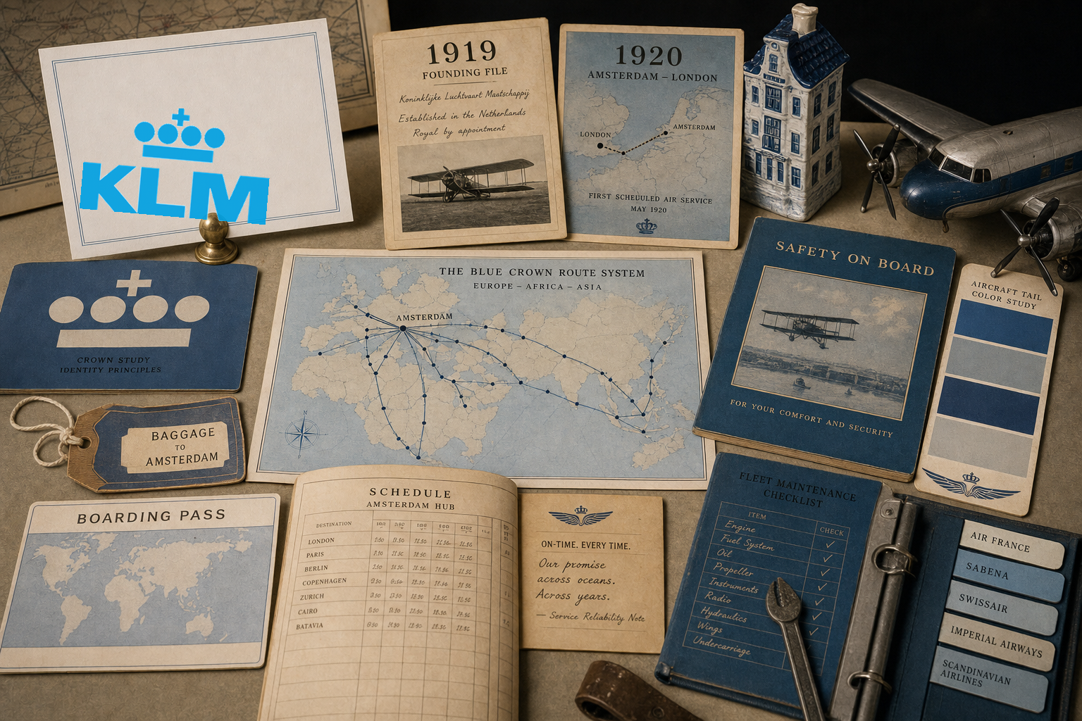
The brand joins the blue crowd

The palette feels credible but nobody remembers which company it was.

Trust theater

Color replaces evidence

The page looks stable while the claims stay unsupported.

Cold service

The brand feels distant

A human-service brand can become too formal if blue is not warmed by voice or type.

Weak action

The CTA disappears

Blue-on-blue systems often fail to create a clear next step.

Category mismatch

The brand needs appetite or urgency

Blue can cool down categories that need heat, taste, speed, or excitement.

Accessibility drift

Pale blue weakens contrast

Links, buttons, and body text become hard to read.

05

Blue decision checklist.

Use blue when
  • The buyer needs risk reduced.
  • Reliability, service, security, travel, infrastructure, or competence is central.
  • The brand has proof behind the trust cue.
  • The blue is distinct enough inside the category.
  • Type, accent, and layout give the system energy.
Avoid or adjust when
  • The category is already full of similar blue brands.
  • The brand needs appetite, urgency, or warmth first.
  • Blue is being used to make weak claims feel serious.
  • The palette has poor contrast.
  • The brand becomes calm but forgettable.
06

Use this for your brand.

Private brand work

Bring the cue problem to a real decision.

If your name, color, message, mark, or page is making buyers hesitate, use Private brand work before the public surface hardens.

Hire usRequest Private brand workUse this when the decision affects sales, trust, launch, rebrand risk, or buyer clarity.
07