Growyourbrand.net Branding guides from Grow Your Brand June 2026
Grow Your Brand Plain brand guides for clearer words, stronger proof, and cleaner decisions.

Branding guide · Typography

Brand typography is the voice people see before they read.

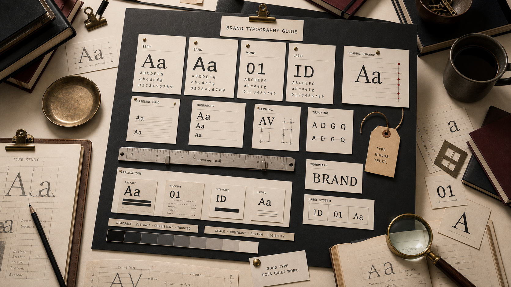
Fonts change how a name, promise, and page feel. Type can make a brand seem precise, warm, official, premium, cheap, fast, slow, playful, or hard to trust.

Choose the voice.The type should match how the brand wants to be heard.
Protect reading.A beautiful font that slows comprehension is a brand problem.
Build memory.Letter shape, case, and spacing can make the name easier to recognize.
Typography system board with serif, sans, display, uppercase, lowercase, and spacing samples.

Brand Typography

font · case · spacing · readability

Typography is not a decorative layer. It is the visible rhythm of the brand's language.
Brand type system board with font samples and approval notes.
The same words change meaning when the type changes.
01

What brand typography controls.

Typography sets visible tone.Before the sentence is understood, the type can feel formal, casual, technical, warm, expensive, playful, or blunt.
Typography controls speed.Readable type helps the buyer move. Difficult type makes the brand feel harder to use.
Typography builds word shape.A name can become more recognizable when its letters, case, and spacing stay consistent.
02

Font types and signals.

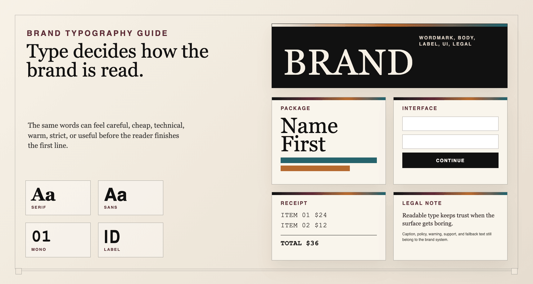
No font category is automatically good. The job is category fit plus reading quality.

Type
Often signals
Good use
Risk
Serif
Tradition, editorial authority, craft, ceremony
Luxury, publishing, culture, food, hospitality, legal
Fake heritage or weak small-size reading
Geometric sans
Order, technology, engineering, neutrality
Software, finance, architecture, systems, tools
Sameness and emotional coldness
Humanist sans
Practicality, access, warmth, public readability
Healthcare, service, education, government, everyday products
Too quiet without color or mark support
Display
Personality, memory, category mood
Packaging, headlines, entertainment, fashion, creator brands
Hard reading and short lifespan
Condensed
Pressure, speed, editorial punch
Sport, fashion, posters, compact packaging
Aggressive or cramped
Script
Personal, handmade, expressive
Food, beauty, hospitality, creator-led brands
Low trust and poor scalability
Monospace
Code, control, record, machinery
Developer tools, technical logs, data surfaces
Artificial tech feeling
03

Case, weight, and spacing.

Small typography decisions change the brand's body language.

Choice
Likely read
Use when
Watch for
Uppercase
Authority, volume, command, label
Short labels, luxury marks, sport, institutional brands
Shouting and reduced word shape
Lowercase
Human, accessible, casual, soft
Apps, service, care, lifestyle, everyday products
Low authority in serious categories
Heavy weight
Confidence, mass, simplicity
Retail, sport, tools, value brands
Bluntness or lack of refinement
Light weight
Precision, luxury, air
Premium editorial and quiet systems
Low readability and fragile UI
Tight spacing
Control, compactness, pressure
Short wordmarks and strong systems
Crowding and reduced legibility
Loose spacing
Premium, distance, ceremony
Luxury, editorial, formal identity
Pretension or weak small-size reading
04

Typography by surface.

A brand font must work where the buyer actually meets it.

Wordmark

Recognition first

Letter shape matters more than paragraph reading.

Homepage

Clarity and hierarchy

Headlines, decks, cards, and CTAs need a clear reading order.

Product UI

Speed and trust

The type must support repeated use and small labels.

Packaging

Distance and shelf read

The name, variant, and claim must survive lighting and movement.

Sales deck

Authority and density

The font has to carry proof without turning the page into a poster.

Support reply

Human readability

The brand voice fails if the font makes help feel cold or hard.

05

Typography checklist.

Approve when
  • The font matches the category and buyer expectation.
  • Body copy is easy to read on mobile.
  • The wordmark remains recognizable at small size.
  • Weights, case, and spacing have clear roles.
  • The font works with the logo, color, and voice.
Hold when
  • The font was chosen because it looks premium in a mockup.
  • Headlines are large because the page lacks content.
  • The type system breaks on cards, buttons, or mobile.
  • The font hides the name shape.
  • Every page invents a new hierarchy.
06

Use this for your brand.

Private brand work

Bring the cue problem to a real decision.

If your name, color, message, mark, or page is making buyers hesitate, use Private brand work before the public surface hardens.

Hire usRequest Private brand workUse this when the decision affects sales, trust, launch, rebrand risk, or buyer clarity.
07