Grow Your Brand Branding guides from Grow Your Brand June 2026
Grow Your Brand Plain brand guides for clearer words, stronger proof, and cleaner decisions.

Branding guide · Color

Brown and earth tones can signal material, craft, food, age, or durability.

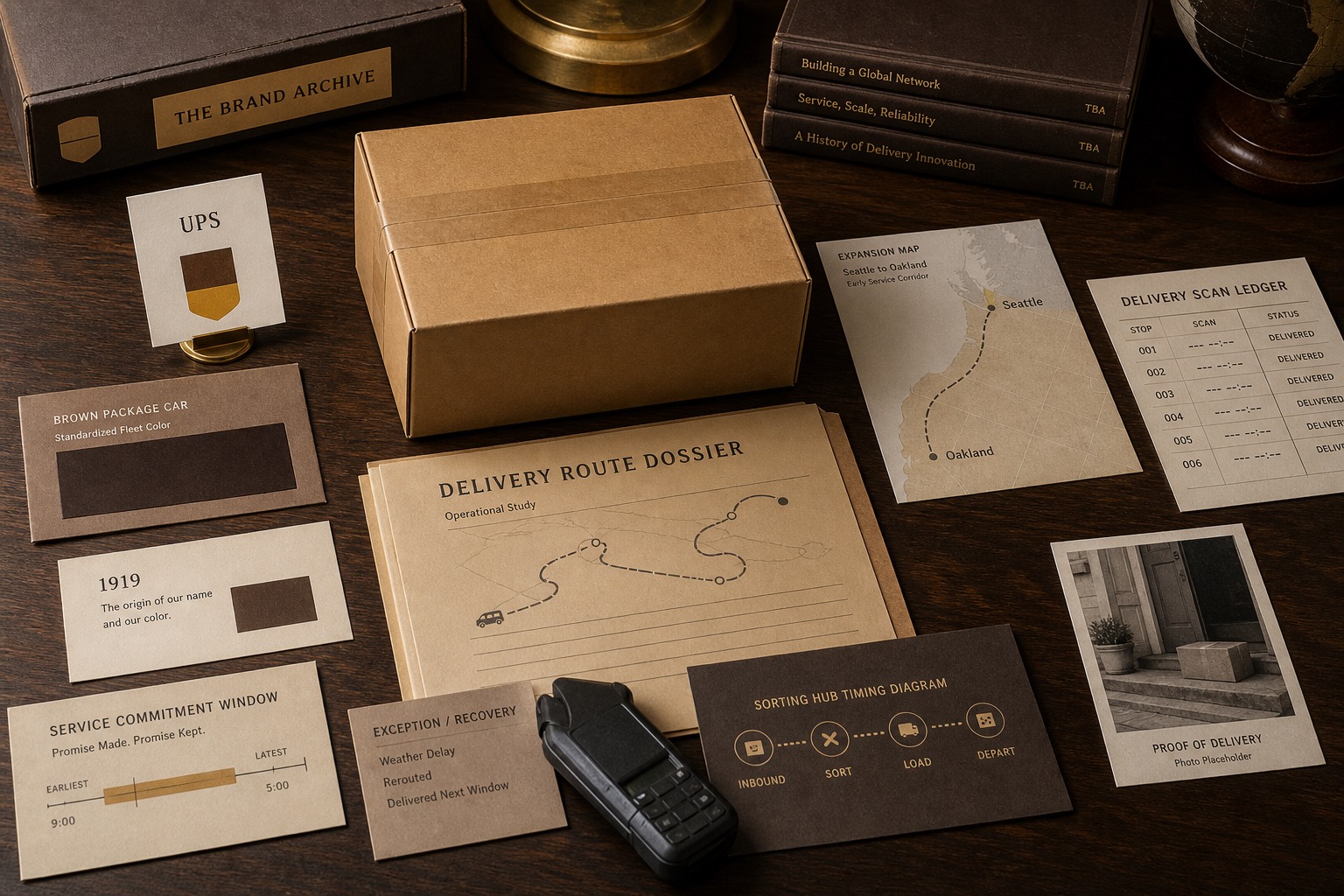
Brown can make a brand feel grounded, physical, warm, old, natural, or durable. It works when material proof matters and fails when it becomes dull, heavy, or nostalgic without reason.

Know the signal.Use brown when the brand needs material proof, craft, food warmth, outdoor durability, or grounded trust.
Know the risk.Avoid brown when it makes the brand feel dusty, slow, heavy, or falsely heritage-led.
Tie it to proof.Color should point to product, service, source, behavior, or a real buying situation.
Delivery surface showing brown used for utility, continuity, and trust.

Brown and Earth Tones in Branding

material · craft · food · durability

Earth tones work best when the buyer can feel the material truth behind them.
Brown delivery surface showing package, uniform, and trust cues.
Use brand examples to study the cue, not to copy the surface.
01

What brown and earth tones in branding can signal.

The color is a cue, not proof.Use brown when the brand needs material proof, craft, food warmth, outdoor durability, or grounded trust.
The color changes by context.Category, culture, material, contrast, type, nearby colors, and product truth change the read.
The color needs a job.Primary cue, accent, field, state color, product family, or campaign color should not all behave the same way.
02

Where it can work.

Use the color when the category and proof can support the signal.

Category
Why it can help
What must support it
Coffee and food
Roast, warmth, taste, and material appetite
Product quality and source proof
Outdoor and workwear
Durability, leather, soil, wood, and weather
Material and use proof
Furniture and home
Wood, craft, stability, and physical texture
Build quality and detail proof
Delivery and logistics
Package, utility, uniform, and trust
Operational reliability
Hospitality
Warmth, comfort, and old-world service
Actual service and space quality
Natural goods
Earth, source, and restraint
Ingredient and sourcing proof
03

How it changes with type, shape, and neighbors.

The same color can feel different when the shape, font, contrast, or second color changes.

Pairing
Likely read
Good use
Risk
Brown plus cream
Warm, craft, editorial
Food, coffee, hospitality
Overly beige or sleepy
Brown plus green
Nature, soil, source
Outdoor, agriculture, wellness
Generic natural brand
Brown plus black
Durable, premium, heavy
Leather, watches, workwear, furniture
Too dark and slow
Brown plus orange
Warmth and action
Food, retail, home, craft
Old retail feel
Brown plus serif
Heritage and ceremony
Hospitality, food, publishing, craft
Fake age
Brown plus condensed type
Work, utility, industrial
Outdoor, tools, logistics
Harshness
04

Where it fails.

Color failure is usually a role failure, a proof failure, or a category mismatch.

Dullness

Dullness

The brand feels slow before it feels trustworthy.

Fake heritage

Fake heritage

Earth tones imply age the company has not earned.

Mud palette

Mud palette

The color roles blur into one brown field.

Low contrast

Low contrast

Warm neutrals weaken text and controls.

Wrong appetite

Wrong appetite

Brown can cue food, coffee, or dirt when the brand needs clean precision.

Category aging

Category aging

The brand looks older than the buyer wants it to feel.

05

Brown and Earth Tones in Branding checklist.

Approve when
  • The brand has material, craft, food, outdoor, or durability proof.
  • The palette has enough contrast and lightness control.
  • Brown has a role beyond background warmth.
  • The brand benefits from grounded physical cues.
  • The tone feels current, not stale.
Hold when
  • The color is hiding weak product proof.
  • The page becomes beige and slow.
  • Heritage is implied but not true.
  • The buyer needs clean modern utility.
  • All neutrals collapse into one tone.
06

Use this for your brand.

Private brand work

Bring the unclear cue into private review.

If the name, color, message, mark, or page is making buyers hesitate, use private brand work before the public surface hardens.

Private reviewRequest private brand workUse this when the decision affects sales, trust, launch risk, or buyer clarity.
07