Grow Your Brand Branding guides from Grow Your Brand June 2026
Grow Your Brand Plain brand guides for clearer words, stronger proof, and cleaner decisions.

Branding guide · Color

Multicolor branding can signal range, platform, play, or complexity.

Multicolor systems work when the brand needs to show breadth, creativity, modules, or many user paths. They fail when every color competes and no cue owns recognition.

Know the signal.Use multicolor when the brand needs to show breadth, creativity, marketplace range, product families, or modular systems.
Know the risk.Avoid multicolor when the brand needs one strong cue, premium restraint, or a simple trust signal.
Tie it to proof.Color should point to product, service, source, behavior, or a real buying situation.
Technology platform surface showing multicolor cues organized around a simple core mark.

Multicolor Branding

range · platform · play · hierarchy

A multicolor brand still needs a hierarchy. Range without order becomes noise.
Multicolor search surface showing letters, product modules, and recognition cues.
Use brand examples to study the cue, not to copy the surface.
01

What multicolor branding can signal.

The color is a cue, not proof.Use multicolor when the brand needs to show breadth, creativity, marketplace range, product families, or modular systems.
The color changes by context.Category, culture, material, contrast, type, nearby colors, and product truth change the read.
The color needs a job.Primary cue, accent, field, state color, product family, or campaign color should not all behave the same way.
02

Where it can work.

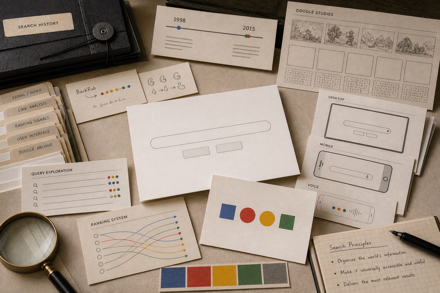
Use the color when the category and proof can support the signal.

Category
Why it can help
What must support it
Search and platforms
Many paths, tools, and surfaces
Consistent core shape or wordmark
Creative software
Expression, range, and flexible output
Clear product taxonomy
Education
Subjects, levels, and approachability
Readable hierarchy and accessible colors
Marketplaces
Many sellers, categories, and choices
Trust rules and buyer protection
Kids and entertainment
Play, energy, and recognition
Strong shape and rhythm
Product families
Variants, lines, and modules
Color roles that do not confuse function
03

How it changes with type, shape, and neighbors.

The same color can feel different when the shape, font, contrast, or second color changes.

Pairing
Likely read
Good use
Risk
Multicolor plus simple wordmark
Range held by one name
Platforms, search, marketplaces
Wordmark too weak to hold the palette
Multicolor plus grid
Order and modularity
Software suites, education, data
Corporate mosaic feel
Multicolor plus white
Open and flexible
Creative tools, public systems
Too much empty neutrality
Multicolor plus black
Play with control
Entertainment, fashion, campaigns
Color becomes decorative noise
Color-coded products
Clear family structure
Suites, catalogs, variants
Users confuse brand color with state color
One owner color plus accents
Recognition plus range
Most growing brands
Accents slowly take over
04

Where it fails.

Color failure is usually a role failure, a proof failure, or a category mismatch.

No owner cue

No owner cue

People remember colorfulness but not the brand.

Functional confusion

Functional confusion

Brand colors collide with status, alert, and product colors.

Childish read

Childish read

The palette feels playful when the decision is serious.

No hierarchy

No hierarchy

Every card, button, and heading competes.

Category blur

Category blur

The brand feels like a platform even when it sells one product.

Asset sprawl

Asset sprawl

Every team adds another color until the system has no rules.

05

Multicolor Branding checklist.

Approve when
  • The brand truly needs range or modularity.
  • One cue still owns recognition.
  • Color roles are written and enforced.
  • Functional colors are separate from brand colors.
  • The palette works in grayscale or single-color fallback.
Hold when
  • The brand needs one memorable cue first.
  • Multicolor is being used to make a thin offer look bigger.
  • The system has no rules for product, state, and brand color.
  • The page feels like a toy when the buyer needs proof.
  • A one-color crop no longer identifies the brand.
06

Use this for your brand.

Private brand work

Bring the unclear cue into private review.

If the name, color, message, mark, or page is making buyers hesitate, use private brand work before the public surface hardens.

Private reviewRequest private brand workUse this when the decision affects sales, trust, launch risk, or buyer clarity.
07