Grow Your Brand Branding guides from Grow Your Brand June 2026
Grow Your Brand Plain brand guides for clearer words, stronger proof, and cleaner decisions.

Branding guide · Color

Purple in branding can signal rarity, imagination, indulgence, or ceremony.

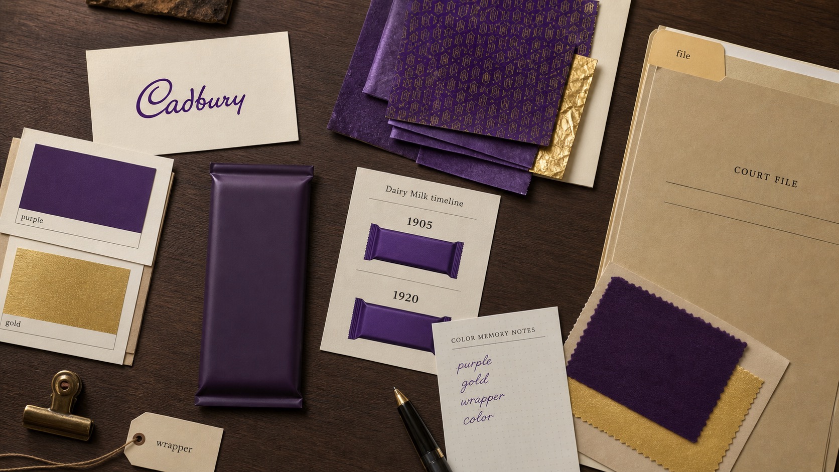
Purple can feel premium, creative, sweet, magical, or unconventional. It works when the brand can support that distance from the everyday and fails when it becomes artificial luxury.

Know the signal.Use purple when the brand needs creative distance, indulgence, ceremony, premium softness, or a non-default category cue.
Know the risk.Avoid purple when the brand needs plain utility, institutional trust, or proof before atmosphere.
Tie it to proof.Color should point to product, service, source, behavior, or a real buying situation.
Digital identity surface showing purple and gradient color used for recognition and mood.

Purple in Branding

rarity · imagination · indulgence · ceremony

Purple asks for permission. The product, service, or world has to make the color believable.
Purple confectionery wrapper surface showing product, shelf, and memory cues.
Use brand examples to study the cue, not to copy the surface.
01

What purple in branding can signal.

The color is a cue, not proof.Use purple when the brand needs creative distance, indulgence, ceremony, premium softness, or a non-default category cue.
The color changes by context.Category, culture, material, contrast, type, nearby colors, and product truth change the read.
The color needs a job.Primary cue, accent, field, state color, product family, or campaign color should not all behave the same way.
02

Where it can work.

Use the color when the category and proof can support the signal.

Category
Why it can help
What must support it
Beauty and personal care
Soft premium, self-expression, and ritual
Product texture, packaging, and ingredient proof
Confectionery
Indulgence, sweetness, and wrapper memory
Taste and shelf recognition
Entertainment and streaming
Imagination, fandom, and screen glow
Content and community proof
Creative tools
Imagination and non-corporate energy
Usability and output proof
Finance challengers
Category break from bank blue
Security and service proof
Hospitality
Ceremony, night, and indulgence
Service quality and physical experience
03

How it changes with type, shape, and neighbors.

The same color can feel different when the shape, font, contrast, or second color changes.

Pairing
Likely read
Good use
Risk
Purple plus gold
Ceremony and luxury
Premium packaging, hospitality, awards
Fake luxury
Purple plus black
Night, edge, entertainment
Streaming, music, fashion, gaming
Darkness without clarity
Purple plus white
Clean creative softness
Beauty, apps, personal care
Too delicate for serious proof
Purple plus rounded type
Playful, sweet, approachable
Confectionery, kids, social products
Childish feeling
Purple plus serif
Formal premium
Luxury, culture, hospitality
Theater without substance
Purple plus neon accent
Digital fantasy
Gaming, creator tools, events
Trend-led fatigue
04

Where it fails.

Color failure is usually a role failure, a proof failure, or a category mismatch.

Artificial premium

Artificial premium

The color suggests luxury the offer cannot prove.

Fantasy drift

Fantasy drift

The brand becomes atmospheric before it becomes useful.

Low clarity

Low clarity

Purple mood hides category and buyer value.

Sweetness mismatch

Sweetness mismatch

The brand accidentally feels like confectionery or kids' products.

Digital sameness

Digital sameness

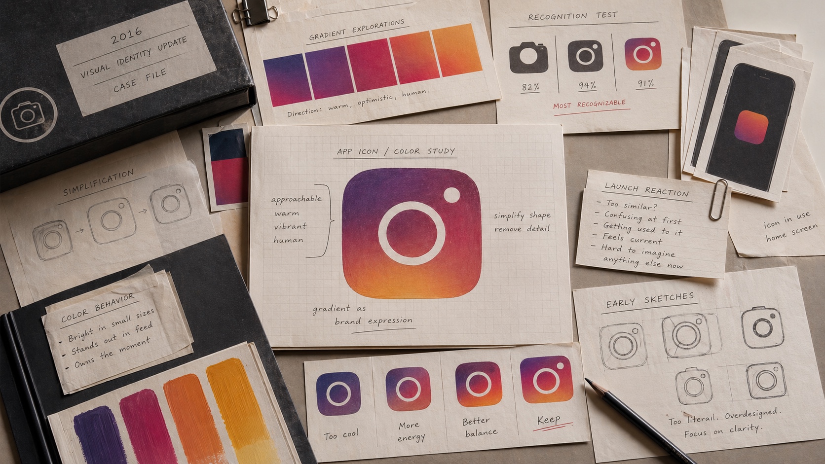
Software and creator brands overuse purple-blue gradients.

Contrast weakness

Contrast weakness

Soft purple fields can weaken text and controls.

05

Purple in Branding checklist.

Approve when
  • The brand can support rarity, imagination, indulgence, or ceremony.
  • The color creates useful category separation.
  • Proof appears before atmosphere takes over.
  • The palette avoids generic purple-blue gradient language.
  • Small text and controls stay readable.
Hold when
  • Purple is being used as instant luxury.
  • The category needs plain utility first.
  • The page feels magical but not clear.
  • The brand already lacks proof.
  • The palette looks like a trend template.
06

Use this for your brand.

Private brand work

Bring the unclear cue into private review.

If the name, color, message, mark, or page is making buyers hesitate, use private brand work before the public surface hardens.

Private reviewRequest private brand workUse this when the decision affects sales, trust, launch risk, or buyer clarity.
07