Every action feels like danger
Buttons, warnings, and errors become visually confused.
Branding guide · Color
Red can cue appetite, urgency, heat, danger, action, and dominance. It is useful when attention matters, and dangerous when the brand needs calm trust or careful judgment.
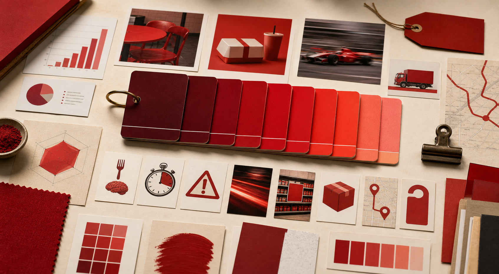
energy · appetite · urgency · risk
Red is strongest when the brand benefits from speed, appetite, presence, or action.
Red is useful because it is hard to ignore. That is also the problem.
Red fails when it is chosen for visibility without deciding what the visibility should do.
Buttons, warnings, and errors become visually confused.
Red can cheapen a premium offer if the system lacks restraint.
Buyers who need calm proof may feel pushed.
Large red fields can exhaust reading and reduce hierarchy.
A serious service can accidentally feel like fast food or emergency.
Long copy and small labels become harder to read.
If your name, color, message, mark, or page is making buyers hesitate, use Private brand work before the public surface hardens.