Short Answer
Brown and earth tones are physical-proof brand colors. They can signal craft, durability, delivery, outdoor work, repair, material trust, and use over time.
Page Map
Read brown and earth by use.
Color Meaning
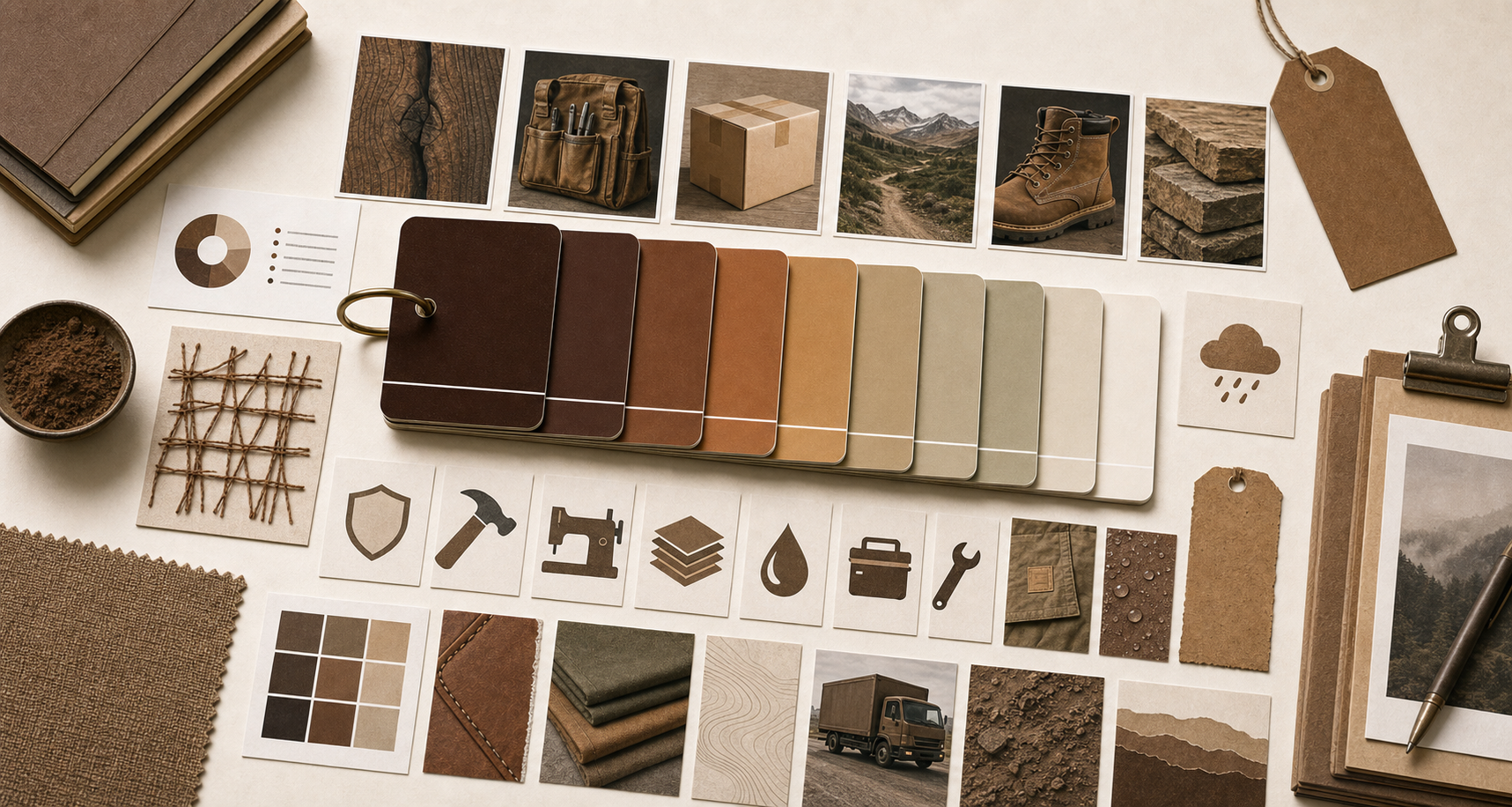
Earth tones work when material proof is visible.
Brown, tan, khaki, clay, and workwear yellows feel strongest when the brand can point to labor, material, weather, delivery, or survival.
Earth tones work when the brand can point to material, labor, or use. They feel false when they are only nostalgia.
The color earns its place when that role repeats on real surfaces: signs, packaging, vehicles, app icons, uniforms, checkout screens, service pages, and product rituals.
Where It Works
Earth colors need contact with the real world.
Delivery, workwear, outdoor gear, skincare, and repair brands can all use earth tones when the product gives the color a physical job.
01
Delivery and operational trust
Brown can become trustworthy when it is attached to a repeated service behavior.
02
Outdoor durability
Earth tones work when the object is expected to survive weather, wear, travel, or repeated use.
03
Craft and sensory restraint
Earth tones can make a brand feel grounded when the product has texture, scent, material, or ritual.
How To Use It
Use earth tones when the brand is built from material and use.
Earth tones can feel durable or nostalgic. The difference is proof.
01
Use earth tones when the brand can show wear.
These colors work when the product gains meaning through material, field use, repair, or repeated handling.
02
Make nostalgia earn its place.
Earth tones can feel classic or fake. They need a product reason, not only a mood-board reason.
03
Do not use earth tones to hide weak quality.
A brown or natural palette can imply craft. If the product feels cheap, the color makes the gap more visible.
Brown and Earth Brand Color FAQ
What do brown and earth tones mean in branding?
They often signal craft, durability, delivery, outdoor use, material trust, repair, and physical proof.
Are earth tones good for premium brands?
They can be premium when material, craft, store experience, or product durability supports the palette.
Which brands use brown and earth tones well?
The Brand Archive examples include UPS, Carhartt, Timberland, Yeti, Patagonia, Canada Goose, and Aesop.
When should a brand avoid earth tones?
Avoid them when the product has no material proof and the palette is only trying to borrow authenticity.