Short Answer
A brand color is not a personality shortcut. It is a recognition cue. It works when customers see it repeatedly in the same kind of decision moment and the product gives the color something true to carry.
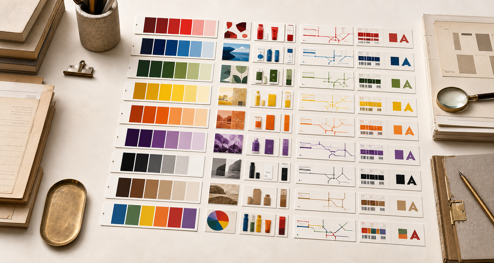
Color Map
Use color as a decision tool.
Theory
A color signal has to earn its memory.
The common mistake is choosing color as a personality label. That makes red mean energy, blue mean trust, green mean nature, and black mean luxury.
Real brands do not get meaning that cheaply. A color becomes useful when the product, setting, and repeated behavior give people the same cue enough times to remember it.
Start by naming the job. Does the brand need to be found from a distance, trusted in a payment moment, recognized on a package, opened in an app grid, seen on a vehicle, or worn by staff?
Then check whether the color can keep that job across boring surfaces. A color that works only in a brand deck will usually fail where customers actually meet the company.
How To Choose
Choose color by job, not by mood.
Start with the place where the brand has to be found, trusted, bought, opened, worn, delivered, or repeated.
Then test whether the color can keep that job across the surfaces people actually see.
01
Start with the buying moment.
A useful color decision begins where the customer has to notice, choose, trust, or repeat the brand. Shelf, street, app icon, uniform, payment screen, package, and vehicle livery all put different pressure on color.
02
Check the category before choosing the meaning.
Color does not carry one universal message. Green in grocery, green in banking, green in search, and green in beauty each ask the market to read a different kind of proof.
03
Decide what must stay constant.
A color system needs one or two repeatable anchors. The rest can flex by product, season, market, or campaign only after the anchor is protected.
Color Families
Every color needs a category reason.
The same color family can carry speed, safety, appetite, authority, craft, value, ritual, or play.
The difference comes from category, repetition, and proof.
Red
Speed, appetite, danger, urgency, and visible energy.
Red works when the brand can handle attention. It can make a product faster to notice, but it also raises the emotional temperature.
Blue
Trust, infrastructure, finance, logistics, healthcare, and technical competence.
Blue lowers the perceived risk of a system when the product already has to feel reliable. It weakens when it becomes only corporate wallpaper.
Green
Nature, repair, health, growth, responsibility, and renewal.
Green is strongest when the operation can prove care. If the company claims virtue faster than it changes behavior, the color can become evidence against it.
Yellow
Visibility, optimism, field recognition, warning, and practical utility.
Yellow earns its place when distance recognition matters. It is less about happiness than about being found fast.
Orange
Warmth, value, construction, youth, movement, and approachable energy.
Orange is useful when the brand needs to feel active without feeling severe. It can turn a store, app, package, or channel into a warmer decision point.
Purple
Imagination, indulgence, creative difference, and category contrast.
Purple works best when it gives the brand a place competitors do not already own. It fails when the product gives no reason for the difference.
Black and White
Control, restraint, luxury, simplicity, edge, and editorial authority.
Black and white can make a brand feel controlled, but only if the product, store, packaging, and copy all carry the same restraint.
Brown and Earth
Craft, durability, delivery, outdoor work, material trust, and physical proof.
Earth tones work when the brand can point to material, labor, or use. They feel false when they are only nostalgia.
Multicolor
Range, access, play, product families, marketplaces, and platform breadth.
Multicolor needs order. Without a system, it becomes noise; with a system, it can make breadth feel usable.
Logo Color Edge Cases
Some logo colors are usage rules, not new color families.
White logos, metallic marks, gold, pink, teal, cyan, and gradients do not always need separate guide pages.
They need routing. The right question is which existing color job they are doing in the real brand system.
01
White and inverted logos belong in black and white.
A white mark is usually not a separate color strategy. It is an inversion strategy: the brand is using contrast, negative space, and surface control so the mark survives on signs, video, packaging, uniforms, and app tiles.
02
Gray, silver, chrome, and metallic marks are neutral systems.
Metallic color is usually about precision, machinery, finance, mobility, luxury, or engineering. It should be read through black and white, blue, or material proof, not as a mood-chart color.
03
Gold sits between yellow, brown, and material proof.
Gold can mean reward, indulgence, ritual, luxury, or heritage. It fails when it is only a premium costume and the product has no material, scarcity, or ceremony behind it.
04
Pink, coral, and hot pink split between red, orange, and purple.
These colors can carry warmth, beauty, youth, finance contrast, or social energy. The correct guide depends on the job: appetite and urgency, approachable value, or category difference.
05
Teal and cyan sit between blue and green.
Teal can make trust feel more human, medical, digital, or fresh. It is not a universal color meaning. It has to prove whether it is lowering risk, signaling care, or making a technical system feel usable.
06
Gradients and rainbow systems belong in multicolor.
A gradient is not automatically modern. It works when the brand needs breadth, creator energy, platform range, or motion, and when the system still has one repeatable anchor.
Bad Decisions
Color fails when it carries a promise the business cannot prove.
The weak move is asking color to do strategy by itself.
The stronger move is making color repeat a real product, service, or operating truth.
01
Do not choose color from taste alone.
The question is not whether the founder likes it. The question is whether the color helps a customer recognize the brand faster in the real environment.
02
Do not ask color to repair weak proof.
Blue cannot create trust by itself. Green cannot create responsibility by itself. Black cannot create luxury by itself. The product and behavior have to earn the signal.
03
Do not ignore contrast and access.
A brand color that looks good in a deck can fail on signage, packaging, mobile screens, receipts, and small icons. Contrast is part of meaning because visibility changes trust.
Brand Colors FAQ
What is brand color psychology?
Brand color psychology is the study of how color helps people recognize, interpret, and remember a brand. It is useful only when it is tied to category, repetition, product proof, and the buying moment.
Which color is best for a brand?
There is no universal best color. The better question is what the customer must notice or trust first, and which color can repeat that job across the brand's real surfaces.
Can a brand use more than one color?
Yes, but multicolor systems need order. A primary anchor, clear roles, and repeated rules keep a broad palette from becoming noise.
Where do white logos, metallic marks, pinks, teals, and gradients fit?
White and inverted logos fit under black and white. Silver and chrome usually fit under neutral or material proof. Gold sits between yellow and earth tones. Pink and coral split between red, orange, and purple. Teal and cyan split between blue and green. Gradients belong in multicolor when they have a system.
When should a brand change color?
A color change is safer when the old cue is weak, misleading, or no longer tied to the business. It is risky when the old color is still one of the fastest ways customers find the brand.