Short Answer
Multicolor is a range brand system. It can signal access, play, product families, marketplaces, platforms, and breadth, but only when the palette has rules.
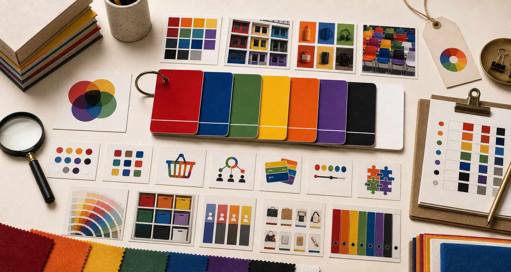
Page Map
Read multicolor by use.
Color Meaning
Multicolor works when breadth has order.
A multicolor brand can feel open, useful, playful, or platform-like. Without structure, it becomes noise.
Multicolor needs order. Without a system, it becomes noise; with a system, it can make breadth feel usable.
The color earns its place when that role repeats on real surfaces: signs, packaging, vehicles, app icons, uniforms, checkout screens, service pages, and product rituals.
Where It Works
Multicolor helps brands organize many things.
Search, software, payments, marketplaces, creative tools, and social apps can use many colors when the customer understands the system.
01
Platform breadth
Multicolor can make a broad system feel accessible when the core mark or interface keeps the range organized.
02
Networks and marketplaces
Many colors can signal many participants, products, sellers, creators, or use cases, but the customer still needs a clear anchor.
03
Play and access
Multicolor can make the brand feel open and usable when the product helps people create, search, pay, share, or navigate.
How To Use It
Use multicolor when range is part of the promise.
Multicolor should not mean anything goes. It needs a repeatable rule.
01
Use multicolor when the brand really has range.
Many colors work when breadth is a real product truth: search, software, marketplace, creative access, or payment networks.
02
Protect one anchor.
A multicolor system needs a stable mark, shape, sequence, interface, or grid that keeps recognition intact.
03
Do not let color become clutter.
Multicolor fails when every surface invents a new rule and the customer cannot tell what matters.
Multicolor Brand Color FAQ
What does multicolor mean in branding?
Multicolor often signals range, access, play, product families, marketplaces, platforms, and breadth.
Is multicolor good for a brand?
Multicolor is good when the brand has a clear system. Without rules, it becomes visual noise.
Which brands use multicolor well?
The Brand Archive examples include Google, Microsoft, Mastercard, Canva, eBay, and Instagram.
When should a brand avoid multicolor?
Avoid multicolor when the brand needs one sharp memory cue and does not have a rule for how the palette behaves.