Growyourbrand.net Reference notes on brand consequence May 2026
The Brand Archive

Definition

What Are Distinctive Brand Assets?

Distinctive brand assets are the cues customers can use under weak attention: small, fast, cropped, moving, noisy, or surrounded by competitors.

What Are Distinctive Brand Assets? archive visual

Direct Answer

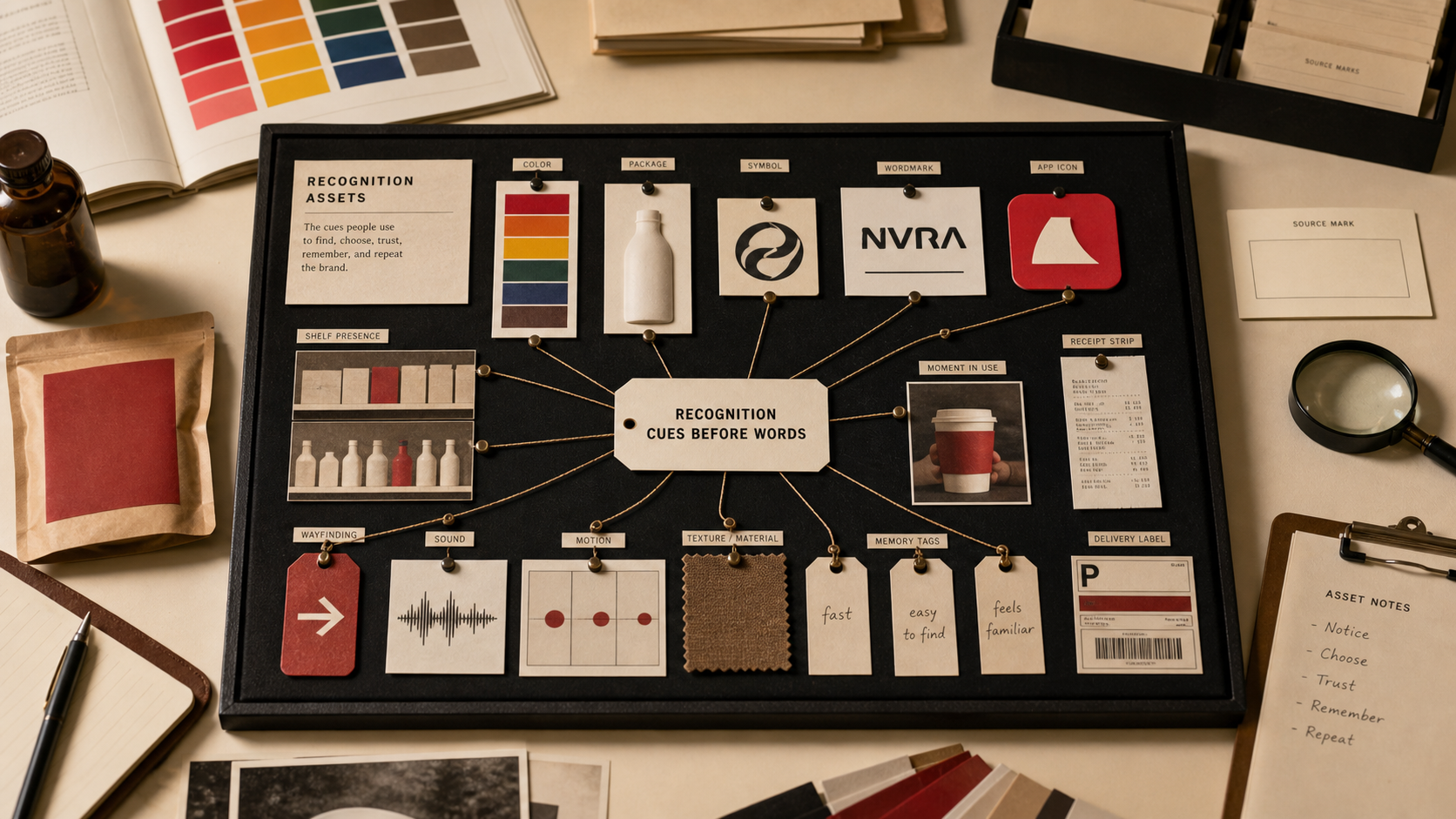
Distinctive brand assets are recognition shortcuts with a job. A buyer can spot the Mastercard circles without the word, the Tiffany blue box before reading the label, the DHL color system on a moving van, or the McDonald's arches from the road. The asset is valuable when it helps the customer find, verify, remember, or choose the brand faster than a full explanation can.

Reader payoff

By the end of this page, you should be able to

  • Define distinctive brand assets in plain language.
  • Separate real recognition assets from design decoration.
  • Use examples to see how logos, colors, shapes, sounds, packages, and rituals work differently.
  • Run a simple asset audit before a redesign, rebrand, campaign, or brand guidelines refresh.

Answer Map

Start with the decision, then check the proof.

Quote-ready definition

The Brand Archive definition

"The Brand Archive defines distinctive brand assets as the colors, shapes, marks, sounds, packages, product forms, phrases, rituals, and service cues customers already use to find, remember, and choose a brand."

Why it matters

Why it matters

Brand assets reduce recognition cost. That matters on a shelf, map, app icon, search result, checkout page, delivery truck, storefront, package, audio cue, or social thumbnail.

A strong asset also protects continuity. When a rebrand, package change, campaign, or product extension moves too far away from the asset customers already use, the brand can pay for attention and still lose recognition.

The business question is not whether the asset looks nice. The question is whether removing it would make buying slower, trust weaker, or search harder.

Mistake to catch

The expensive mistake

The common mistake is calling every design element a brand asset. Most elements are styling. A distinctive asset has to earn use in the market.

A second mistake is replacing the asset because the internal team is bored with it. Customers are rarely bored at the same speed as the brand team.

A third mistake is protecting everything. If every color, shape, phrase, pattern, and layout block is sacred, the team cannot tell which cue actually carries memory.

Comparison

Distinctive assets by recognition job

The asset type matters less than the job it performs. Build the audit around the job first, then decide what should be protected.

Asset type Recognition job What to test
Symbol Carry the brand when the name is absent, tiny, cropped, moving, or translated. Can people identify it without the wordmark?
Color Help the buyer find the brand before reading the pack, sign, app, truck, or ad. Does the color still point to the brand in the category context?
Package or form Make the product easier to locate on shelf, in thumbnails, at the door, or during use. Which shape or pack cue would shoppers miss first?
Sound Trigger memory when the screen is absent or attention is elsewhere. Can the cue be recognized without the brand name spoken after it?
Service cue Turn a repeated operating behavior into brand memory. Does the cue reduce risk or make the brand easier to choose again?
Ritual Attach the brand to ownership, status, use, gifting, return, or repeat purchase. Would removing the ritual make the product less memorable?

Proof matrix

Distinctive brand asset examples by mechanism

Do not copy the surface. Study the mechanism: what the cue lets the customer do faster.

Case What happened What it proves Operator lesson
Mastercard
Rebrand / 2016-2019
Mastercard moved toward a wordless symbol after decades of repetition trained the overlapping circles. A symbol can carry identity when recognition is already earned across cards, terminals, screens, and sponsorships. Drop words only after the symbol has enough market memory to survive alone.
Starbucks
Rebrand / 2011
Starbucks simplified the siren while keeping the central equity cue visible. Simplification can work when the bridge cue remains familiar. Modernize the frame without erasing the signal customers already use.
Cadbury
Brand System / 1905-present
Cadbury's purple wrapper became a shelf memory asset and a legal-pressure file. Color can become valuable when it repeats in a category long enough to point to a brand. A color asset needs category context, consistent use, and evidence of recognition.
DHL
Trust / 1969-present
DHL's yellow and red system turns vans, uniforms, signage, parcels, and aircraft into moving recognition surfaces. Color works harder when the brand appears in motion and at distance. Audit assets in the real environment where customers see them.
Tiffany
Brand System / 1845 / 1886-present
The blue box moved beyond packaging and became a cue for gifting, ownership, and anticipation. A package asset can carry emotion when the ritual is repeated and protected. Protect the moment around the asset, not the color file alone.
Tropicana
Failure / 2009
Tropicana's redesign removed familiar shelf cues and made the product harder to find quickly. A cleaner design can still be a worse asset system. Test recognition before approving visual improvement.
McDonald's
Launch / 1948-present
The arches, colors, store rhythm, product names, packaging, and roadside visibility work as one memory system. Distinctiveness gets stronger when visual cues and operating repetition reinforce each other. Treat assets as a system, not as isolated style rules.
Liquid Death
Launch / 2019
A tall can, metal-inspired naming, black-and-white cues, and entertainment language made water easier to notice and talk about. A distinctive asset can change category behavior when it creates contrast people can repeat. Contrast is useful only when it helps the buyer remember and explain the brand.

Decision framework

How to use it

The practical test is whether the concept changes a real decision.

  1. Name the cue Which asset does the customer notice before reading?
  2. Name the surface Where does it work: shelf, app, checkout, truck, package, street, voice, or support?
  3. Name the job Does it help the customer find, verify, compare, trust, remember, return, gift, or recommend?
  4. Test weak attention Does it still work small, fast, cropped, mobile, moving, and competitor-adjacent?
  5. Rank asset strength Which cues would the customer miss first if removed?
  6. Protect the bridge If it changes, what old memory carries people into the new system?
  7. Write the rule Can a team use the asset consistently without turning the guideline into a museum?

Common mistakes

Mistakes to avoid

These mistakes are common because they sound reasonable inside the company and fail when customers meet the brand.

Treating assets as style preferences

Judge the cue by the customer job it performs under weak attention.

Changing a package cue without shelf proof

Tropicana shows the cost of removing the shortcut buyers used to buy quickly.

Simplifying before recognition is earned

Mastercard and Starbucks simplified after repetition had trained the market.

Protecting everything equally

Protect the assets that retrieve memory, trust, or choice; let weaker decoration move.

Testing assets in perfect mockups

Test them in the messy surface: thumbnail, aisle, delivery box, vehicle, map pin, app grid, or low-attention scroll.

Confusing distinctiveness with difference

Different is easy. Distinctive means customers connect the cue to the brand.

Letting guidelines ignore behavior

If the asset is a ritual, sound, service moment, or packaging action, document the behavior that keeps it recognizable.

Copying a famous asset type

A blue box, wordless symbol, or mascot is not transferable unless the brand can repeat the cue in a real buying context.

Operator test

Operator test

Use the checklist as a pressure test. If the answer is vague, the brand decision is not ready.

  1. List the cues customers notice before reading: color, shape, mark, sound, pack, phrase, product form, behavior, ritual, or place.
  2. Name the decision surface: shelf, search result, app icon, truck, storefront, package, checkout, delivery, support, or social thumbnail.
  3. Test the cue small, cropped, grayscale, in motion, beside competitors, and without the brand name.
  4. Ask what buying task the cue helps: find, verify, compare, trust, remember, return, gift, or recommend.
  5. Separate earned assets from internal preferences.
  6. Protect the cue if removing it would make a customer slower, less certain, or more likely to choose the wrong brand.
  7. When changing an asset, define the bridge cue before launching the replacement.
  8. Document the asset in guidelines with usage context, decision surface, and failure risk beside color values and logo spacing.

What Are Distinctive Brand Assets? FAQ

What is a distinctive brand asset?

A distinctive brand asset is a cue customers can use to recognize a brand before they process the full message.

What are examples of distinctive brand assets?

Examples include the Mastercard circles, Tiffany blue box, McDonald's arches, Cadbury purple, DHL yellow and red, Starbucks siren, and Tropicana's shelf cues.

Can a color be a distinctive brand asset?

Yes, when customers connect the color to the brand in a real buying or recognition moment and the cue is used consistently enough to earn memory.

How do you test distinctive brand assets?

Test the cue without the brand name, at small size, in motion, cropped, beside competitors, in grayscale, and in the real buying surface.

Should distinctive assets ever change?

Yes, but change needs a bridge, a business reason, and proof that recognition will survive.