Short Answer
Typography is not font taste. It is a reading system. It tells people whether to skim, slow down, trust, compare, buy, sign in, keep reading, or remember the name.
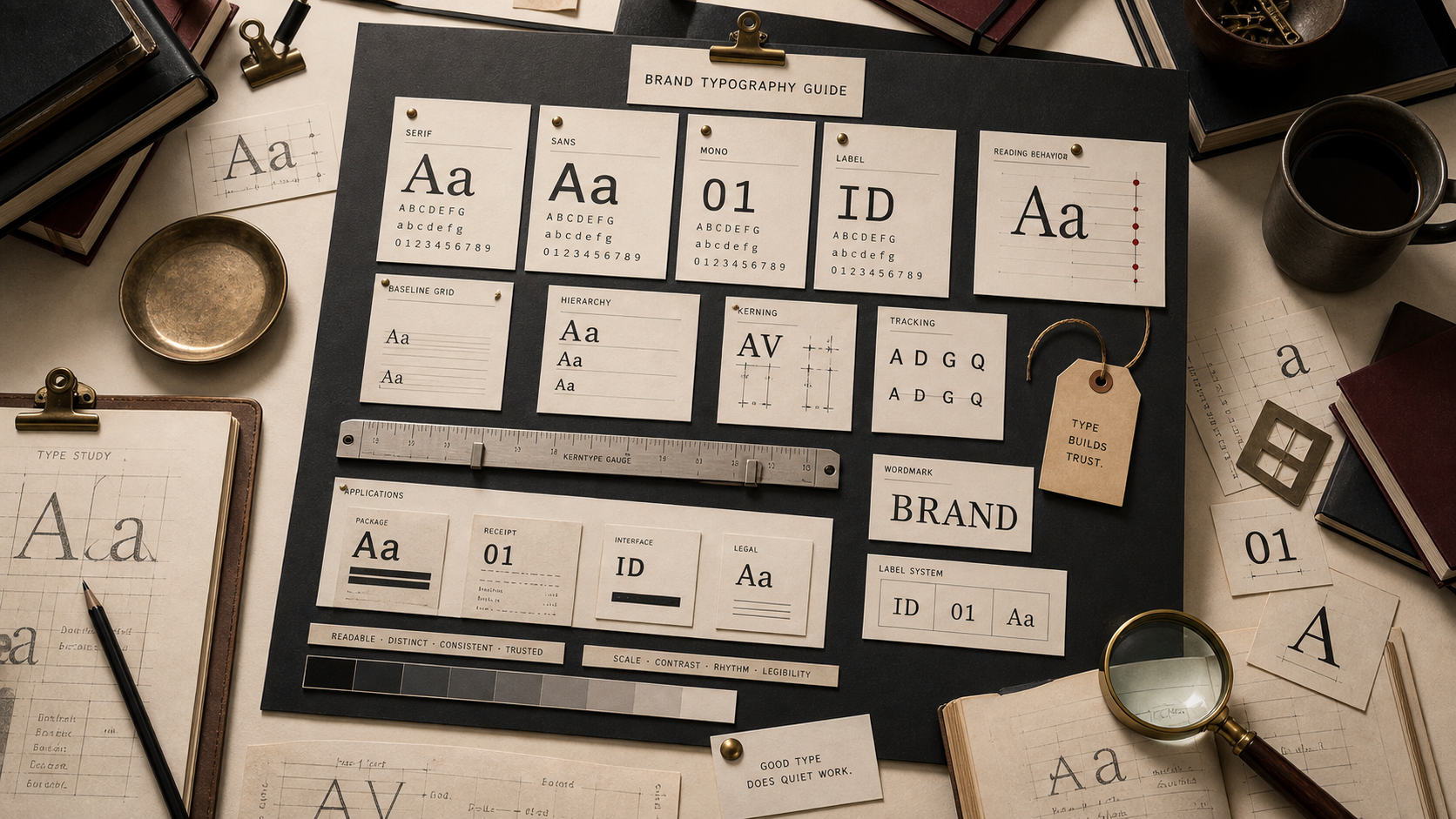
Type Map
Use type as a reading system.
Theory
Type changes the behavior before the sentence lands.
People read type before they read words. Size, weight, spacing, case, rhythm, and shape tell them whether the brand feels careful, cheap, technical, soft, fast, or strict.
That makes typography a business decision. The type has to work where the brand is used, not only where it is presented.
A good type system gives the brand one voice without forcing every surface to shout. A homepage headline, product label, checkout button, receipt, support answer, and legal note do not need the same volume.
The useful test is not whether the typeface looks good in a deck. The test is whether it makes the brand easier to recognize and easier to trust when the customer is busy.
How To Choose
Choose type by job, then by personality.
Start with the surfaces where the type must survive. Then decide which parts need expression and which parts need quiet utility.
The stronger system usually has fewer fonts and clearer rules.
01
Start with the surface.
A font that looks strong in a launch mockup can fail on a receipt, package side panel, app setting, support page, or shipping label. Typography starts with the smallest repeated surface.
02
Separate tone from reading.
Display type can carry attitude. Body and UI type have to carry use. A brand weakens when the expressive font is forced into jobs where people need speed, clarity, or trust.
03
Test the system before the launch graphic.
A useful type system survives the boring list: product names, prices, help text, warnings, legal notes, navigation, captions, emails, and small mobile screens.
Type Roles
Every type choice needs a reading job.
Body type, display type, UI type, label type, and wordmarks should not be judged by the same standard.
Each one carries a different piece of the brand's memory.
01
Body type earns trust by disappearing.
If the reader notices the body font before the argument, the font is doing too much. Body type should make claims easier to inspect, compare, and believe.
02
Display type sets temperature.
A headline face can make the same sentence feel severe, generous, technical, playful, cheap, or expensive before the copy has time to argue.
03
UI type makes the brand usable.
Buttons, menus, settings, alerts, forms, captions, and onboarding screens decide whether the brand feels reliable under use. Nice type that slows the task becomes a cost.
04
Wordmarks turn letters into memory.
A wordmark teaches the name, pace, category, and seriousness every time the mark appears.
Typeface Families
Read type families by behavior, not fashion.
Serif, sans, mono, script, condensed, and display type all change the customer's pace.
The wrong family can make a serious brand feel flimsy or make a useful brand feel harder to use.
Serif
Editorial authority, tradition, long reading, permanence, and premium restraint.
Use serif type when the brand benefits from slower inspection, cultural weight, or a more book-like reading rhythm.
Sans
Clarity, modernity, public systems, interfaces, logistics, and everyday utility.
Use sans type when the brand has to stay clear across screens, signs, labels, forms, and fast public reading.
Mono and Technical
Control, infrastructure, precision, code, machines, finance, and operational proof.
Use mono or technical type when the brand needs to make systems, data, checks, or engineering feel inspectable.
Script and Hand
Warmth, craft, human touch, ritual, food, beauty, and personal service.
Use script or hand-drawn type only when the brand can keep the human signal readable. If it becomes decoration, it weakens trust.
Condensed and Label
Packaging, tickets, badges, warnings, sports, field marks, and constrained spaces.
Use condensed type when space is the problem and recognition still has to survive. Tight type needs discipline around contrast and spacing.
Display and Custom
Distinctive voice, campaign memory, launch expression, and category contrast.
Use display type when it creates a recognizable voice, then pair it with a quieter system for the work surfaces.
Bad Decisions
Typography fails when it asks style to replace clarity.
The weak move is choosing the font before defining the reading job.
The stronger move is making the type prove itself on the surfaces customers actually use.
01
The font is chosen for taste, not work.
A founder, designer, or agency can like a typeface that customers struggle to use. The market does not care what looked tasteful in the deck.
02
The expressive face gets used everywhere.
A loud display face can be useful in headlines and terrible in instructions, forms, labels, checkout, legal notes, and support pages.
03
The wordmark forgets the name still has a job.
Over-simplifying letters can make the mark feel cleaner while making the name harder to learn, pronounce, search, or trust.
Brand Typography FAQ
What should brand typography decide?
Brand typography should decide how the brand is read: fast, careful, premium, technical, warm, strict, public, or private.
Should a brand choose serif or sans first?
Choose the job first. Serif can help when authority, restraint, or long reading matters. Sans can help when public clarity, interface use, or fast scanning matters.
Is a wordmark just text?
No. A wordmark is a memory tool. It teaches the name, tone, pace, and category while the market is still learning the brand.
How many fonts should a brand use?
Use as few as the system can survive with. Most brands need one clear reading family, one controlled display voice, and rules for weight, scale, spacing, and fallback use.
What is the fastest typography test?
Set the same brand in a hero headline, product label, mobile form, receipt, support answer, and legal note. If one type choice cannot survive those surfaces, the system is not ready.