Failure / CPG / 2009
Tropicana and the Cost of Losing the Shelf Cue
The redesign case sits at the center of recognition equity: when the asset is visual memory, improvement starts by protecting the cue shoppers already use.

Short Answer
Tropicana and the Cost of Losing the Shelf Cue is a failure case about Tropicana in 2009. A familiar shelf signal was replaced by a cleaner visual system, exposing how packaging can carry recognition more than preference. The decision lesson is procedural: identify the visual elements that carry retrieval before judging what looks current. Recognition cues are protected. Aesthetic preferences are negotiable.
Brand Entity
Tropicana has a parent brand file.
Tropicana: brand decisions on file collects the filed cases, source trail, concept paths, and primary visual proof for this brand.
Key Takeaways
- The redesign removed the orange-with-straw cue that shoppers used to find the product quickly.
- The new pack made the brand look cleaner in isolation, but weaker in the shelf environment where the decision happened.
- Reported sales declines after launch turned a packaging update into a commercial reversal.
- The case shows why package redesigns must be tested against retrieval, variant clarity, and shelf speed.
The Decision
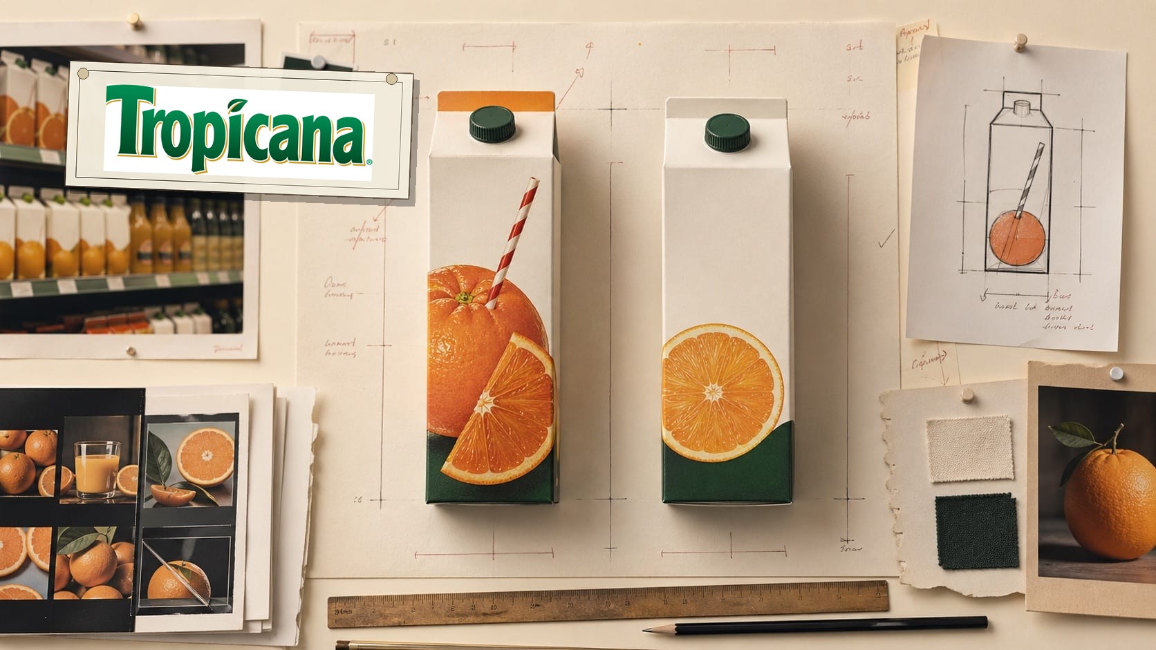
In January 2009, Tropicana introduced redesigned packaging for Tropicana Pure Premium orange juice in the United States. The work, associated publicly with Arnell Group, replaced the familiar orange pierced by a straw with a cleaner image of orange juice in a glass. The brand presentation became more minimal, the wordmark orientation changed, and the familiar shelf code became quieter.
The decision was understandable at a surface level. Food and beverage brands often update packaging to feel cleaner, fresher, and more current. But Tropicana was not changing a low-memory asset. It was changing a package that shoppers used as a shortcut. In a refrigerated aisle, customers do not study every carton. They scan for signals they already know.
The package also changed more than one cue at the same time. The orange-with-straw image became quieter, the product image became more literal, the cap became part of the orange idea, and the name moved into a different reading pattern. That made the change harder to isolate. If the shopper hesitated, the team could not easily tell which removed cue had done the most work.
What Changed On Shelf
The orange-with-straw image did more than communicate freshness. It created an ownable visual device: a whole orange turned into a drinking experience. That cue was fast, specific, and difficult to confuse with a generic juice glass. The redesign replaced that memory structure with a more literal product image, which made the carton less immediately identifiable among neighboring orange juice products.
The old cue also worked across distance and partial attention. A shopper could catch the orange, straw, green cap, carton shape, and color field without reading the full name. The redesign asked the shopper to relearn a quieter package while the category still contained other cartons, oranges, glasses, pulp variants, price tags, and private-label choices.
This distinction matters because packaging does not live in a presentation deck. It lives under fluorescent store light, next to private label cartons, competing national brands, price tags, fridge doors, and hurried shoppers. A redesign can win in isolation and still fail at the moment of recognition.
The Reversal
Reports at the time described a swift consumer backlash. Tropicana announced that it would bring back the previous package, including the familiar straw-in-orange visual, after complaints came through blogs, email, and other public channels. NPR described complaints that the new box resembled a generic store brand, and reported that a company executive had underestimated the attachment some customers had to the original package.
Convenience Store News also covered the reversal and quoted Tropicana saying that the company heard consumers, listened, and responded to the attachment customers had to what they saw as their Tropicana. BrandlandUSA reported on February 25, 2009, that PepsiCo would bring back the old package after the outcry and noted that the packaging was created by Arnell.
The commercial reporting made the reversal harder to dismiss as a loud-minority story. Advertising Age reported that Tropicana Pure Premium sales fell sharply between January 1 and February 22, 2009, with unit sales down 20 percent and dollar sales down 19 percent. The important point is not merely the exact number. It is the speed at which a packaging decision became visible in the business.
The Recognition Lesson
The Tropicana file is a shelf-recognition case. It shows that visual equity can sit inside a single recurring cue, and that the cue may be more commercially important than the team realizes. The orange with a straw was not a nostalgic flourish. It was a retrieval device. It helped a shopper locate the product and confirm that the product was the same one they intended to buy.
A redesign brief can ask for freshness, modernity, simplicity, or premium feel. None of those goals is wrong. The danger comes when those goals are allowed to erase the cues that carry memory. A package can become more elegant while becoming less findable. In grocery, less findable is not a design issue. It is a revenue issue.
The Operating Pattern
The operating lesson is to test redesigns in the conditions where the decision occurs. That means shelf context, speed, adjacent competitors, variant recognition, distance, and repeat-purchase behavior. Asking whether customers like a cleaner package is not the same as asking whether they can find the brand at a glance.
The test also needs to separate the assets. A package team should know whether the orange, straw, cap, color field, wordmark, carton shape, or variant label is carrying retrieval. If several cues change together, the launch becomes a live experiment in which the customer pays the cost of the confusion.
Tropicana also shows why redesign decisions need a protected-assets map before creative exploration begins. A protected asset is not frozen forever, but it cannot be removed casually. If a team wants to retire it, the burden of proof rises. The redesign must show how recognition will survive the change.
The Depth Test
For a case-depth file, the Tropicana question is not whether the old pack looked better. The sharper test is whether the redesign protected retrieval at the exact point where the buyer decided. That test has six parts: distance, shelf adjacency, variant finding, old-cue removal, public language, and sales pressure after launch.
The case also belongs with Gap, Mastercard, Starbucks, Target, Cadbury, UPS, and Coca-Cola because it treats visual identity as work. A package is a surface. If that surface helps the customer find, name, trust, and repeat a product, it is part of the brand system. A cleaner design has to beat that job before it earns the right to replace it.
Where The Strategy Can Break
Tropicana should not be read as a clean success label. The useful question is where the failure promise can fail in the real category: users depend on the system to work in ordinary moments, not in brand campaigns.
The weak reading is talking about scale, innovation, or ecosystem reach while hiding the exact behavior people repeat. That kind of page sounds polished but gives the reader no way to judge the decision.
The concrete failure mode is this: the name becomes large but less useful because the user cannot tell which part of the system solves the problem. If the case cannot explain that risk, the brand story is not finished.
The Bad Example
A bad Tropicana copycat would start with the visible surface: the mark, the color, the store, the app, the route, the campaign, or the public phrase. Then it would assume the surface created the result.
That is usually backwards. The surface worked only if the category proof underneath it was already strong enough: daily usage, uptime, distribution, account trust, partner tools, switching cost, and recovery when the service fails.
The page has to protect readers from that shortcut. The mistake is not ambition. The mistake is copying the artifact while leaving the constraint untouched.
What To Copy
Copy the discipline, not the costume. For Tropicana, the discipline sits in the link between cpg pressure, customer behavior, and the proof a buyer or user can inspect.
A useful reader should be able to point to one behavior that changed, one risk that dropped, and one cue that made the change easier to remember.
If those three pieces are missing, the page should not pretend the case is a repeatable playbook. It is only a brand example with missing machinery.
The Proof Trail
Start with the year or period: 2009. Then ask what was visible to the market at that time, what changed after the decision, and what evidence still exists now.
The source list gives the inspection trail. Use it to separate what Tropicana says about itself from what the case page argues about the brand decision.
The proof should answer five checks: daily behavior, uptime or access, user control, switching cost, failure recovery. If the page cannot answer them, the case needs more source work before anyone treats it as a decision record.
The Decision Limit
The case should not be used as a slogan for doing the same thing. It should be used as a boundary test. The question is whether the same market pressure, customer behavior, proof surface, and timing exist before the decision gets copied.
Tropicana gives the archive a concrete inspection point: daily usage, uptime, distribution, account trust, partner tools, switching cost, and recovery when the service fails. If a team cannot point to that proof in its own business, the comparison is weak, even when the visible asset looks similar.
The better lesson is operational. Decide what must be true before the cue, campaign, name, product, route, or experience can carry the promise. Then decide which signal would stop the move if customers reject it, ignore it, or use it in the wrong way.
A serious reader should leave with a constraint, not a mood. For Tropicana, the constraint sits in cpg: who is choosing, what risk they are managing, which proof they can inspect, and what would make the promise collapse under normal use.
The final check is the comparison set. Put Tropicana beside two adjacent cases and ask what changed in each file: the cue, the behavior, the channel, the proof, the public language, or the operating burden. The answer keeps the case from becoming trivia.
This is where the archive page earns its keep. It turns a brand story into a decision memo: what changed, who had to believe it, what proof reduced the risk, what failure would expose the gap, and which nearby cases warn against copying the surface too quickly.
Case Depth
Why This Case Matters
Tropicana matters because it proves shelf recognition is an operating asset. Packaging is judged in a cold aisle, at speed, next to substitutes, price tags, fridge doors, and hurried shoppers.
The case is the archive's clearest warning that cleaner can be weaker when the removed cue is the thing customers use to find the product. The orange, straw, cap, carton shape, and variant signals were not decoration. They were retrieval infrastructure.
The case also matters because the reversal did not stay in taste or design opinion. Public complaint, rollback reporting, and sales-pressure reporting turned the package into an operating file.
Operator Misread
What Operators Usually Misunderstand
- The shallow reading is that customers dislike change. The better reading is that customers punish change when it removes a cue they were still using.
- Operators often test preference instead of retrieval. A package can win a style conversation and lose the buying moment.
- The operational misread is changing several cues at once, then learning too late that the team cannot tell which missing cue slowed the shopper down.
- A protected-assets map should name the old cue, the surface, the attention condition, the substitute cues, the bridge cue, and the stop rule before the redesign reaches stores.
Source-Backed Timeline
The Decision Timeline
- January 2009 campaign PepsiCo put the package change inside a U.S. Tropicana marketing and packaging revamp tied to the Squeeze, it's a natural platform.
- January 2009 Tropicana introduced redesigned U.S. Pure Premium packaging that reduced the familiar orange-with-straw cue, changed the product image, and moved the reading pattern.
- February 23, 2009 NPR reported that consumers objected to the new carton, including complaints that it looked like a generic store brand.
- February 25, 2009 BrandlandUSA reported that PepsiCo would bring back the old package after the outcry and noted that Arnell created the redesign.
- March 2009 Tropicana moved back toward the previous packaging system, including the familiar straw-in-orange visual.
- April 2009 Advertising Age reported steep sales pressure between January 1 and February 22, making the recognition problem commercially visible.
Comparable Cases
Consequence Pattern
The Tropicana Pattern traces the repeatable decision pattern from this case across comparable brands.
Sources
- Convenience Store News, Tropicana Reverts to Old Packaging, March 4, 2009
- Advertising Age, Tropicana Line's Sales Plunge 20% Post-Rebranding, April 2, 2009
- ScienceDirect, A study of the impact of package changes on orange juice demand
- Designboom, consumers want the old packaging of tropicana juice back, February 26, 2009
- HispanicAd, Packaging: Lessons from Tropicana's fruitless design, February 16, 2009
- Domain-b, PepsiCo to revamp Tropicana advertising, marketing and packaging in the US, January 10, 2009
- Fortune via CNNMoney, Tropicana's botched redesign, July 1, 2009
- NPR via WVIA, Consumers Reject New Tropicana Carton, February 23, 2009
- BrandlandUSA, Tropicana to Revert to Older Packaging, February 25, 2009
- Wikimedia Commons, Tropicana Products old Logo file
People Also Ask
What happened to Tropicana?
Tropicana and the Cost of Losing the Shelf Cue is a failure case about Tropicana in 2009. A familiar shelf signal was replaced by a cleaner visual system, exposing how packaging can carry recognition more than preference. The decision lesson is procedural: identify the visual elements that carry retrieval before judging what looks current. Recognition cues are protected. Aesthetic preferences are negotiable.
Why is Tropicana a failure case?
Tropicana is filed as a failure case because the visible consequence sits in that decision pattern. A familiar shelf signal was replaced by a cleaner visual system, exposing how packaging can carry recognition more than preference.
What can brands learn from Tropicana?
The decision lesson is procedural: identify the visual elements that carry retrieval before judging what looks current. Recognition cues are protected. Aesthetic preferences are negotiable.
Is Tropicana still operating?
The Brand Archive marks Tropicana as Active / continuing. That means the brand, company, platform, product system, or parent organization is still operating, continuing, or being actively resolved.
What should Tropicana be compared with?
Compare Tropicana with Coca-Cola, JCPenney, Netflix to see the same decision pattern from nearby cases.