Grow Your Brand Branding guides from Grow Your Brand 2026-09-18
Grow Your Brand Plain brand guides for clearer words, stronger proof, and cleaner decisions.

Branding Guide · Documented examples

Brand color examples are stronger when the use rule is visible.

A color name does not explain how an identity works. The surrounding field, version and required contrast decide whether the cue survives.

Inspect the words or rule. Each example includes its original source.
Separate the judgment. GYB interpretation is labeled beside the observation.
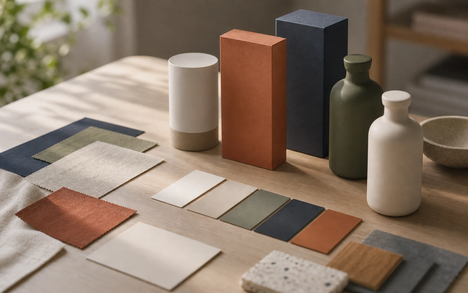
Muted blue, green, rust and cream material swatches beside unmarked packages and ceramic containers.

Brand Color Examples

specimen · source · interpretation

Editorial illustration. Read the original source beside each example below.
01

Two official color-use decisions.

Open the linked guidelines to inspect the original colorways. The examples below explain the decisions; they do not reproduce or license the marks.

Official rule, paraphrased

Spotify: the background changes the logo version

Green logo on black or white; monochrome on other backgrounds.

Observed: Spotify's developer guidance separates the primary green mark from its black and white versions.

GYB reading: Recognition color has a defined role. Repeating green on every background would ignore the application rule.

Spotify: Which color logo to useSource checked 2026-09-18
Official rule, paraphrased

NASA: preserve contrast around a multicolor identifier

Preferred full-color insignia backgrounds: white, black, gray or silver.

Observed: NASA also permits other backgrounds when contrast is maintained and warns against similar saturation or clashing colors.

GYB reading: The decision depends on the whole foreground/background pair. A palette alone cannot establish legibility.

NASA: Insignia background colorsSource checked 2026-09-18
02

Record a color pair before approving the palette.

A use record for each important foreground and background combination.

Role and pair
Name what the foreground identifies or does, and the exact background on which it appears.
Rendering conditions
Check the actual small-screen or print output. Test text and controls with the relevant accessibility criteria.
Permitted alternative
Specify the version to use when the usual combination cannot meet the requirement.
03

Use this for your brand.

Private brand work

Pressure-test the decision before buyers do.

If a name, color, mark, message, voice, or page is starting to affect sales or trust, get the public-facing decision checked before rollout makes it harder to change.

Private work Request private brand work Use this when a live brand decision needs outside pressure before launch, redesign, or sales review.
04