Accenture / 2001
Accenture and the Name That Outran Andersen
Andersen Consulting's forced rename looked awkward in 2001, but Accenture became a rare positive naming case when distance from Arthur Andersen turned into a strategic asset.
Decision Type
Name, identity, and positioning changes where public memory was put at risk.
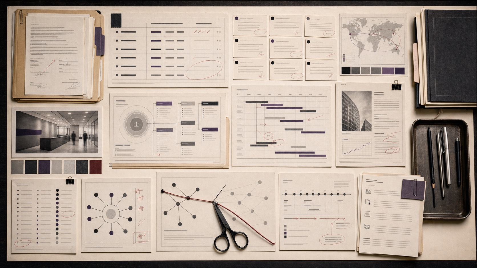
Rebrands are governance events. A company is not merely changing design. It is changing the signal customers use to recognize, trust, and remember the business.
Shelf Rule
Rebrands are governance events. A company is not merely changing design. It is changing the signal customers use to recognize, trust, and remember the business. The page is a shelf inside the archive, not a ranking and not a recommendation list.
Accenture / 2001
Andersen Consulting's forced rename looked awkward in 2001, but Accenture became a rare positive naming case when distance from Arthur Andersen turned into a strategic asset.

Airbnb / 2014
The rebrand attempted to turn a marketplace into a shared symbol, making the logo carry community, trust, and category ambition.
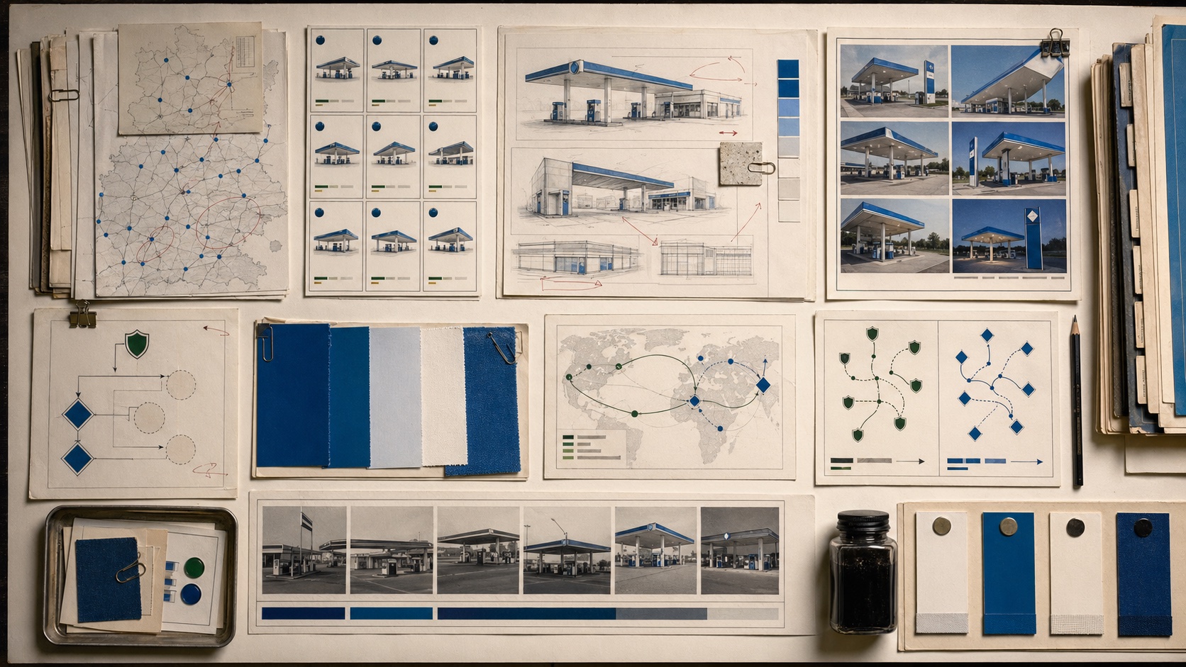
Aral / 2002-2004
BP's acquisition of Veba Oel could have erased Aral in Germany. Instead, BP converted its own German stations to Aral and let local recognition lead the retail architecture.
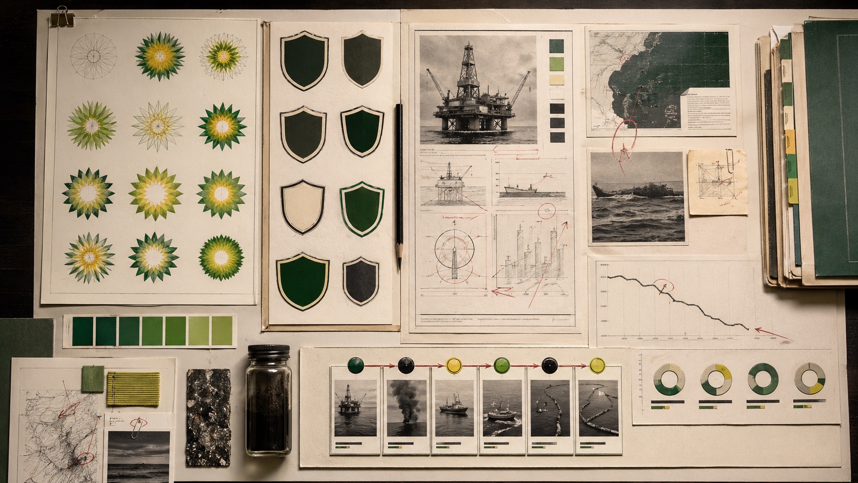
BP / 2000-2010
BP's Helios and Beyond Petroleum identity made an energy-transition promise visible before the company could make the operating reality stable enough to protect it.
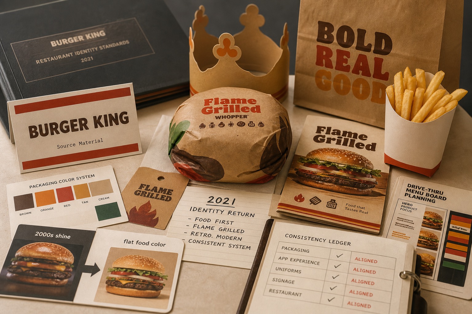
Burger King / 2021
Burger King's 2021 identity return replaced shiny digital-era cues with warmer food color, simpler typography, packaging logic, and restaurant cues that made the brand feel edible again.
Chevron / 2007
Chevron's Power of Human Energy campaign tried to turn energy debate into a human problem, but the same warmth exposed the trust gap around fossil-fuel reputation advertising.
Gap / 2010
Gap's 2010 redesign became a reference case because the failure was not visual taste alone. It was a break in recognition, memory, and control.
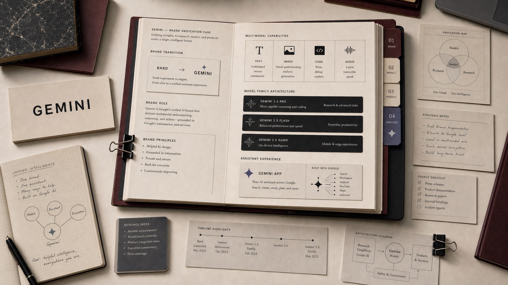
Gemini / 2023-present
Gemini gave Google a single AI brand across model family, assistant app, developer platform, and multimodal ambition after Bard made the consumer story feel separate from the model story.
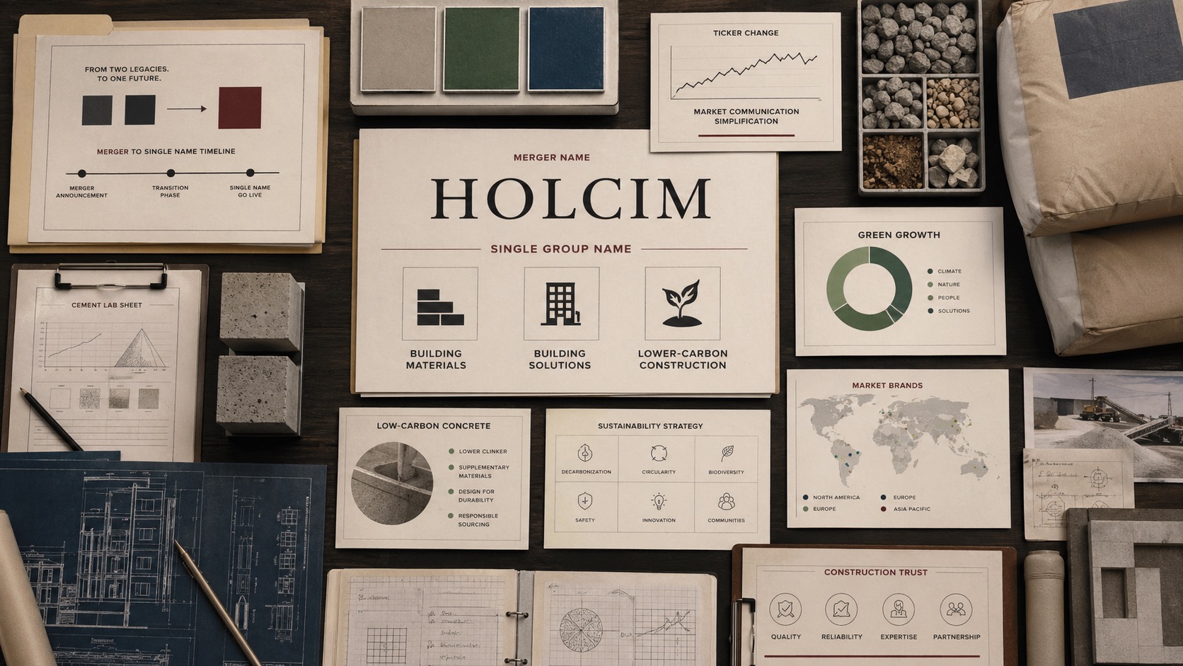
Holcim / 2021
LafargeHolcim's return to the Holcim name simplified a merger-era corporate identity while reframing the group around building materials, building solutions, and lower-carbon construction.
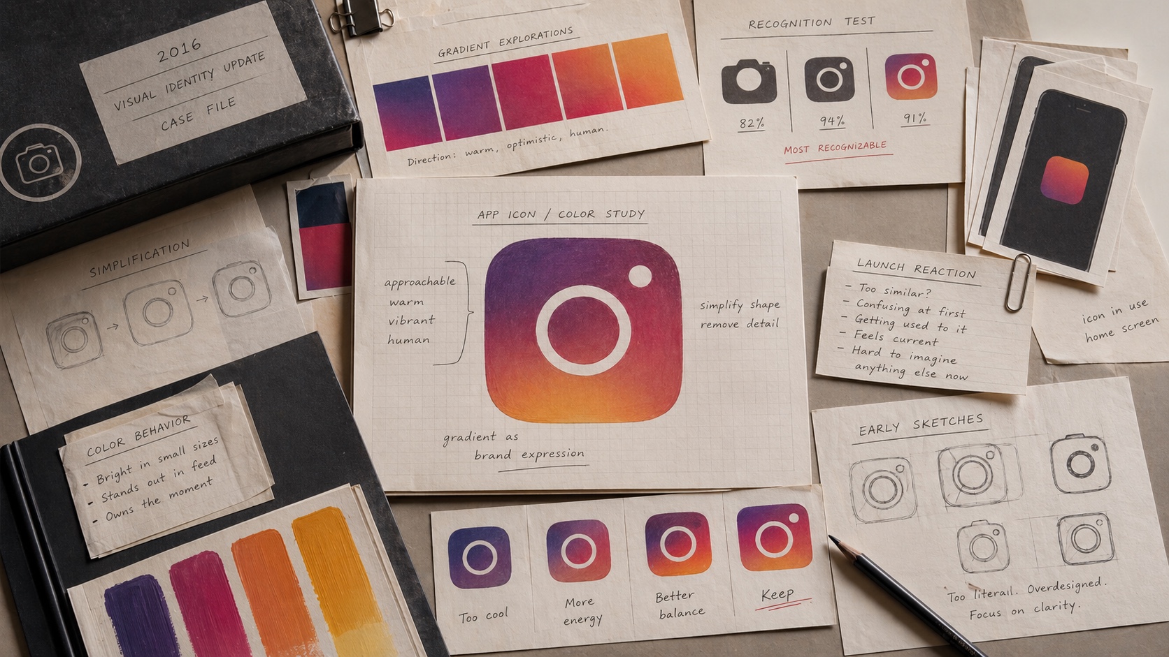
Instagram / 2016
Instagram's 2016 redesign was mocked at launch, but the gradient icon later became one of the clearest examples of a risky identity change becoming normal.
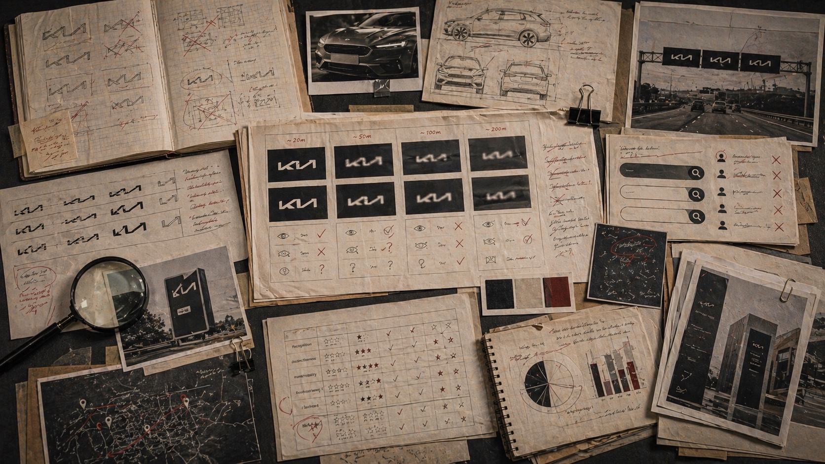
Kia / 2021
Kia's 2021 identity showed how a bold mobility rebrand can create a readability tax when the mark becomes too stylized for first-contact recognition.
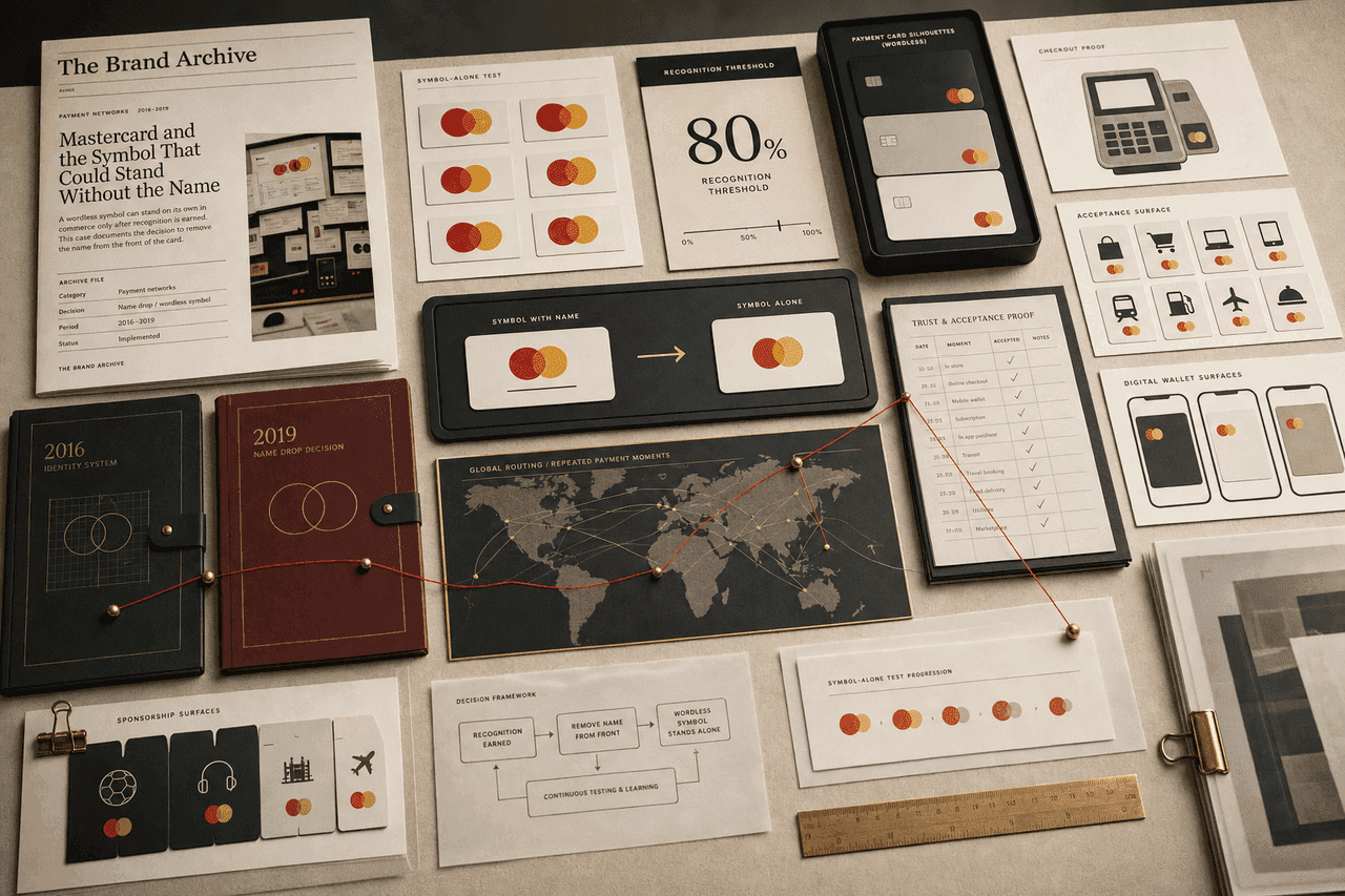
Mastercard / 2016-2019
Mastercard's move to a wordless symbol worked because the interlocking circles had already accumulated enough global payment memory to carry acceptance, trust, and network recognition on their own.
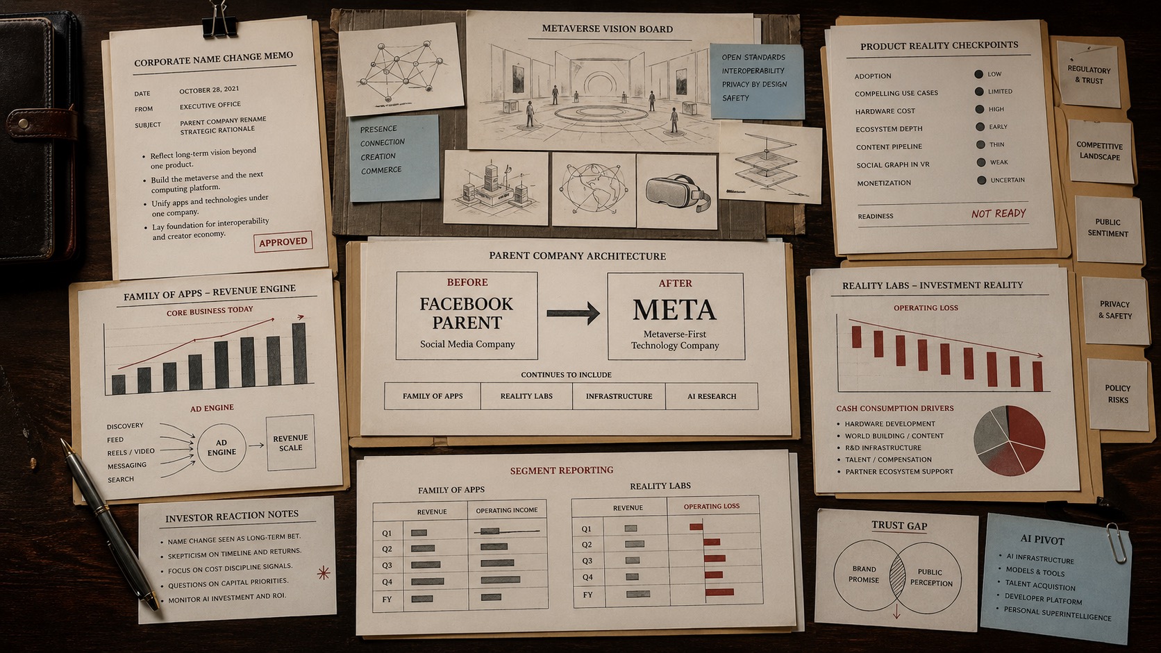
Meta / 2021-2025
Facebook's parent-company rename to Meta was meant to shift the strategic frame toward the metaverse, but the brand story kept colliding with product readiness, ad-engine dependence, trust baggage, and Reality Labs losses.
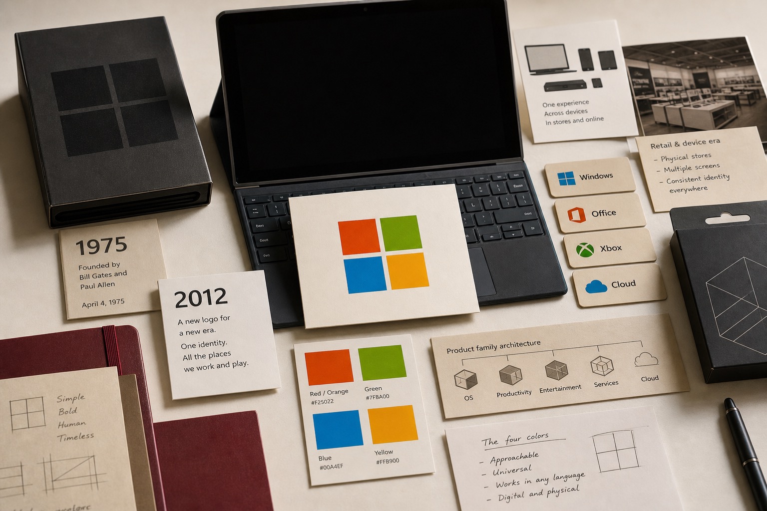
Microsoft / 1975 / 2012-present
Microsoft used the 2012 logo to connect Windows 8, Windows Phone 8, Xbox services, Office, retail stores, PCs, phones, tablets, and TVs through one four-color parent signal.
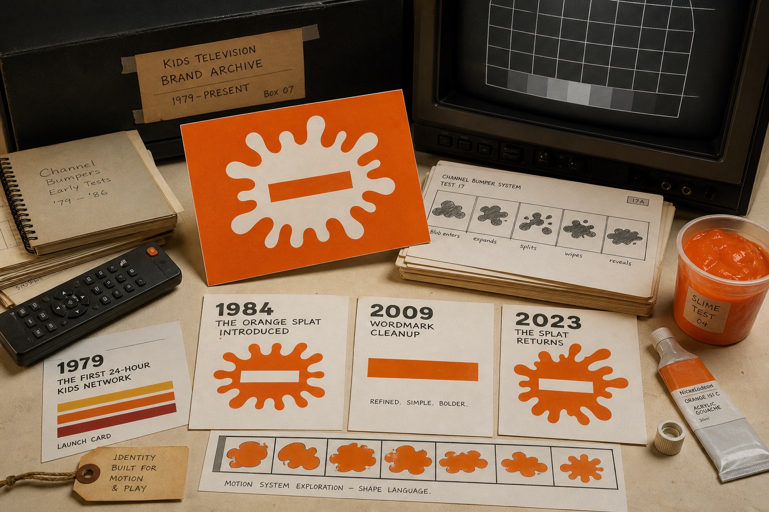
Nickelodeon / 1979 / 1984 / 2023-present
Nickelodeon used orange, splat shapes, slime cues, bumpers, and motion behavior to make a kids channel feel less like a schedule and more like a place where the rules could bend.
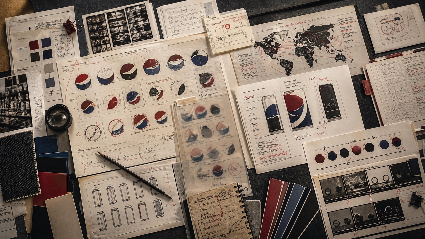
Pepsi / 2023
Pepsi's 2023 visual identity update shows a brand trying to recover older memory while still signaling the present.
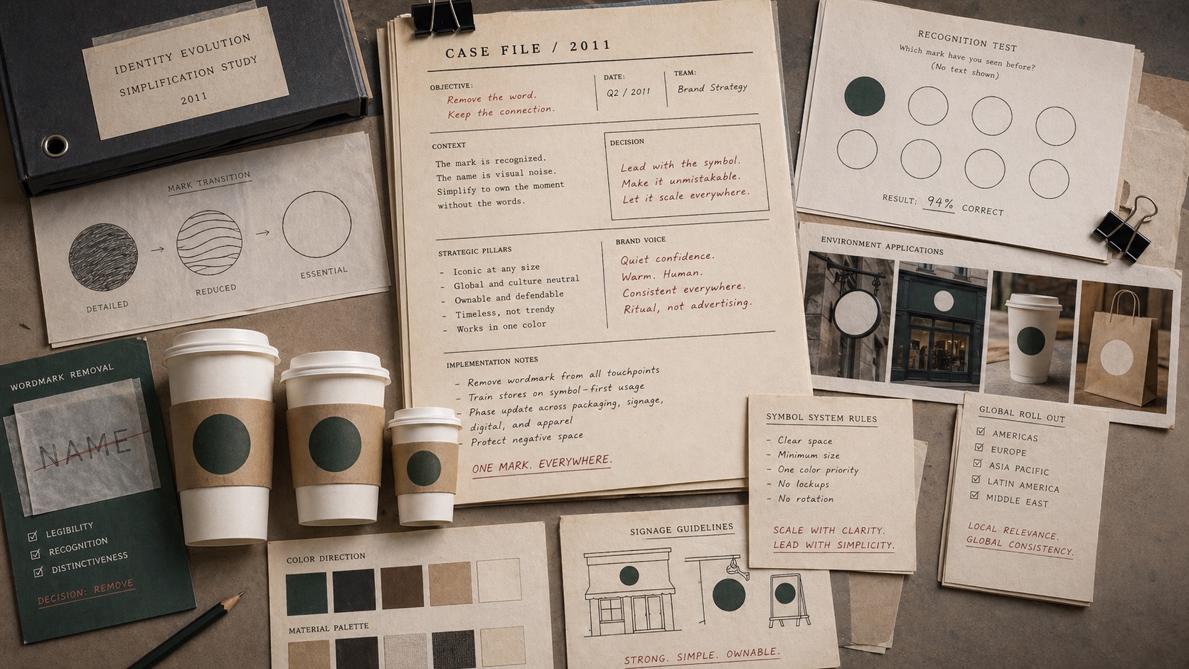
Starbucks / 2011
Starbucks removed the words from its logo only after the siren had accumulated enough global recognition to carry the brand alone.
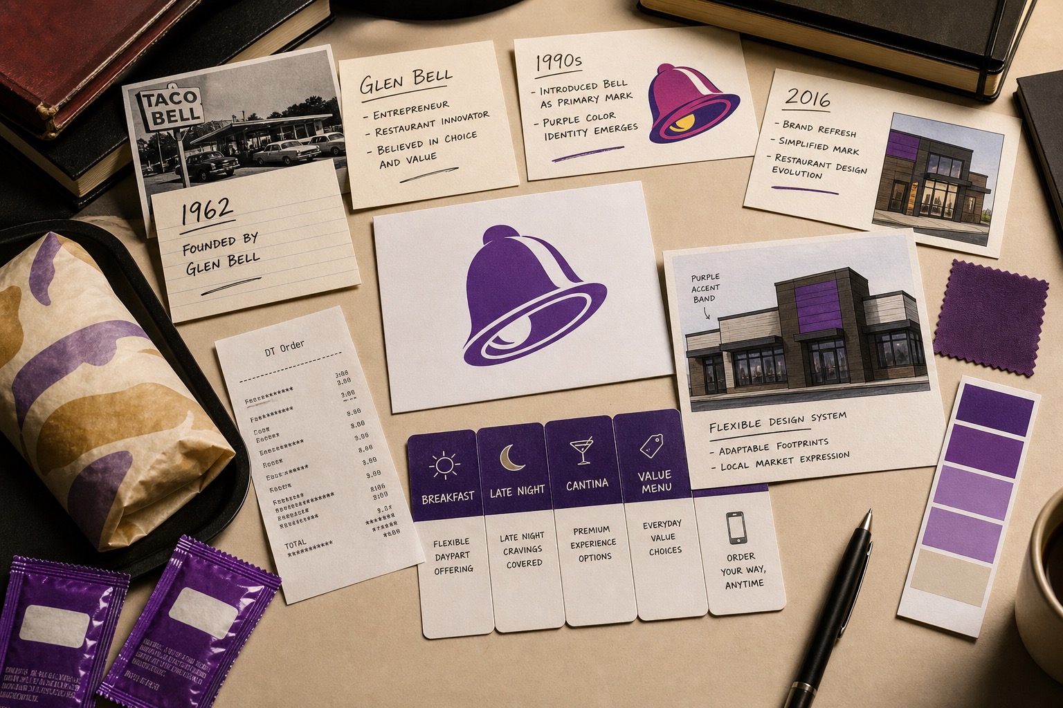
Taco Bell / 1962 / 1995 / 2016-present
Taco Bell used the bell, purple, restaurant formats, Cantina cues, menu range, late-night behavior, and digital ordering to make a quick-service chain feel looser than burger-category rules.
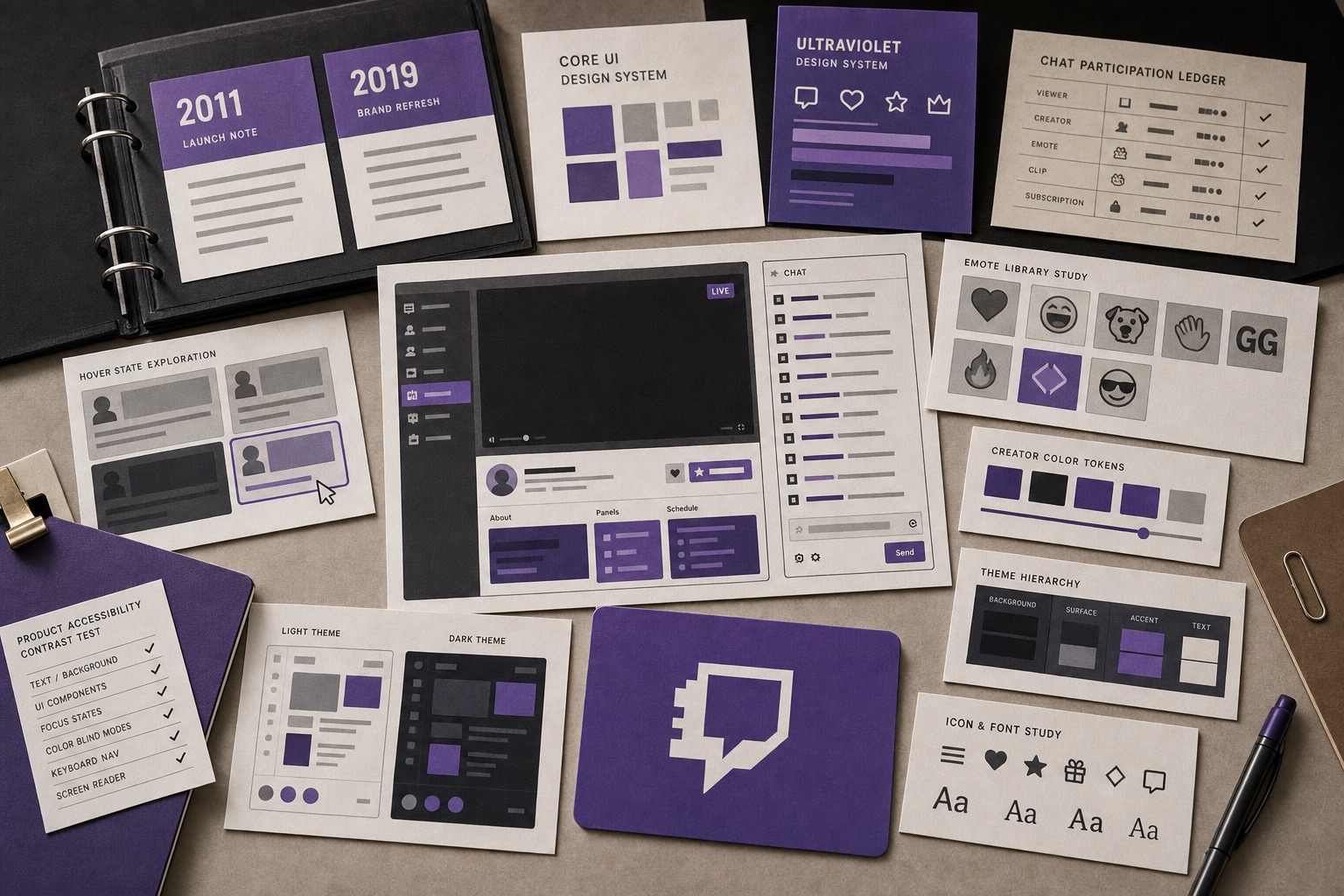
Twitch / 2019-present
Twitch used purple, Glitch, chat, emotes, creator color, and a product design system to make live streaming feel like a shared room rather than a plain video page.

X / 2023
The rebrand removed one of the rare consumer internet marks that had become language, not merely a logo.
It belongs here when the primary decision pattern matches the rebrands category and produces a visible consequence.
Decision type determines what the reader should compare. Packaging failures, identity changes, and recovery decisions do not teach the same lesson.
No. The archive is a reference structure, not a ranking product.